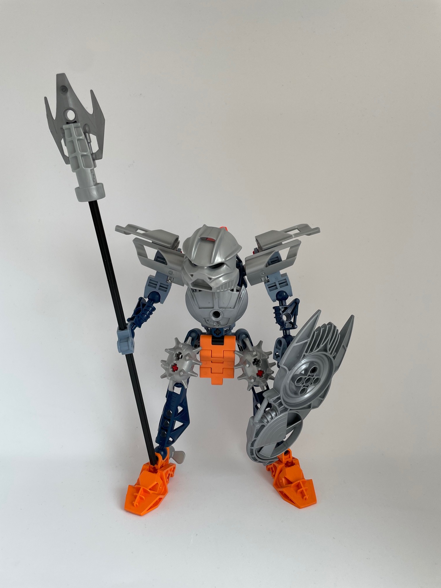
There might still be some time until the canonization contests resume, but anyway, here’s my version of the Toa Hagah of Water!
I had grown a bit tired of the “elegant, graceful” design language often used for female mocs, so I wanted to go in a drastically different direction - and with Gaaki’s personality being described as someone who will gladly take risks to impress others, I wanted to make her look like she’s always ready to jump into action. Thus, I lowered her head and gave her a more edgy, somewhat 90s-Technic-inspired build - please feel free to tell me what you think about these design choices!
I don’t like how she has a hunch, and the orange is kinda distracting, but I overall like the build. However, they may mandate metallic feet in line with Norik and Iruini, so you might want to change that.
@Atobe_Brick Thank you very much! @The_Blue_Panda That’s my biggest fear as well - I tried to (sort of) solve that by adding silver propellers, but I realize it’s a stretch Thank you for your constructive feedback tho!
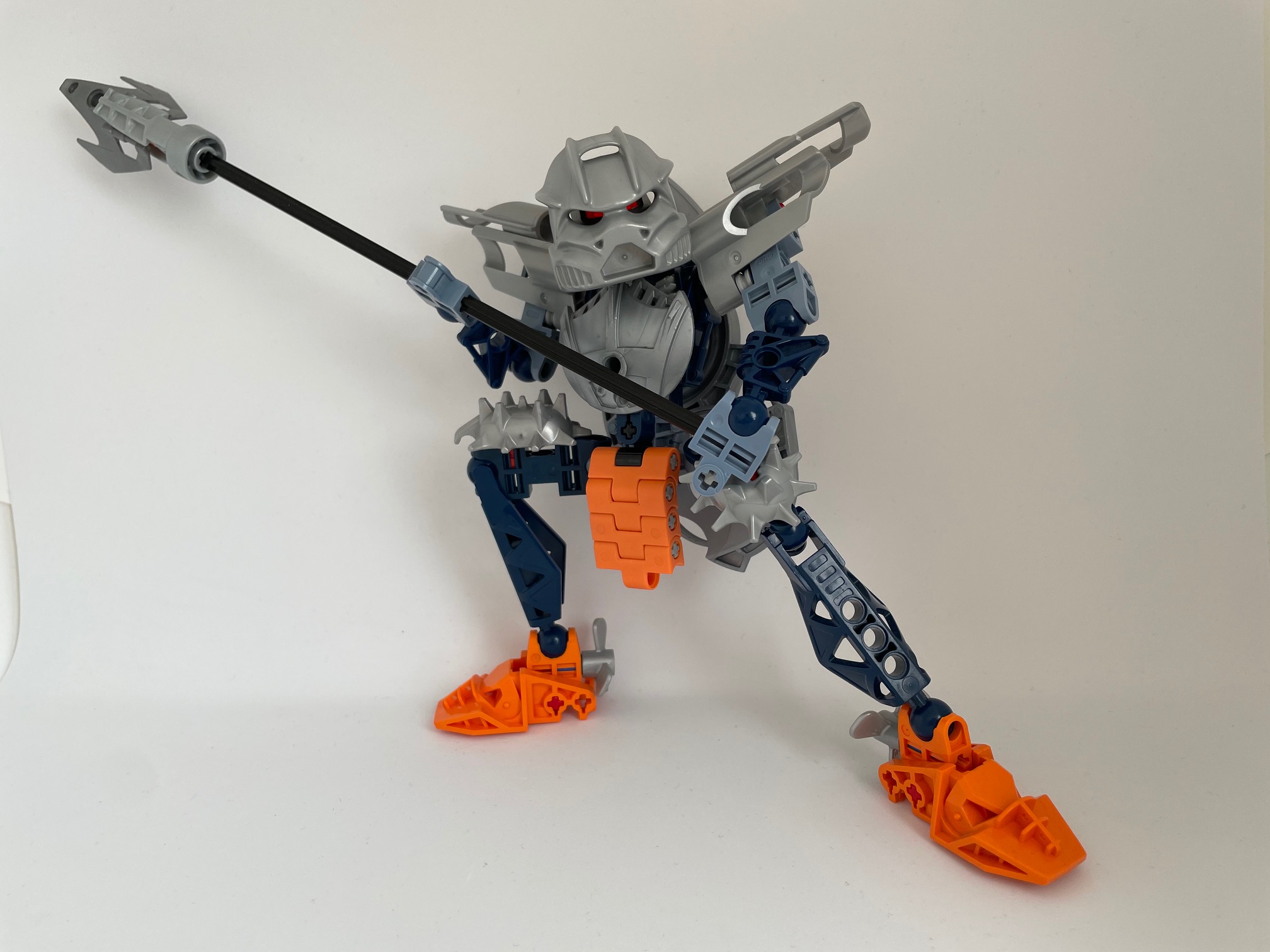
it’s a cool moc with interesting part usages and ideas but personally I wouldn’t vote for it in the contest, It’s just a bit too out there for the hagah imo.
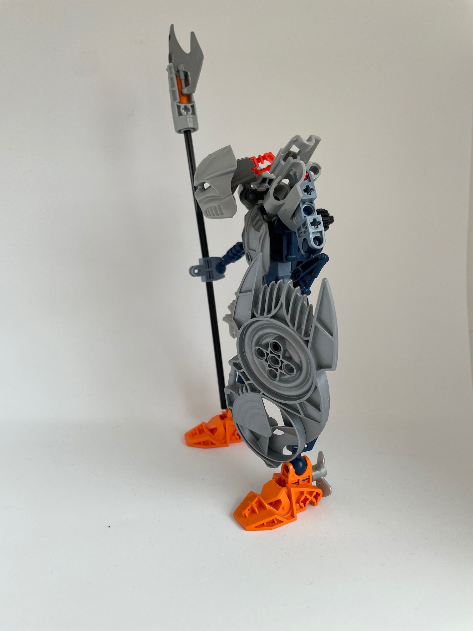
Feel like it needs a few more steps to make it consistent - I don’t know what relationship the mace pieces have to the shoulder aerodynamic pieces, but they probably don’t go together; and the arms and upper torso need some orange to match the legs.
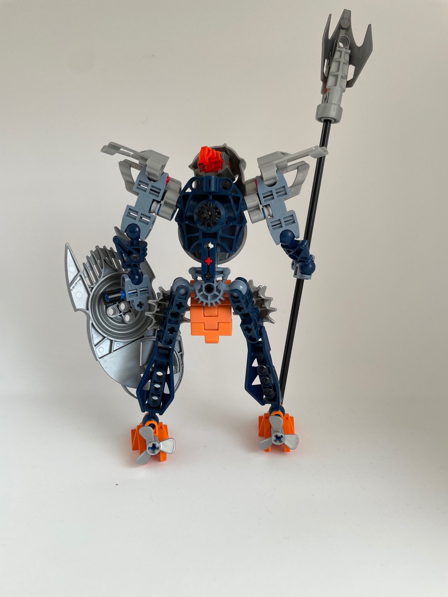
That Kaukau Nuva is a big flex. Also those belt treads are a neat method I have never really seen before. Overall, really a good design that leans into a more retro aesthetic.
no two parts of the model really go together I feel. Each piece of armor has a different texture than the last. the colours also feel a bit haphazard. sand blue and orange seem to be completely segregated top to bottom and neither of them seem integrated enough.
The concept behind the build is interesting but the execution just doesn’t really work in my opinion.
First of all, thanks to all three of you for your feedback! @Hawkflight I agree with you - the mace piece was mainly added bc it looked like a starfish so that’ll probably be replaced. And I think I already know what to make instead… @xboxtravis7992 Thanks a lot, I’m glad you like it! That mask is indeed special happy to meet a fellow retro-aesthetic fan! @StudentScissors I see your point, I definitely could have done more to tie those two colors together… As a matter of fact, I wanted to be very mindful of the colors I chose - but when I saw these colors together, I just liked them so much! I think I know what to do about the textures, and maybe some orange hands could work… to be continued
 Thank you for your constructive feedback tho!

 so that’ll probably be replaced. And I think I already know what to make instead…
 happy to meet a fellow retro-aesthetic fan!