I see. Which website did you use?
It just makes them look bad, I’m sorry
For me aesthetic mostly so that it flows with the armor, and fits in to a degree with the original two hagah feel wise.
Yeah not sure how I feel about Kualus, but I do agree a brighter copper color would look cool on Gaaki. It’s a shame there is no official color that is a more vibrant copper.
I don’t know if this changes any opinions, but the green on Kualus would ideally be the official Lego metallic green.
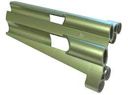
(Again, the colour swapper was kind of limited.)
Ah. That’s the same website that I used to use for my Artakha recolors.
A few days ago, however, I found a website which, in my opinion is far superior. It takes less trial and error, and is generally easier to use.
Here’s the link: https://www.colorizephoto.com/
To each their own. I think that Green Kuakus looks fine, but I’m unsure if whether or not it’s befitting of a toa of ice.
Ahh gotcha, still not sure if I would personally like it for Kualus, but I can get behind that color in general as a metallic toa color.
An interesting idea might be Metallic Green Gaaki. It’d have a similar vibe to Hahli Mahri, but would still be unique it’s own way.
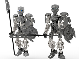
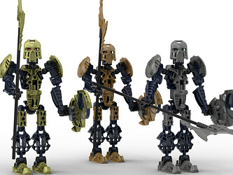
Haven’t posted my concepts yet (only have started on these 2 so far), and after also being curious to see how Gaaki would look in green, rendered it up and here they are:
Kualus
Gaaki
Still not decided on the colors, which is why there are multiple in both shots (Metallic Green is the 5th color I’ve tested on Gaaki now lol).
Maybe the green is too overpowering. metallic colors like gold and silver work because they can fit with any element. We’ve seen gold on black, green, red, blue, and white characters. We’ve seen silver paired with pretty much every color.
On the other hand, metallic green is a shade of one of the elemental colors, so when it’s added to a hagah in high concentration, they end up looking like a primarily green toa.
Also I’ve noticed that in almost every stud.io render of Gaaki I’ve seen, the metru blue looks very dark. Is there any way to make it appear brighter?
Yeah, agreed. It’s just too much, and takes away from their main element. If the green was less strong and more silver-ish, almost would like it since it gives a kelp forest feel to me. Also yeah, when the metallic color matches it’s element, it looks too plain. When they don’t match, they look too strong. Definitely leaning towards Gold, Silver, and Gunmetal in general. Maybe Copper if I like how it looks on Bomonga.
Actually, I just had an idea.
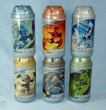
Theoretically, someone could use the green on Lewa Mata’s canister lid (and for any of the other lids, for that matter). I don’t have the canister to confirm, but it looks like a more muted shade of green, and I think it’d count as an official lego color.
When selecting metallic colors, it’s important to note why we see them as we do. Silver is rather innocuous because it’s a neutral color, essentially just grey or white with extra shine. It can go on almost anything without overpowering the “main” color a character is supposed to read as having. Norik has a lot of silver, and silver probably takes up more of his surface area than red, but he still reads as red because chromatic colors generally jump out more than neutral colors.
Other metals, like copper, gold, and various alloys, are chromatic, but they’re generally fairly dull and, in terms of Lego colors, correspond to real chemical substances we’re all familiar with. The same cannot be said of bright red, green, blue, or pink. When these colors are paired with a “base” color on a character that’s very different from them, the metallic color now overpowers the nonmetallic visually and reads as the character’s “main” color.
This is why green on Kualas or red on Bomonga is a bad idea. In this particular instance, it produces a combo that’s just too exotic and clashes with how the character is supposed to read. On that note, with as much courtesy as I can possibly offer…
Hard pass. Hard. Pass.
contest over; we have the hagah
I just wanted to say that I 100% agree with all of this. ![]()
I like the idea that the Bionicle universe might have some “precious metal/valuable” colours that aren’t necessarily parallels to the real world - it adds to the non-human feel of the universe. But I think they need to be chosen with purpose rather than just for the sake of looking “different”.
A deep, metallic red for Bomonga can give a soil-like tone, or even a mantle/crust feel, so long as it’s not too close a shade to fire. Pink Pouks, as I’ve said prior, could evoke geodes or gemstones embedded in the rock. Green on Gaaki, in the right shade, could suggest seawater, kelp, or algae - and copper could almost give a “reef” feel. I think Kualus would look great in either ice blue (glaciers) or gunmetal (mountains).
The trick is choosing colours that add depth to the Toa’s element, rather than obfuscating it. I’m all for new and weird colours, but they must be chosen with a purpose. If I can’t tell what element the character is, you’re defeating the point of experimentation. I’d rather vote for Gold/Silver/Copper x2 than a random rainbow, but over both of those I’d prefer a rainbow that is constructed deliberately and thoughtfully. Just my two widgets. ![]()
(Oh and also, totally a fan for all three of those posture suggestions.)
I’ll be away from my parts for the duration of this contest, so I’ll be taking full advantage of art (assuming it’s an art contest or free-for-all) to give each Toa a new mask design. I started by designing variants on existing masks, and have been designing armor with similar aesthetics to the Kanohi. For instance, if I gave one of them the canon Mask of Psychometry, I’d give the armor shapes that evoke classic Technic, Throwbot & Roboriders elements. To me, it’s all about the design.
Actually, I sort of wish this contest was being held after the one for the Yesterday Quest Toa- then more new designs would be on the table.
A question about armor, though- if it is art-only or free-for-all, will artists be required to have images for new armor/weapon elements like the masks, with front, top, and side images of each, so they can easily be 3D rendered?
Oh no not the BNG
insert obligatory sentence about throwing my two cents in
*disclaimer: this is a lot of words! You have been warned ![]()
First off, I want to extend a BIG THANK YOU to @Eljay @Mesonak @Kini_Hawkeye for holding these contests. I know its a lot of stress & time on y’alls end, but having canon contests again has been a very cool experience (for me at least lol), and I know thank you is a small reward for you guys but still - thank you. You didn’t even have to open up this topic for feedback, and yet here we are. I appreciate all you are doing for the community, & I’m sorry you have to put up with so much all the time.
Okay, onto my thoughts.
Right off the bat I’ll say I voted for Option 1, after reading the doc, listening to the Nak&Jay, reading through some of this topic, & thinking about it for a day or so. I do think its the best option. I think it is the best way to consolidate all that is going on.
Imo, the most important thing to remember is that these are contests for a group of characters - a wave of Toa if you will. And thus, they should look like a wave of Toa. I really like how @Mesonak puts it by saying a certain ‘theme’, if you will.
THIS. As @Eljay said in the most recent Nak&Jay, these are not contests to see how far we can push things, or how crazy we can go. This isn’t Biocup or any other moc contests - this is a canon contest, and thus sticking to a canon representation (Metru-style) is of greater importance than anything else. I think this should be the lens with which we look at these Hagah contests through.
I understand how many people have a concern that this may limit what can be created. I have a two-fold response to this. 1) Most definitely. This will limit what can be created. As @CMO has said, there will be restrictions. This is because these mocs need to adhere to metru-style as Greg has said, in order for them to be canon. 2) This is not necessarily a bad thing. And I whole-heartedly believe it will not limit things nearly as much as moc-ists think it will. Stay with me. I studied product design for 4 years in college(Please don’t take this as me being extremely prideful here, rather trying to explain how this perspective is viable - allow me to explain). I was taught very early on in school the importance of restrictions on design. Entertain a simple analogy: design work is like elementary children in a playground. Option 1 (little to no restrictions) has a playground with no fences. Option 2 (tighter restrictions) has a playground with a large square fence around it. The children in the playground with no fence tend to stick to each other and to the center of the playground, for fear of strangers/cars/etc., while the children in the fenced playground feel a bit more secure and venture all the way out to the edges of the fence, populating a much larger area than option 1 (this is a real thing studies have been done on this). This is a lot like design work. Sometimes with no restrictions, we don’t even know where to begin. We are so caught up in trying to think of a set of criteria for our product that we never actually get to designing the product itself. However, with a few set standards (restrictions) of design criteria, we feel like we have a clear direction for our design work, & can immediately start to iterate ideas and push the envelope of creativity because we know at least a little bit of what this thing should look like/be like/etc. Trust me, I have seen time & time again projects with little restrictions fail or perform poorly for lack of direction, vision, or general creativity, and I have seen time & time again projects with many restrictions push the envelope of creativity and flourish under the respective design criteria. People always think it is the other way around, but it really is not, as weird as it seems. Now I know that’s a lot and meant for high-level production project design work, but I think the same principle can apply here.
Take these for instance:
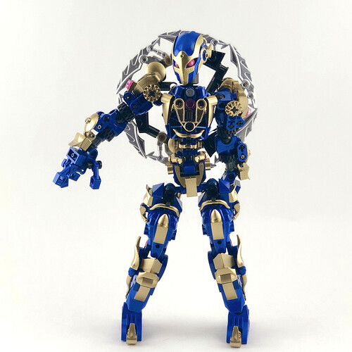
All potentially Metru-style, all very different. This is not to say these are what the future Hagah will look like, only to show that there is no need to worry about the possibility of differentiation.
I can already see people reading this and wondering ‘well, how different then? What constitutes a Metru-style build then?!’ Fair question. And I think this point is key. This right here is where the balance of restriction and creativity happens. This is where we need to decide how far we can push the envelope, how far away we can build the fences. Here is a helpful image:
A ‘metru skeleton’, if you will. Now, I’m not going to demand ultimatums for what metru-style looks like exactly. But I truly think deciding where the restrictions on metru-style fall is the heart of balancing creativity and canon in this contest (basically this is my thesis and if you get nothing else out of my rambling get this!!) Maybe it is just the torso. Maybe it is the gear function. Maybe it is the proportions, or the shield. Maybe a combination of those or something else entirely. But I think that finding that balance is the best shot at giving the moccists freedom and the purists canon. (If it were up to me, I would hold a ‘survey’ of sorts to gauge the room, so that both purists and moccists can vote in and find a compromise on this. Wait did he just say compromise?! No! Compromise cannot exist in this world! It is my way or the highway! It NEEDS to be - okay sorry I’m done with that rant haha). So try it out at home! Take apart your metru builds (or get stud.io if you don’t have the parts) at home and see for yourself where you think Metru-style is. And then try to see where other people stand. Try to see where a compromise can be made that is best for all, and best for the contests. Or just get fed up with it and send me all your Metru sets so that I can combine them all into one big Hagah that will end all Hagah…sorry getting carried away again. aaaaaanyways… ![]()
I also see a few issues that could result from a free-for-all contest. The most prominent issue that we cannot get around is that BS01 will not accept a 3D-printed part on their web page. So if we decide to go for a free-for-all, and a moc with a 3D-printed kanohi wins (which tbh I think is very likely - I have seen a lot of epic designs out there lately related to the Hagah and I think a lot of people really like them), then we will have to hold a separate art contest anyways to determine an official representation for BS01, which is basically what we have been doing anyways.
(side note on 3D printing: it has my full support. I think it includes a large part of the community, allows for some incredible talent/work to be showcased, & is being handled incredibly well by TTV. This is another reason I voted for Option 1 - because it allows for a sure-fire way to deal with 3D printed kanohi that have a very large chance of winning these contests.
well, nevermind, there goes my point on 3D printing ![]() )
)
In addition to this, people are going to want Hagah builds. People want to display a full set of 6 Toa Hagah on their shelves. If there is a free-for-all, people in this camp are going to vote for mocs simply because they are mocs that can be built. And if there are enough people in this camp (which is very likely - the moccing community is waaaay larger than the art community), then a moc will most likely win anyways, simply because it is a moc and can be built.
An art-only contest raises a few issues as well. I think the most prominent one is community engagement. Lots of moccists are going to feel left out of this. I’m with @Mesonak & many others that this would take away a lot of participation that we really want to have happen, not to mention we wouldn’t have builds right away, which as stated in the above paragraph is valuable to a lot of people (myself included).
Option 3.5 is…weird. ![]() I understand that it makes creating a unified group of Hagah easier, as they are all done in one go. That being true, I think it would be really weird if there was a peice of art canonized for a specific (or multiple) Hagah, and then a little while later another piece of art cannonized for that specific Hagah. So then there would be 2 canon pieces of art? Which would be ‘official’? Which would be up on BS01? Would the winner of the first round (if it was an artist winner) feel like his/her piece is now suddendly not ‘as canon’ as it used to be? Are there 2 different canon artworks, made by 2 different people, for the same character? These are just thoughts that go through my head for this option. (I know there can be two different interpretations of the same character, but it just doesn’t seem like the strongest option imo)
I understand that it makes creating a unified group of Hagah easier, as they are all done in one go. That being true, I think it would be really weird if there was a peice of art canonized for a specific (or multiple) Hagah, and then a little while later another piece of art cannonized for that specific Hagah. So then there would be 2 canon pieces of art? Which would be ‘official’? Which would be up on BS01? Would the winner of the first round (if it was an artist winner) feel like his/her piece is now suddendly not ‘as canon’ as it used to be? Are there 2 different canon artworks, made by 2 different people, for the same character? These are just thoughts that go through my head for this option. (I know there can be two different interpretations of the same character, but it just doesn’t seem like the strongest option imo)
SO. That was a lot. But all of ^that is why I stand with Option 1. But one last thought on the contests - don’t sweat it too much. Seriously. I remember a lot of people (myself included) getting a little too worked up about the Helryx contests, but the moc and art came out fine despite numerous trials. I remember a lot of people (again myself included) getting a little too worked up about the Artakha contest and the color restrictions, but that one turned out just fine as well. These Hagah contests will be just fine. There are too many people sitting active in this community to le the Hagah turn into some wicked monstrosity that Greg never intended. And even if that does happen, Greg still has the final say, and he will not give a ‘very nice’ to that. He is the Toa of Canon, after all. ![]()
That is all. Thank you for your great patience in entertaining my ramblings on this toy line that we are all so passionate about. I will do my best in the coming weeks to respond to those who reply to me (as long as you are polite of course)
A couple disclaimers:
If I quoted you or your work without properly citing you, I am sorry. There was just no way I was about to read through thousands of responses to make sure everything was perfect. This already took a lot of time as it is haha
Please know I am trying very hard to be kind, polite, and see the glass half full. I know it is difficult through words on a screen to see tone of voice, body language, or other means by which we gauge expression. In no part of this am I upset with anyone. I want to make it a point to be polite and have a civil discussion. I think the staff agrees.
As long as its on the end of a Hagah spear ![]()
oops
I get where you are coming from, and I think in the end definitions/boundaries for the Hagah will need to be set (shields, proportions, metallic use, etc.). But by definition, the Hagah are Metru builds. So sure we could seek out to define the Hagah build, but step 1 of that process (per Greg) would be to define a Metru build.
Edit #2: In addition to all of this, I think some healthy discussion around the guidelines for the kanohi of the Hagah would be very beneficial. These are special cases, and don’t always need to look like their abilities (if that even makes sense). I think some thought really needs to go into how that is handled, and what the guildelines should be when choosing what kanohi you are going to use/represent/draw/etc.
Indeed. Also, as @Takutanuva was talking about earlier, it’d neat if Norik and Bomonga’s color schemes had some overlap, since they’re both team leaders.
Even so, I don’t think that metallic red is my favorite option. I wouldn’t mind it being canonized, though.
There’s always Stud.io
What the h*ck is a BNG?
Team who made render above and models they used for it. Their hagah stuff is pretty gross
