Toa Hagah - Raid on Destral (Canon Contest #3: Honor Guard)

Hey everyone,

This is my art entry for the Hagah contest. It’s inspired by the style of Randy Elliot’s Bionicle comic art from the 2004-2005 era.

(No textbox version)


Here’s Gaaki’s custom mask of Clairvoyance…


Pouks’ mask is the same used in the the MOC by @Kodiak
Here’s a link.


I’ll let the art speak for itself, it took me way too long to make!

Thanks for checking it out.

55 Likes

yes
also nice artwork, I really like it

3 Likes

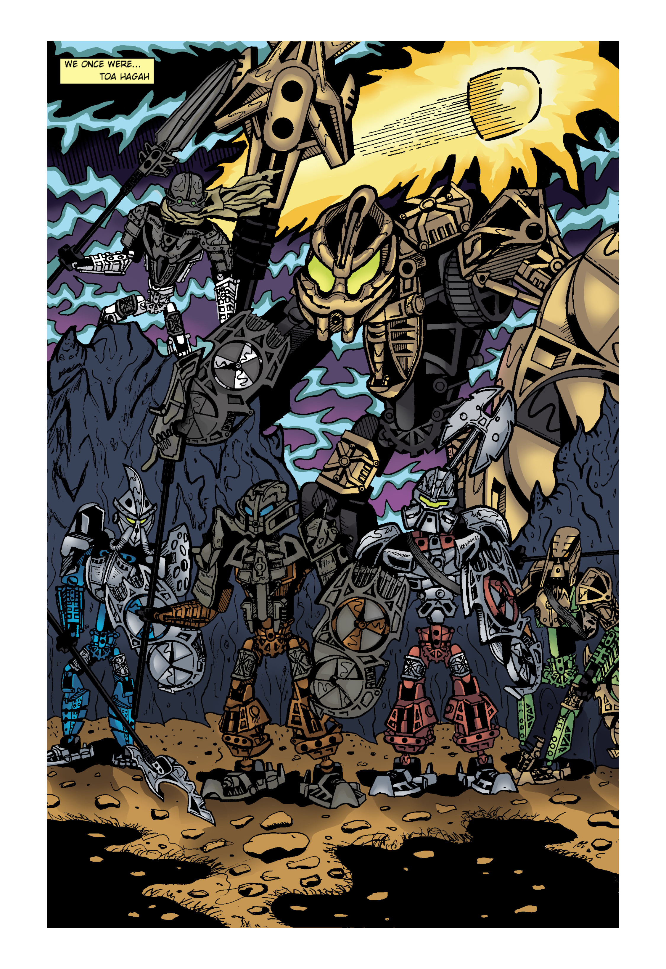
You did a pretty good job of recreating the comic-book artstyle, but I think you should either get rid of the text box in the corner, or make it a little bigger.

Good luck!

4 Likes

You’ve nailed the comic aesthetic here! The colors really pop and the background really compliments the characters as the focus.

1 Like

Really like the comic look! As it looks like we won’t be getting a 3-3 split, this will probably get my vote.

1 Like

I like that huge fin on gaaki’s mask. It’s almost like a pterosaur crest or a swordfish fin. Also bomonga’s eyes are huge, almost bohrok-like

4 Likes

Bruh, this one wins. Nice work, dude! I love it.

2 Likes

It was worth every second!

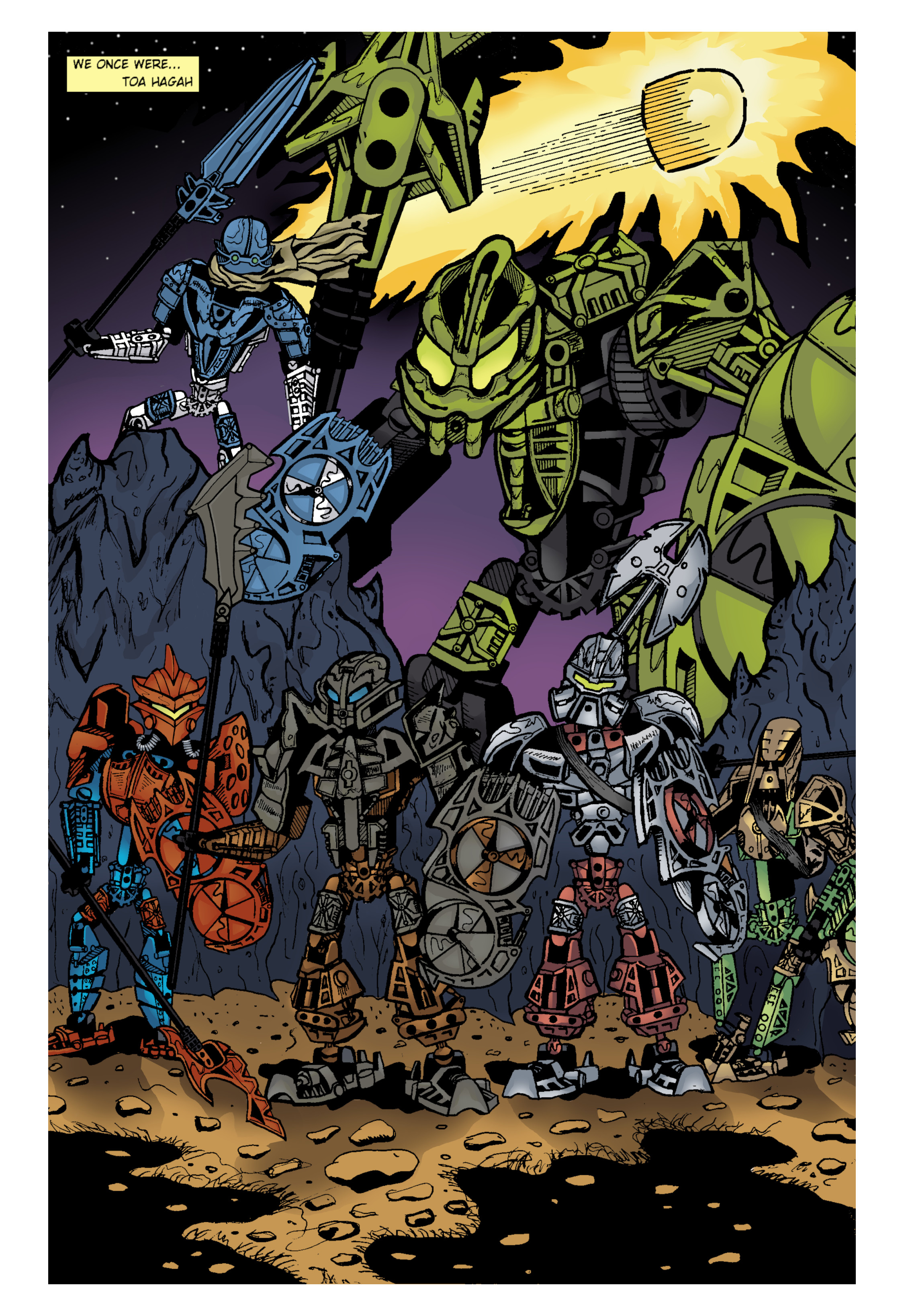
I like that you chose a 2/2/2 metal color concept. As much as I don’t mind the metal blue color for Kualus, this art concept, if it is canonized, makes it easy to avoid time/money to spray paint parts.

I genuinely wish you the best of luck!

1 Like

It reminds me how huge Vakama’s eyes were in the comics, because of his Huna, I like it.

2 Likes

You absolutely nailed the comic style, it’s little imperfections and all. Great entry, good luck!

2 Likes

This is fantastic artwork! Great job!

My only issue with it (and don’t take this to heart, it’s just my opinion) is the color split. Now this might be a bit of a hot take, but I much prefer a 1-1-1-1-1-1 split, or a 2-2-1-1 split of the original builds. Also, if we were to have a 2-2-2 split, I think I’d prefer making Pouks blue. The more I see this color variation, the more I dislike it. Once again, this is not to say your art is bad, in fact quite the contrary, it’s incredible! Good luck in the contest!

Edit: just to reiterate, I’m just sharing my opinion and In no way am I trying to make someone else feel bad

1 Like

Wow! You definitely nailed the comic look! Amazing job with this piece!

1 Like

I completely understand. I had the same issue with most of the other entries. I’m sure a lot of the voting this time will be more about color schemes than the art itself. It is a canon contest after all, not an art contest.

Not sure if you saw, but I did add a version without the text box. Which was my plan from the beginning. I like the visual of the text box too much to get rid of it completely!

Thanks for all the positive feedback everyone!

1 Like

Extremely jealous that i am
But i was thinking

Nobody knows the true canonized form of the kanohi pehkui / others

Save for irunis and gaakis and pouks

…And no one ever did

This is neat, though the perspective on Kualas’s size is kinda janky and Bomonga looks possessed with his enormous eyes. The art style is certainly appealing, though. Nice work.

1 Like

Mask of Absorption

What about this one?

That is one B I G B O I.

Love the artwork. As others have said, really vibes with the OG comic.

1 Like

You did a fantastic job of capturing the comic style!

Also, while I’d rather see Kualus remain metallic blue, I like this version of the 2/2/2 color split.

3 Likes

I like the style but i prefer the metal blue on kualus I like the original color schemes

1 Like

Hey everyone,

I’ve seen a few people go back and rework their Hagah art submissions to make them canonically accurate now that we have a winner. I wanted to do the same since it seemed a shame all the work I put into this drawing could be sidelined due to its inaccuracy to canon. I hesitated for a while because I wasn’t sold on the metallic colors, but by now I’ve really warmed up to them! The color distribution also seems to work well with my drawing. I also went back and fixed some things I didn’t like about the original, mainly the hectic sky in the background. Hope you like it!


(Original for comparison)

7 Likes