Toa Hagah Visualizations

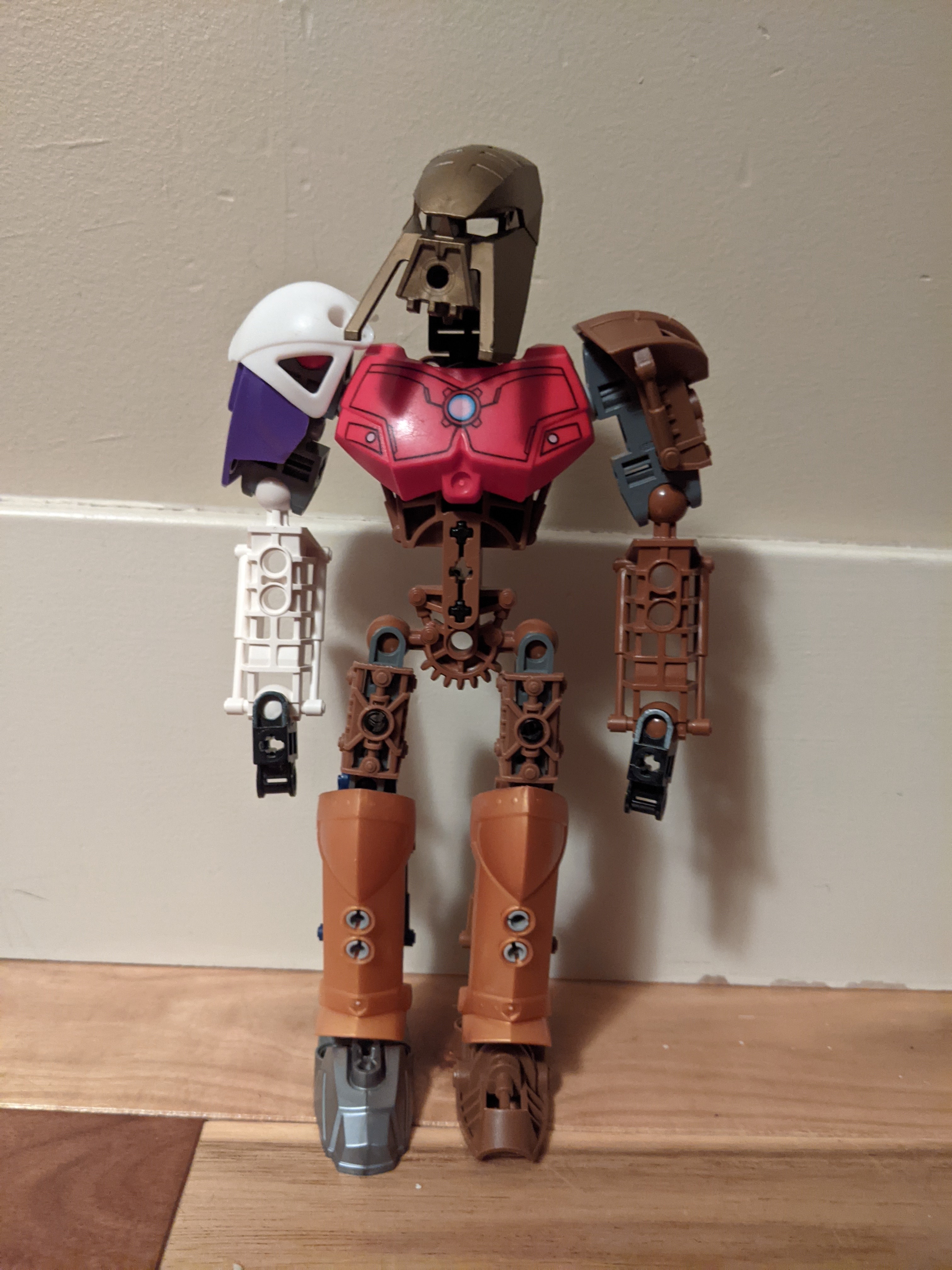
With my newfound powers of stud.io, I decided to build off of this concept art I created a few weeks ago:

Toa Hagah Canon Contest Format Feedback - #1670 by TheJerminator

These are far from final, and are moreso concepts than final designs. As such, the posing is pretty bland as well.
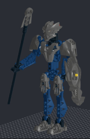
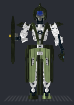
Gaaki:

image

(Ignore the lack of a head, since stud.io doesn’t have the G2 head, or the Uniter Mask of Water.)

There’s not much to talk about here; I didn’t have any special ideas for Gaaki beyond the mask, so she has a fairly standard build. The final version would have metallic armour, but stud.io doesn’t have metallic orange. One advantage of this design is that, for the purists, most of the armour comes in the non-metallic colour depicted above.
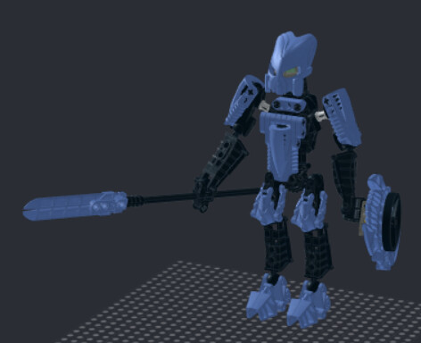
Kualus:

image image

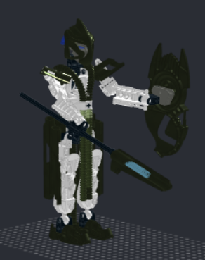
The driving force behind this design was the utilization of the limited metallic green parts officially made by Lego; the only painting requirements would be the mask and shield (obviously), as well as the feet. I’m considering trying out custom feet with those metallic panels, but can’t imagine how I’d make that look good. (Maybe use krana or kraata?)

The mask isn’t final either; I had decided that I wanted Kualus to have a standard, pre-existing Kanohi, and I chose the Rode simply because that seems to be a popular choice for Kualus. However, neither stud.io or the Biopack have the Rode, so I’m using Galva’s version.
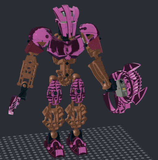
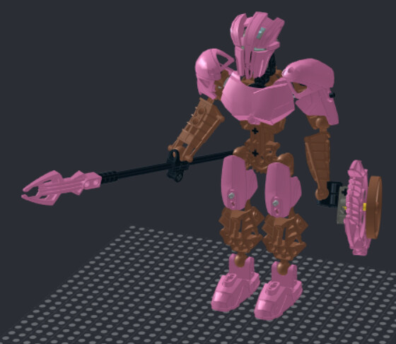
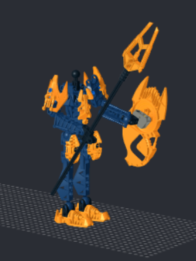
Pouks:

image
image

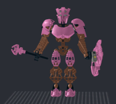
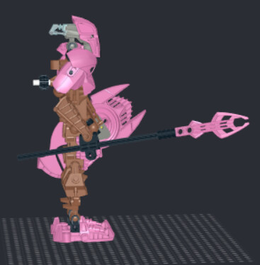
Well, here it is: pink Pouks.

Unlike the other three, I started this design months ago with physical parts, with the intention of it being my only Hagah design. As such, it uses slightly more complex armour construction, relying on non-standard connections that could only be tested with real parts.

The original design was planned to require the modification of as few “classic” Bionicle parts as possible; this can be seen in the use of CCBS, and I might also replace the Metru feet with the similarly-shaped CCBS feet. I even chose to use the Guurahk staff since, unlike most other G1 parts, it got a rerelease in G2. One concept that had to be scrapped due to the new rules is the usage of Knight’s Kingdom shinguards, which would leave the Metru thighs unpainted.

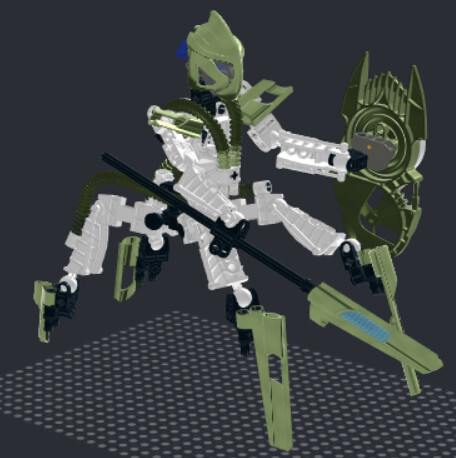
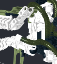
Finally, the most ambitious of the four: Titan Bomonga:

image
image

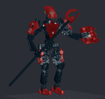
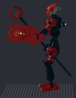
There’s not much to say here. Behold the glory of the titan-scale Metru build. I think it came out pretty well, though the waist is maybe a little thin.

I’d also like to make it clear that basically none of these titan techniques were created by me; I just brought them all together in one model.

(Note that, as with Gaaki, all of the pieces officially come in the non-metallic colour [except the shield, obviously])

Group shot:

image

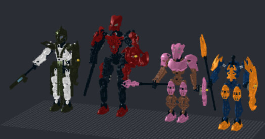
Bomonga’s definitely taller than the rest of them, and that’ll cause issues if the “no one taller than Iruini” rule sticks around, but he doesn’t seem obnoxiously tall.


COMPATABILITY:

I’ve seen a few people concerned about the functionality of the Hagah, so I might as well clarify that here:

  • Gaaki and Kualus have the same “geared spear arm, pinned shield arm” as Norik and Iruini

  • Pouks has two pinned arms; the CCBS shell in his torso completely blocks any possibility of gear functions.

  • Bomonga has two geared arms with ball joints

They also have a fair degree of “consistency”, although this was mostly accidental:

  • Shins have a 2-2-2 split
  • Thighs have a 2-2-1-1 split
  • All six have the same feet and forearms, as well as the usage of black sockets.
  • Each Hagah has unique metallic colours and shoulder amour

I await the feedback, positive or negative.

8 Likes

headless Gakki is such a bold artistic choice

12 Likes

You actually went and did it.
Thank you. :stuck_out_tongue:

Ok, feedback:
Those renders make the metallics hard to appreciate properly… that said I think I like them. Bomonga is probably the most questionable (does he fit in the height regulations?). Really like Kualus the best out of these - the shaping and colour of his armour are both really cool, and the spear is really neat. On-the-fence about Gaaki because I’d like to know how that looks in real plastic (or at least a high quality render).

Other than maybe the red on Bomonga, none of these feel ambiguous regarding their element’s either, which I like.

I’m not sure I like the CCBS chest on Pouks. Not because it’s CCBS, but because that part specifically is a very blocky and humanoid one - I don’t think it looks too great on a G1 set.

The Kanohi choices are… ok. Not my top picks, but their not the focus of these builds anyway, are they?

Wait, can we not use KK pieces?

2 Likes

That’s probably because (with the exception of Kualus) they aren’t actually metallic; stud.io doesn’t have any metallic red or orange, and the chrome pink slowed things down even slower than they already were. But now that I’ve closed most of the models…

Also, I saw that a colour pack was released fairly recently, and I plan to look into that for the final versions; I’m sure I could get good metallics out of that.

Right now, no.

It is stated that none of the Hagah can be taller than Iruini. However, I am hoping that this is one of the rules that isn’t set in stone yet. Obviously I want my Bomonga to qualify, but it also seems kind of arbitrary; who are we to say that Iruini is the tallest? I get we still want them to be “Toa-sized”, and Iruini is probably on the tall end of the spectrum, but still…

It’s hard to get the positioning right in stud.io, but the chest flows a little better with the shoulders when they’re positioned correctly:

Now, admittedly, that may not fit “G1 aesthetics” for some people, and it’s certainly still wide; there’s no denying that. However, I like the way they fit together, and the solution I came up with for the chest, so I’ll probably keep it unless I can come up with something really good. Plus, it kind of works with my idea of Pouks being short and stocky.

Not in the context I wanted to use them; my plan was to give him painted pink shinguards, therefore avoiding painting Metru thighs. However, the current ruleset states that the metallic colours must be restricted to the same spots as on the two existing Hagah sets, which means no metallic shinguards.

I’d still be allowed to use them as parts of Pouks’s base colours, but that defeats the purpose. Besides, as you can see above, the shinguards required Pouks to have pretty long shins; I like him being shorter.

2 Likes

I won’t vote for these especially not the Bomonga

I will vote for these even if they aren’t in the contest

Headless Gakki is my headcanon

4 Likes

The feet are not purist. Not that its bad BUT its a false claim.

I like the models. But in my opinion it would be to much painting of parts and i am not motivated to paint my parts to build these. That said i would build these without painting pieces. So i dont know if they are a direct no i wont vote these or a yeah maybe i vote these.

Yeah, they definitely involve a lot of painting if you want metallic colours.

Pouks is the worst, which is why I aimed to use more modern parts for him, but the other three at least have non-painting options. There’s no getting around the shields, but Bomonga can otherwise be built with dark red, and Gaaki can use orange except for the feet. I’m hoping to figure out a good krana-based foot design for Kualus, in which case his metallic form would be completely non-painted (other than the shield, of course. At least that part can be 3-d printed).

Then, since it would be a little weird if Kualus was the only one with different feet, this would give me an excuse to use CCBS feet on Pouks.

I’m considering switching to metallic keetorange for Gaaki since the feet come in that (non-metallic) colour, but then none of the other pieces do. I’d have to redo her armour (which isn’t that big of a deal), and I’m not sure what I’d do for the staff; I already used the widely-recoloured Climbing Claw for Bomonga.

EDITS:

I could use Inika feet on Gaaki, since they come in orange. Then, to make the consistency a little better, I could also use them on Bomonga.

Also, if I use kraata, rather than krana, for Kualus’s feet, maybe I could give him bird-like feet with talons.

1 Like

(I quoted the wrong one.)

Yeah if you want to change the problem will be the tip. And shoulder and thigh armors.

I would say keep gaaki how it is.

Yeah it can be. Some people dont like 3d printing (but they wouldnt vote these anyways (masks)) or some dont own one. I hope i can get a printer at some time. But that shouldn’t hinder you building what you want.

Oops double posted:

Yeah those feet on gaaki would work (even them being a bit bigger (flippers)) and bird kualus would be cool.

Yeah, that does accidentally imply that Gaaki could be built without painting. Gaaki would need painted feet, but Bomonga is completely buildable with dark red without painting (except for the shield, of course).

Maybe the Roborider heads from Keetongu?

Either way, the orange Mata feet are also an option; the smaller feet might look more feminine?

1 Like

Bad reconstruction of what it would look like.

I think the mata ones kinda work

Oh no.

The Gakki meme.

I like the ideas of some of these. They aren’t canon contest compliant, but it’s not like for visualizations they need to be. Titan Bomonga is pretty well-constructed.

3 Likes

THE PROPHET HAS SPOKEN

HEADLESS GAAKI IS NOW CANON

4 Likes

The mask of clairvoyance really did a number on her head.

2 Likes

Don’t know about this knew crew of yours.

For the people who don’t like these - as a fellow feedback-giver (not the builder) I’d like to know more specifically why?

I’m not saying that I don’t understand the issues people might have with the designs. But I’d like to know which design choices are making these potentially write-offs for some people, and which ones aren’t. The colours? The part choices? The parts specifically in certain colours? Something else?

If these exact same designs were in artwork form rather than set form, would people be more/less/equally likely to vote for them? I can see reproducability issues, but no more so than characters like Surel, Nikila, etc. - arguably these are easier to recreate. Are people not liking the medium (impossible sets vs impossible art), the ability to recreate generally, or the design choices themselves? If all those parts came officially in metallic pink, would your issues be allayed or not?

Just really curious about this. I think these are very cool designs (albeit in need of their finishing touches, sure) and as someone who, if I enter, plans to go full-artwork styllized rather than MoC, I’d love to know exactly why some people are saying they’d be uncomfortable voting for these.

1 Like

Idk about others but to me it’s just the metallics. Im not motivated to paint my pieces. So gaaki and bomonga are fine.

1 Like

@TheJerminator

Ok, so here is why I’m not going to vote for these:

  • Bomongas thighs and lower legs make him look really wierd, the metallic red clashes with the black to much and makes the overall design worse.
  • Pouks has a problem with his metallic coloring but other than that he’s mostly unoffensive. The use of ccbs puts me off from the moc personally but thats just a personal thing.
  • Gaaki looks pretty much like a carbon copy of my initial design which got revised, just less intricate. The vorox armor looks a bit weird but not a deal breaker. Glatorian neck with a g2 head and mask is a bold choice I must admit.
  • Kualus is probably just a bit too custom for my taste and the colors don’t work either.

Yeah…

I hadn’t looked at your design in a while until today, but you’re totally right. I guess there’s only so many viable orange pieces.

I’ll change it though. I’ve been considering using metallic blue on one of them for purism reasons, and this is the final push to do it. I won’t put it on Gaaki for obvious reasons, but I can use it on Bomonga, which frees up red for Gaaki. This also addresses your concern of the red not looking good on Bomonga, though I can’t promise you’ll like the blue any better.

I kind of agree, though I’m not sure what I can do about this without a complete conceptual redesign (which may have to happen anyways, depending on the final rules).

1 Like

Well, with the contest underway, I figured I’d share my updated designs before officially submitting them to get any ideas for improvements, as well as checking with TTV about their legality.

The biggest changes I made were in regard to purism. Before, only one model had a purist metallic colour (Kualus), and even he still had non-purist feet. Now, three of the four models are completely purist with the exceptions of miscoloured shields and 3d-printed masks. Pouks is still pink though.

Pouks:

image

I didn’t do much to Pouks. I only changed his feet and thighs to use more “modern” pieces, so as to avoid requiring the modification of older Bionicle parts in a physical build.

Bomonga:

image

Bomonga underwent a complete redesign; I had to change his build to comply with the height rules, and I changed his colour to be more purist (in theory; his shoulders and spear are placeholders until I can find stud.io parts for the Knight’s Kingdom shoulders and swords).

Gaaki:

image

After being made aware of an incredible amount of similarities with @Tarkur’s orange Gaaki, I changed the colour of my Gaaki’s metallic armour. This version is also more purist than the original.

Gaaki is probably the most basic of my four entries. I didn’t want to use gunmetal on account of it being such a generic colour (and because I’m concerned we’ll see an identical colour scheme in an upcoming Toa of Water contest), but it was the only other metallic colour I could find feet in, so here we are.

Kualus:

image

After concerns with the legality (and purism) of his original leg design, I came up with this. This is the only way I could think of to give him metallic green feet with them looking like clown shoes. Additionally, as can be seen in this photo, he now has metallic armour on the front of his thighs:

image

This is the design that I am most concerned about the legality of. TTV, what would the ruling be on this concept? I know it’s unusual, but it’s the only leg design I could come up with that was both purist and good-looking.

Just for reference:


Thoughts?

2 Likes