30 Likes
looks very good, if there is a naho contest i would vote for this
1 Like
Very nice indeed.
1 Like
It looks cool.
1 Like
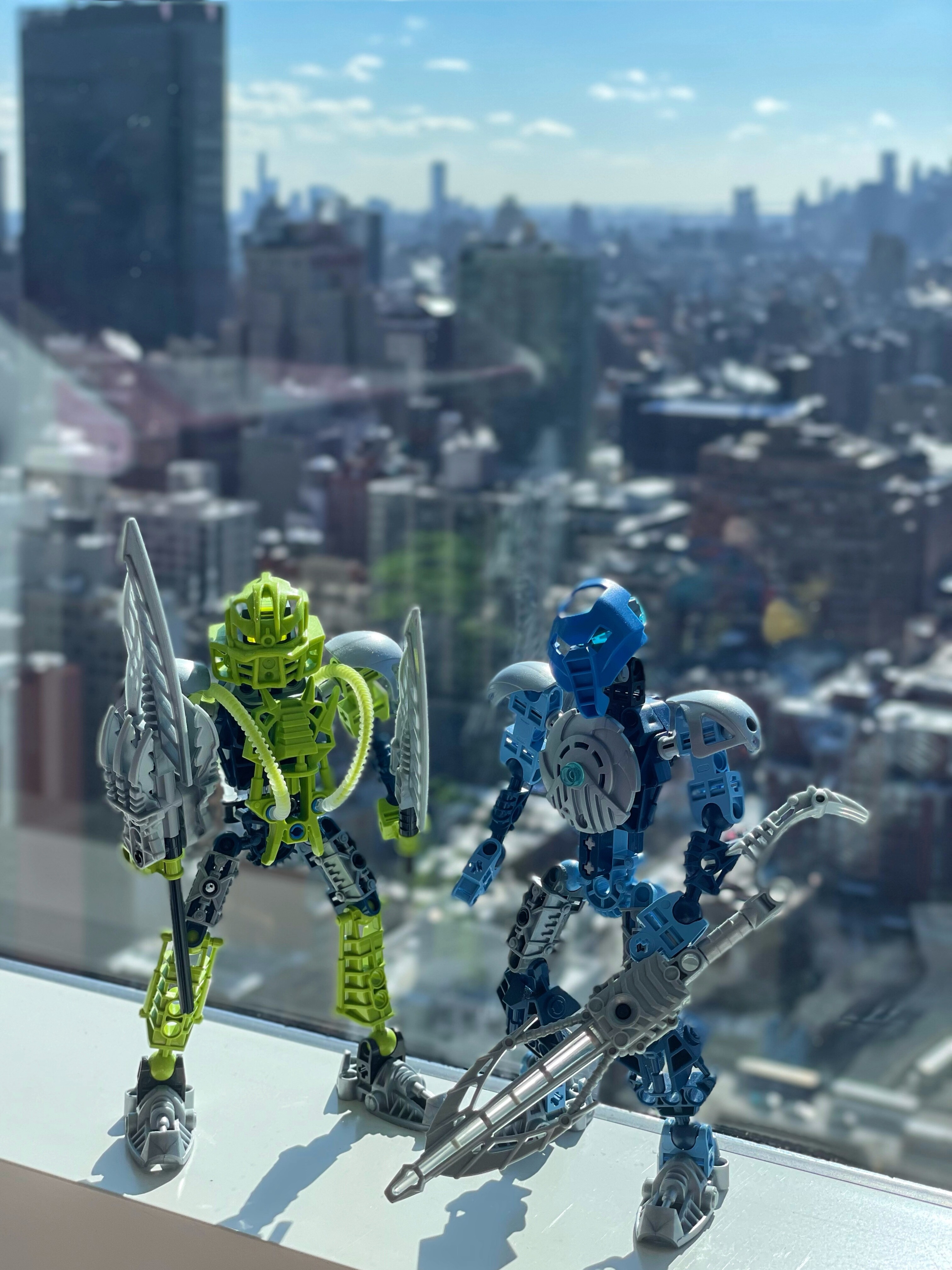
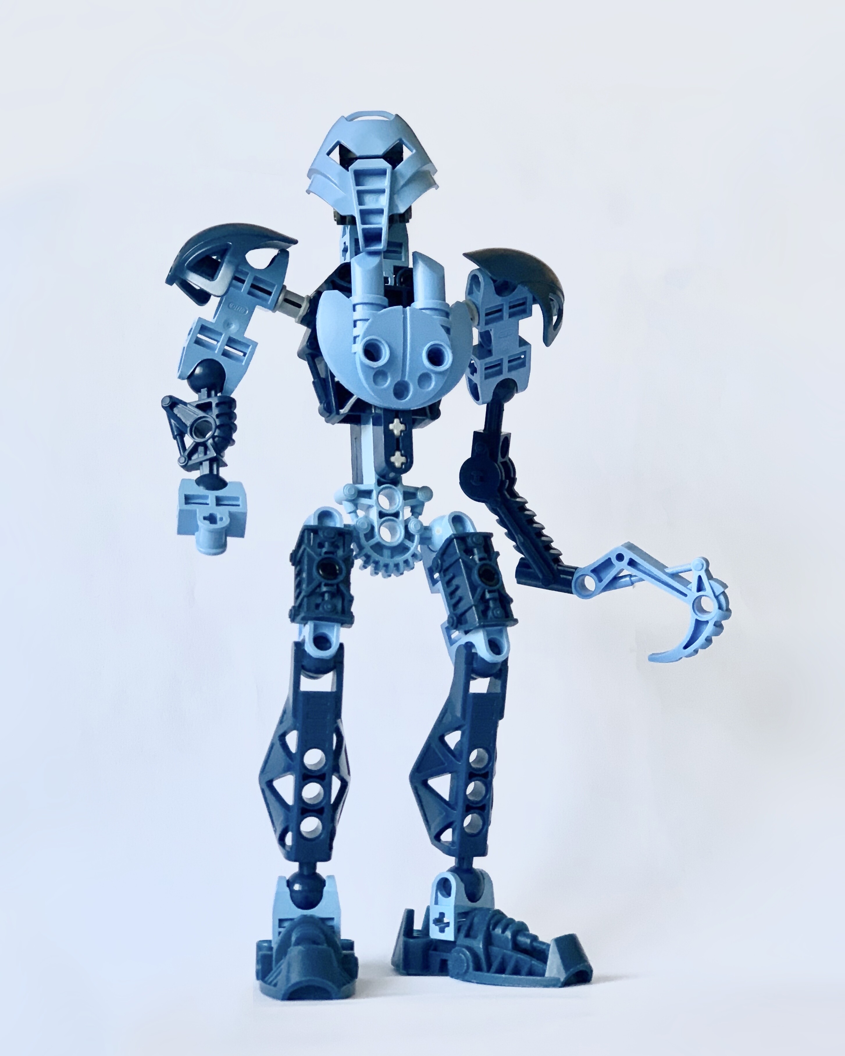
This looks pretty good. I really like how the two different shades of blue go together.
1 Like
Awesome
2 Likes
I like the idea of naho being a softer medium blue and a calmer personality in comparison to Tuyet.
3 Likes
I like the color choices, but I kinda wish the chest plate was flipped.
2 Likes
simple but effective
2 Likes
@Enbeanie @lacerta @Rukah @Tarkur @Eilrach Thanks!
@Sargos Yes the medium blue looks better than my anticipation, she looks like a graceful girl
@Rhyla416 Thank you! It is sad that the canon contest is over. I hope we could have some fandom ones in the future. 
@Krelikan sounds like a good idea!
4 Likes