

Can you guys see the pictures? I seldom use forums and I am not sure if I uploaded the pictures in the correct way.
1 Like
OMG! I love this! 
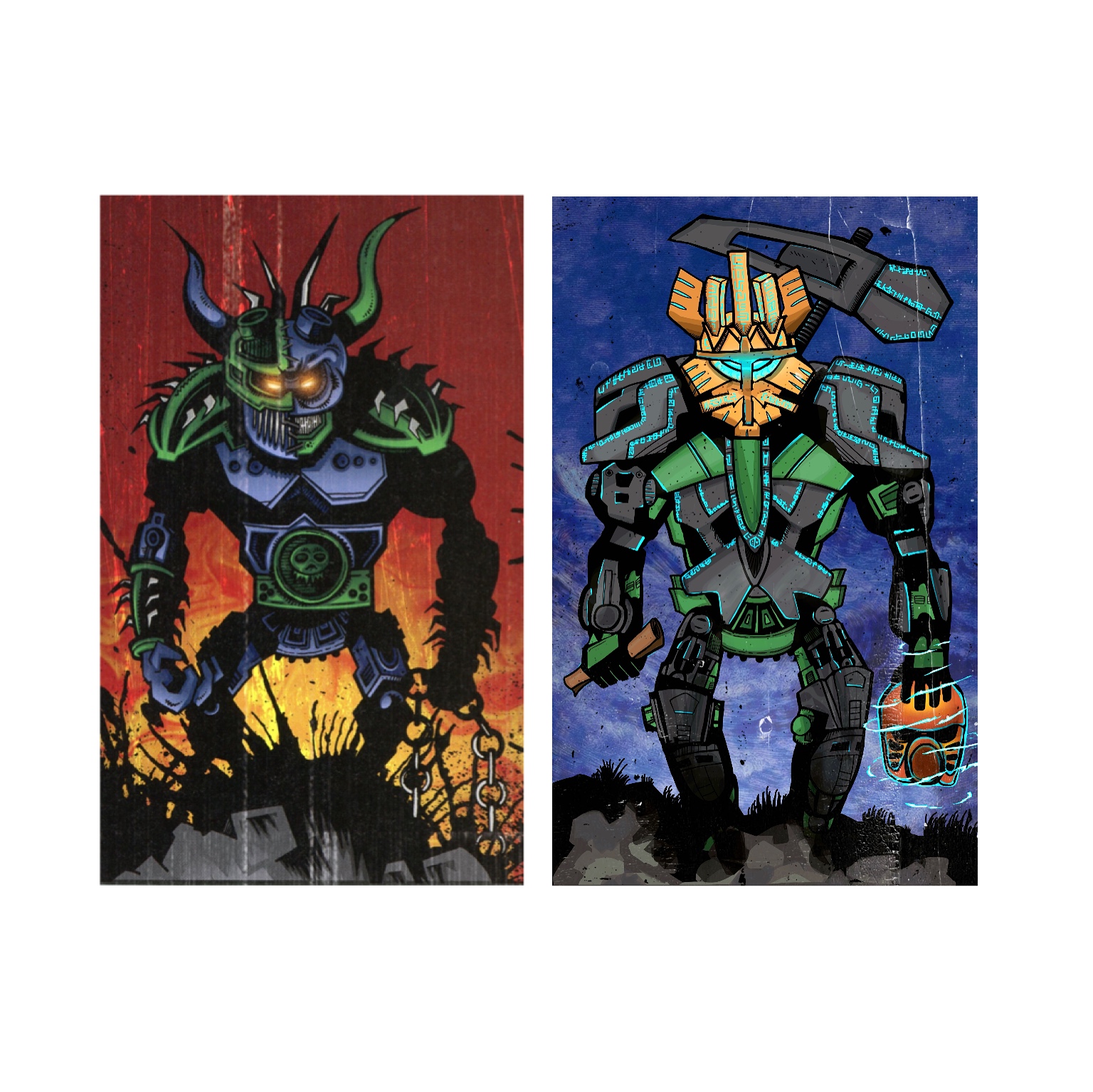
I think the canon karzahni’s art has be drawn in cartoon-style in a bit, and this is very effective for contrast with him!
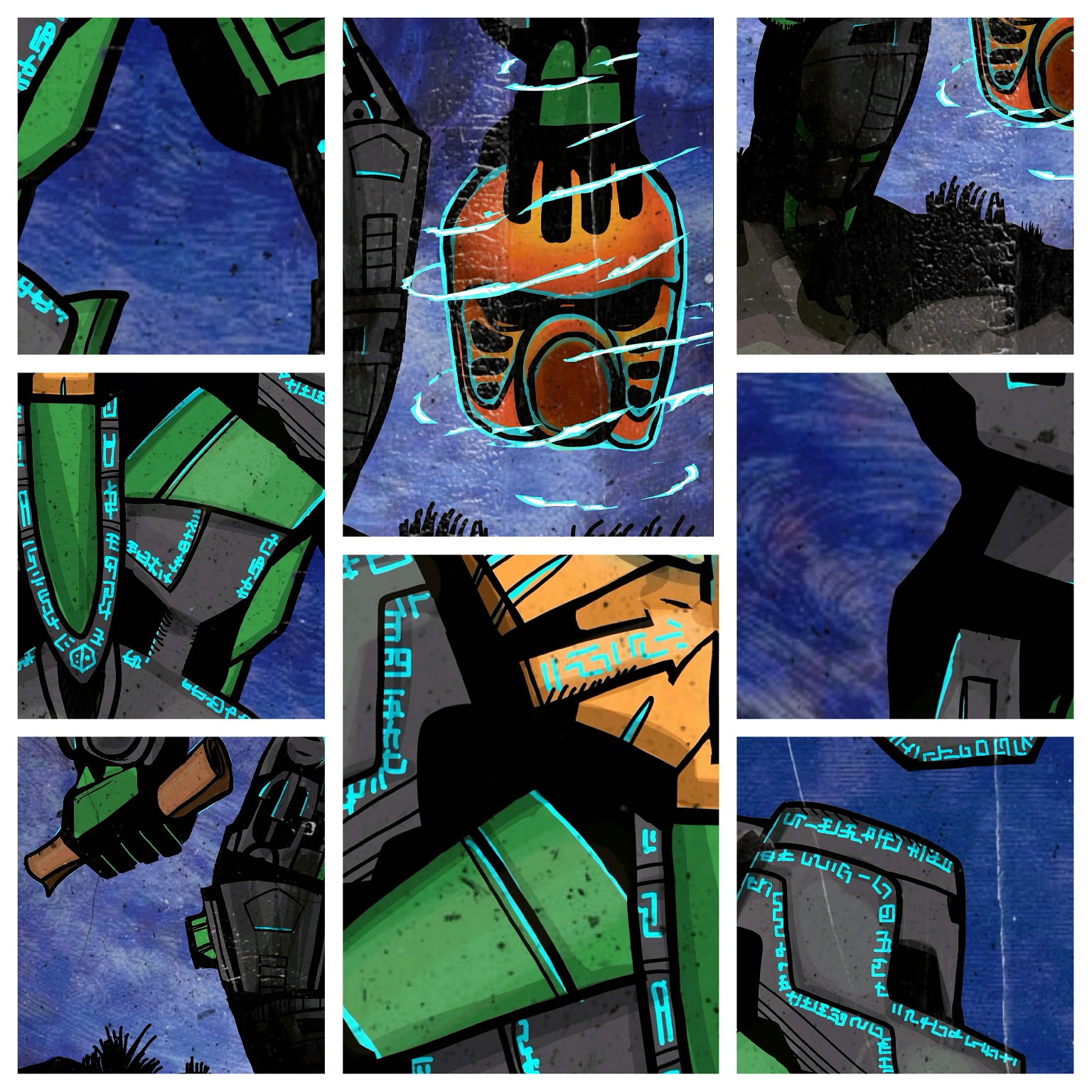
AND the mask design has be so Sophisticated!
4 Likes
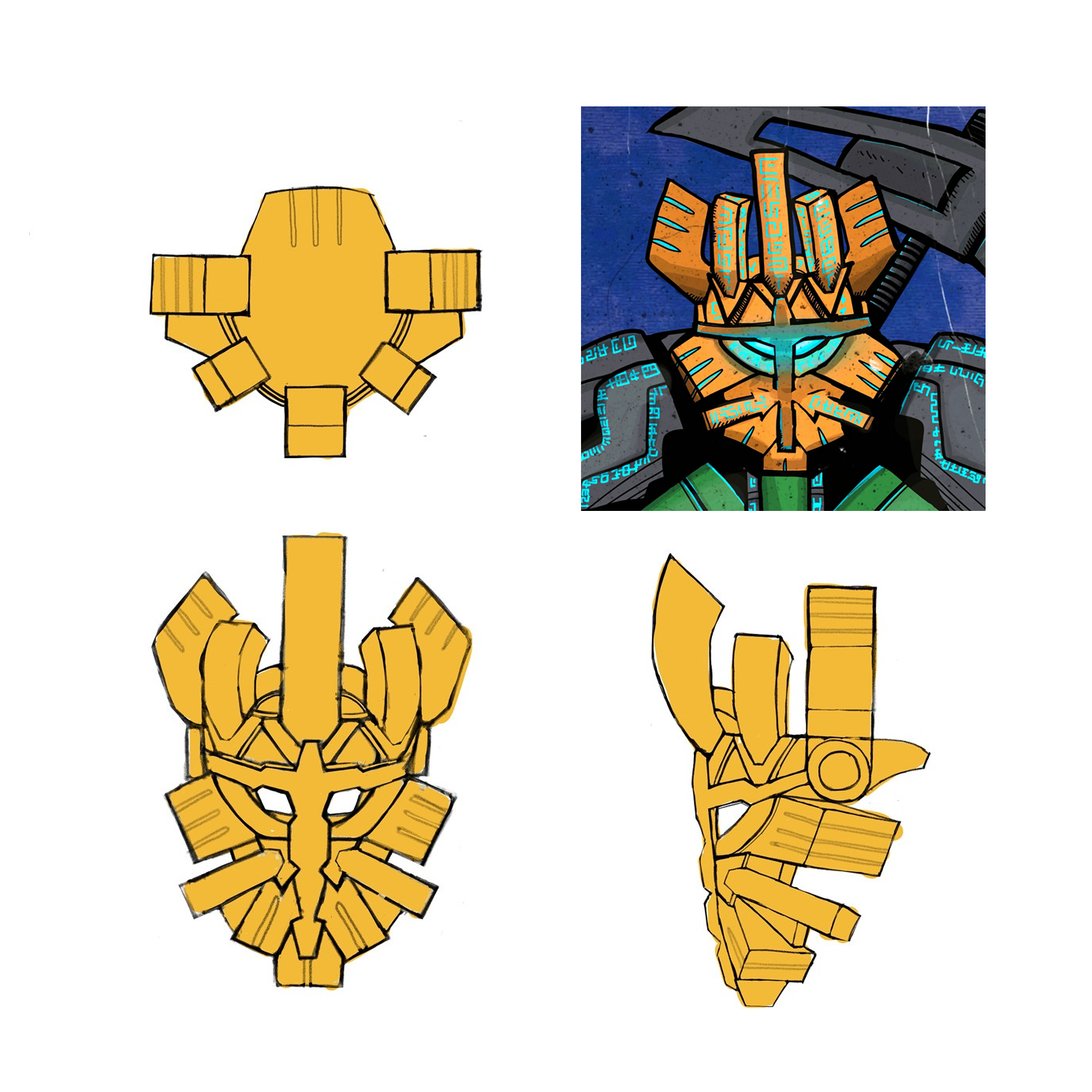
i tried my best to make it the same style of canon Karzahni😀
3 Likes
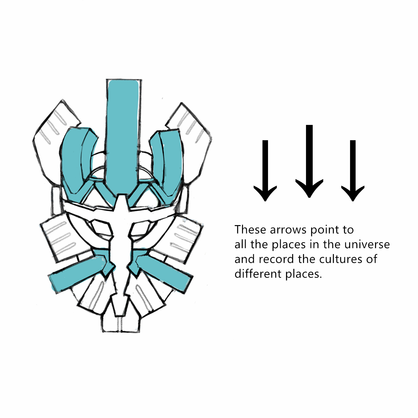
Great. Super. Cool. The style is perfect. The ideas with arrows and Mata Nui in different pose on the mask are outstanding and unique. Crown also slightly resembles Olisi’s horns, right? Maybe more bluish (like on Karzahni) color of armor would be slightly better. For now, that’s my favorite.
2 Likes
good job!
Those runes look kinda familiar… Anyway amazing work, it really resembles the moc and karzahni well. I love it
1 Like
Wow. Neat idea in how you include Mata Nui in the mask. Great work.
2 Likes
This entry is fantastic! Your design process for the mask is really cool, and I think the finished product speaks for itself. Your stylization also makes an obvious callback to the Karzahni art, and since the two are depicted even in the same pose, it lends to the idea that perhaps the two brothers were depicted the same way to highlight their opposite nature. The only thing I don’t love is Artakha’s gorilla-like proportions, but given the stylization and the fact that you’ve deliberately matched him to Karzahni’s portrait, perhaps that’s excusable.
5 Likes
Well this look cool and a nice mirror to the official Karzahni artwork, nice job good sir.
2 Likes
If I could make a bit of a suggestion for Artakha’s art piece. It feels like he’s more of a menace like his brother with the red/yellow colors behind him. Maybe change the background color to a more blue/ color to change the tone of the image itself?
The image itself is fine but some people may think that it’s too close to Karzahni’s art. Just don’t want you to seem like you’re coping the image, is all. Because it’s very nicely done along with that to match with Karzahni.
2 Likes
While I appreciate your effort to make this drawing similar to Karzahni’s official artwork, I feel like it ended up being too similar. It looks more like an edit of that artwork rather than its own thing. I would at least change the background. But oh well, it’s too late for that I guess.
2 Likes
Great job! I enjoy how you made the art mimic Karzahni’s canon art, although the legs look a smidge too short. I really appreciate the thought and effort put into the mask, the arrows and GSR added onto the face!
2 Likes
art is great, made me laugh my ■■■ off when i first saw it
but i have a few issues with it
the hand holding the mask looks incredibly awkward
the arm on the left side of the art is twisted 90 degrees
and the mask is another one of those awkward “not G2” masks
1 Like
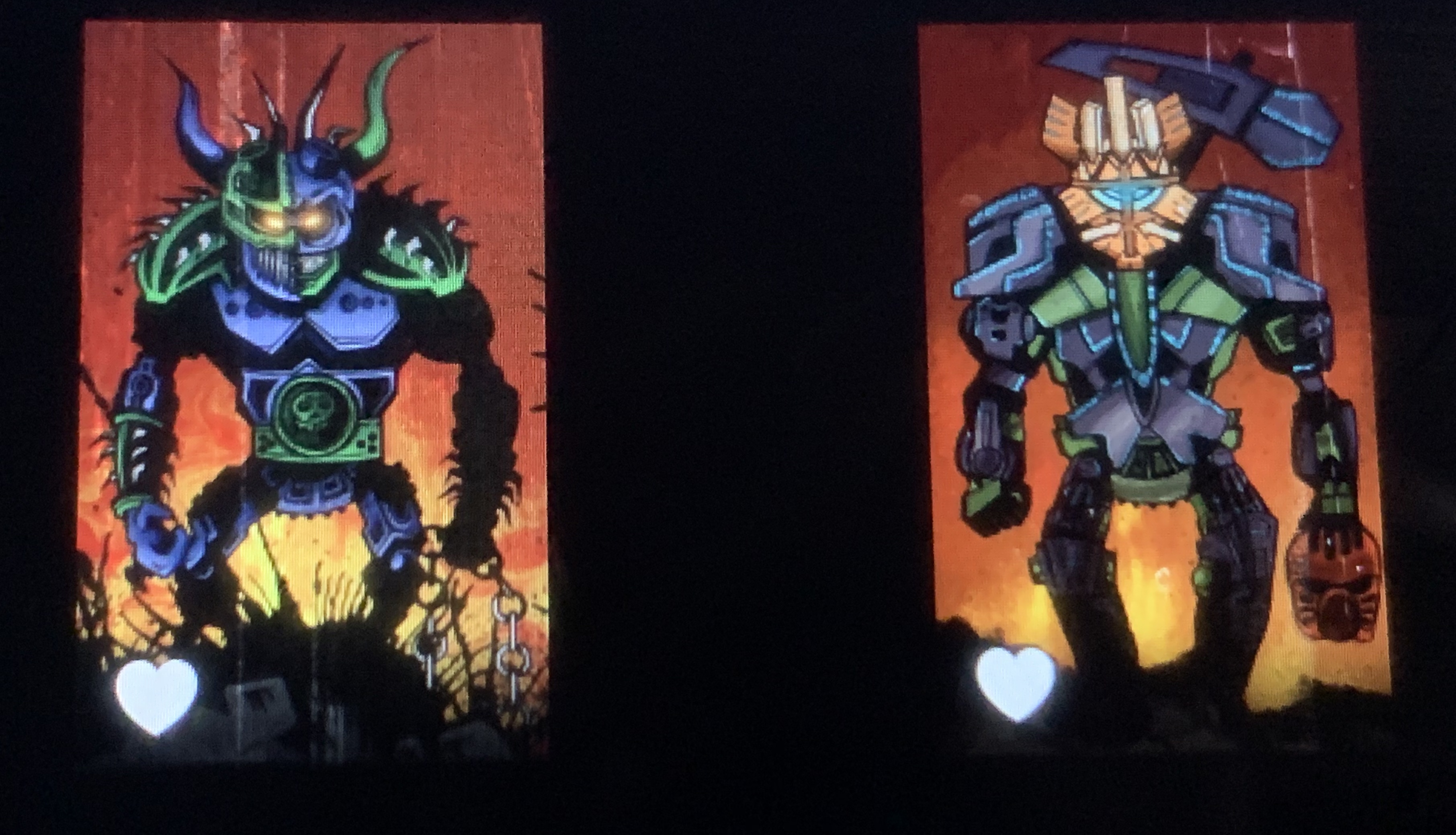
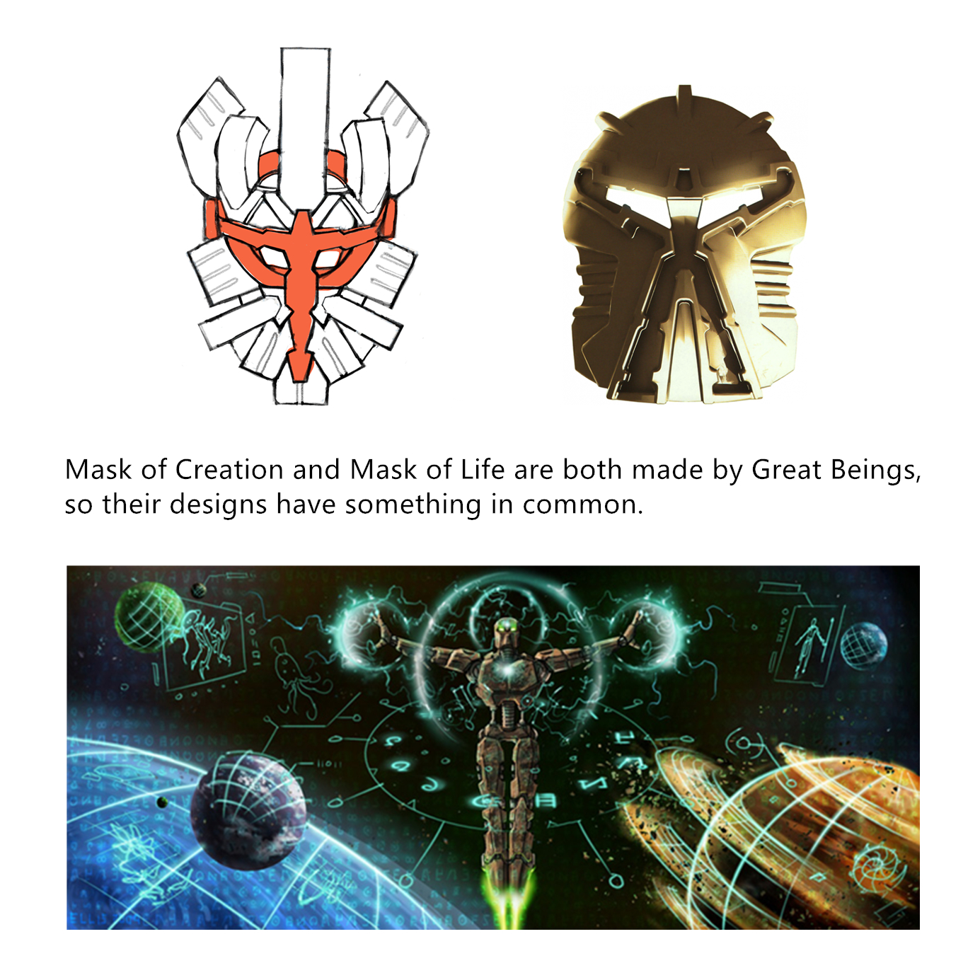
In fact, I have tried many colors of background, such as purple, blue, yellow, etc. (these are the colors used in the official illustrations), but in the end I chose crimson, for the following reasons
First of all, I feel like that the darker background color can better set off the characters, (if I draw something like architecture, I might consider using a light background)
In addition deep red gives people a sense of long history like ancient portraiture. If you use a lighter color, it will look too lively and not serious enough.
I found that the red background is immediately reminiscent of the portrait of karzahni, and that’s also what I considered about when I designed artakha’s pose, and if we used other colors, our brains wouldn’t make a connection between the two pictures so quickly, and after I finished this painting, I put the two pictures together and showed them to a friend who didn’t know bionicle, and she knew almost immediately that there was a connection between them, and that’s what I wanted.
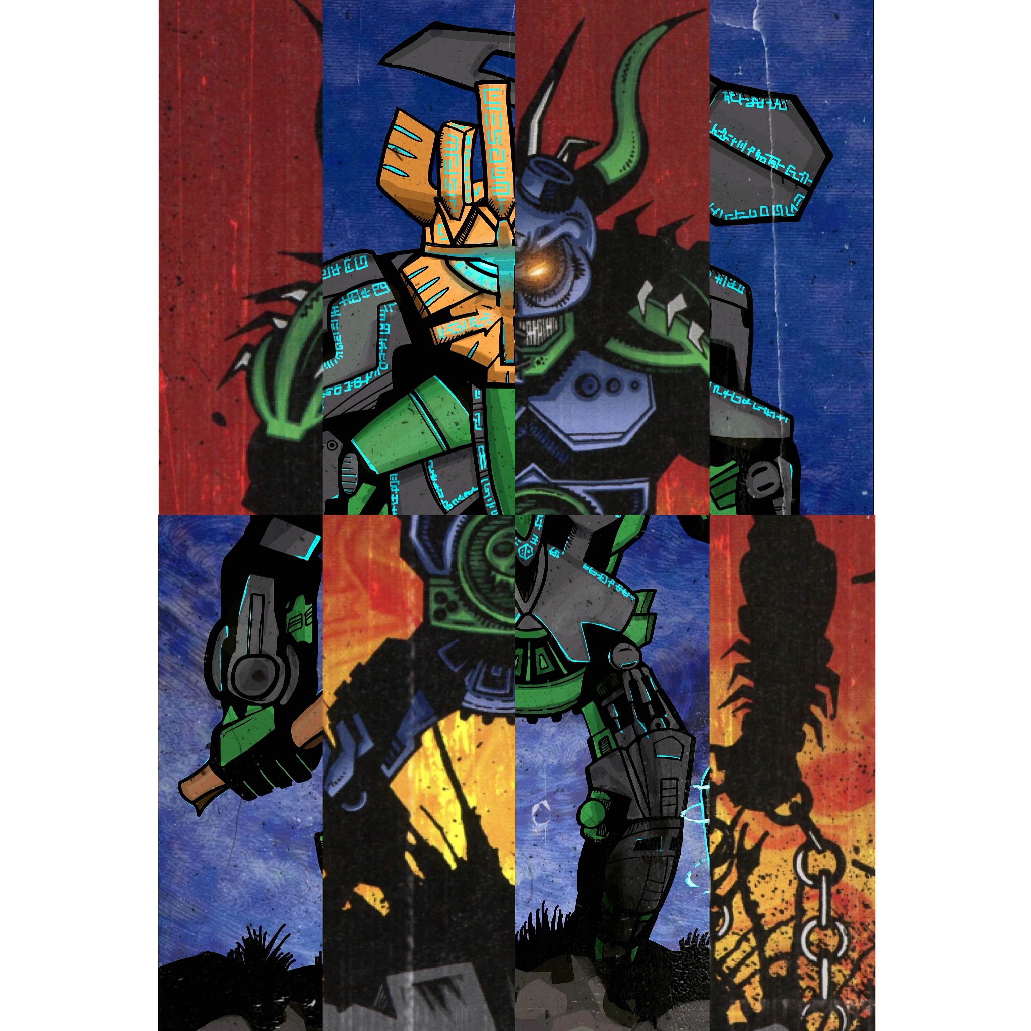
The second thing I want to talk about is the comparison of these two paintings, and I’m sure you’ve noticed that.  For me, artakha and karzahnk are like yang and yin, and they’re originally of the same origin, but they end up going in the opposite direction, so at first glance, they’re so similar, but every detail is completely opposite. for example, karzahni holds a chain in his hand to symbolize that he is a slave owner, while his brother holds his own creation.
In my opinion, the bright color of karzahni is like the warning color of a viper, indicating that he is completely crazy and extremely dangerous, while artakha, is a rational, just, neat knight in clean armor. He should be steady, low-key and humble.
There are still a lot of comparisons like this. I’m waiting for you to find out one by one. whats more, if you know East Asian languages, you may be able to find something interesting in the runes on artakha.
When I first drew this picture, I used a brighter color, but I soon realized that it wasn’t serious enough and that the green became too lime and didn’t fully meet the requirements of the competition. It could be controversial. (I’m super afraid of being DQ.) Too bright colors also make people ignore the mask, which I think is the soul of my design.
About art style, although the current style is more like comics, I personally think that since artakha and karzahni are both mythological characters, matoran should only paint their portraits based on rumors, so the style should be a little weird. I deliberately omitted some details to keep the two paintings in the same style.
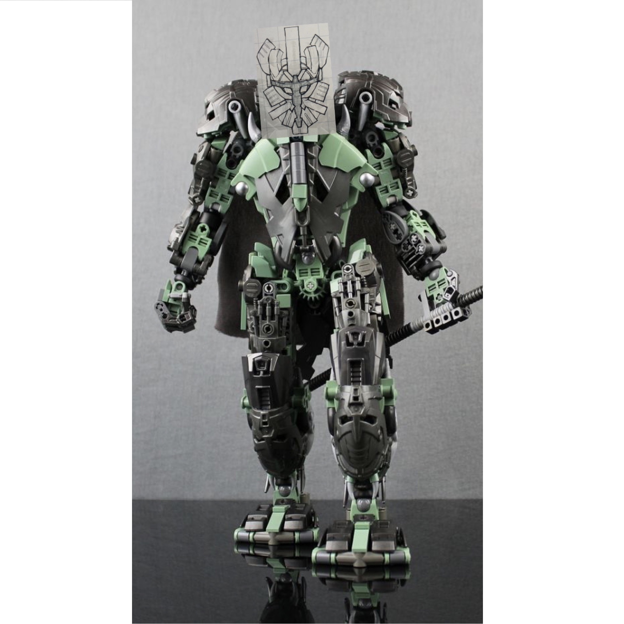
I am also very happy to see that you all like the design of the mask! as a bionicle collector, I want this mask to be closer to G1 legendary masks in style, and if it is actually produced, it should match well with the moc.
thanks to all of you!
4 Likes
I like the armor of the arms so I draw him in a strange pose then we can see the armor on the outside of the arm. that is weird but the art style is a little bit weird too
Frankly, I wouldn’t want this entry to win, but it is already one of the most remarkable on the contest.
3 Likes
Don’t worry, there are still more than ten days to go before the end of the contest. The best works will probably be released at the end.
It is very well done, but I think making it like the Bionicle: the World illustration works against it in this case.
I feel like a less reductionist style would fit Artakha better.
1 Like
I see some Arabic and Chinese numerals, 123456789 一二三四五六七八九十
2 Likes