I still don’t get why, it looks so boring in comparison to blue Pouks
Probably because metallic blue is hecka scarce and harder to paint
The reason I like it isn’t because I want gunmetal Kualus, but because I don’t want blue Kualus.
Another reason is purism; it terms of existing official parts, it’s way easier to turn the winning Kualus gunmetal than to turn the winning Pouks blue.
But, ignoring all that, blue Pouks does look pretty good:
Larry David.gif intensifies
Personal opinions of the MOCs aside, a big congratulations to the winners. It was a long time coming, which nobody, mods, participants, and voters all included, didn’t want. Hopefully the Art Portion goes a bit smoother, unforeseeable real life events permitting. Good luck to those contestants, and another congratulations to the winners.
Definitely going to reread Dwells in Darkness soon now that we have these MOCs.
That’s definitely a question for BS01. Obviously the shaping is intended to be it, but because it’s a fan fiction piece, and there’s nothing in the text saying Bomonga wears a Faxon-variant-shaped version of the Mask of Growth, there’s not a clear prerogative for them to do so. If you don’t mind me getting (further) into speculation territory, I think if it was solely up to Swert it’d be a “Yes,” or if it was solely up to Dorek it’d be a “No.” But because it’s up to both of them, and whoever else is considered senior enough to meaningfully weigh in… I don’t know. I can see it going either way.
I definitely agree with this. Blue metallic armor looks far more precious than just gunmetal.
Honestly, over the past couple days I’ve grown fond of the idea of Kualus and Pouks being blue. I’m kinda hoping at least one art entry has them with blue armor. Although I’m definitely expecting many of the entries to have the metallics distributed 3-3, which I’m also fine with.
I’m not sure about the second half of the question (it’d probably be a case-by-case basis), but for the first half, I unfortunately don’t think so. Per the rules:
I assume therefore that use of the actual Faxon wouldn’t be allowed.
I was considering something like this as well, that the MOC we have now is him partially gigantamaxed. Glad I’m not the only one thinking it. I’m definitely going to prioritize art that abstracts the pieces enough where it’s ambiguous, and that presents Bomonga as his giant form.
Wait until they’re all sold out in a couple days ![]()
![]()
Listed under things I did not expect to read in this topic…
I was thinking the same thing. Has the center crest, and a similar rounded shape. Even the mouths are both greebled.
I mean, to be fair, hardly any of the entries included the ripcord (certainly none of the winning entries did), but people are still going to be adding that to these winners. I have other reasons I dislike it, but the rhotuka function isn’t one of them.
I swear he has blackmail material on them or something, I don’t know how this and his Artakha were even allowed in the first place, but what do I know
I do love that noble Kadin design…
Bomonga in the LDD mockup looks so much less extreme size wise than I was expecting. I think most of that came from Double’s superb posing in the photo entries.
As for the color debate, I was personally on team “each Hagah Unique” as I felt it being metal tones was enough cohesion. That said if I had to pick between a 2-2-2 split and a 3-3 split, I will do the 2-2-2 split any day of the week. I really don’t want to see gold on either Pouks of Kualus.
Congratulations to Underscored, Sub, doni, and Kodiak!
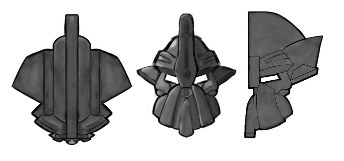
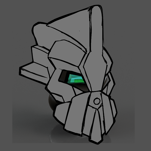
I’m personally pleased with Gaaki and Pouks’ designs, however I must admit that I am a little bummed about Kaulus and Bomonga. I say this with the best respect to Sub and Underscored, and am no way trying to put them down, but the reason why I am a little disappointed is rather simply due to the fact that we don’t have the option to come up with different designs for their masks, which weren’t exactly the ones I had previously envisioned.
Although with that being said this turned out a lot better than I thought it would. At the end of the day I’m fine with these designs, as well as the fact that this could’ve been a lot worse then what it ended up as.
Well, all four do allow their metallics to be changed, so it’s not necessarily over for the 1-1-1-1-1-1 gang yet.
Okay, out of the finalists, these four were the exact ones I wanted to win. Neat.
Also, I know Galva isn’t a fan of Gaaki’s mask anymore, but I for one think it’s gorgeous.
Thanks. Painting all on one layer isn’t something I’m experienced in but I’m glad with how this turned out. Here’s more photos if you’d like.
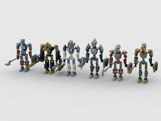
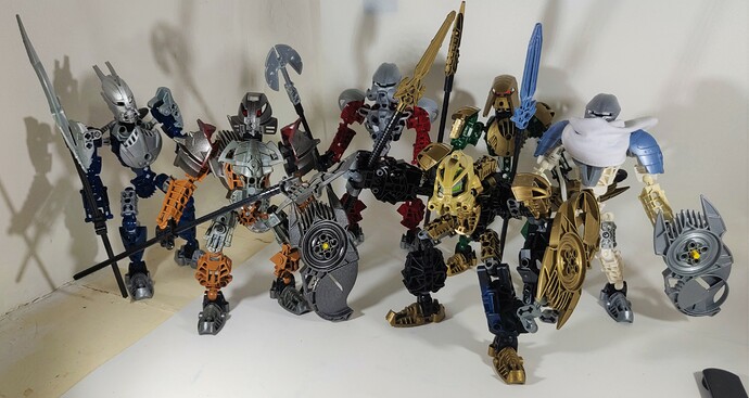
Custom masks notwithstanding, I’ve manage to put together a fairly accurate rendition of the team tonight:
They fit oddly well together
Looks pretty good, it’s better than I thought.
We want them to be held, displayed, and posed in the same stature as Norik and Iruini. That’s the whole point behind the stipulation. I get that it doesn’t make sense to some of you, but there’s a precedent set for how the Toa in G1 wield shields and we want to follow it.
Keep in mind: there’s nothing stopping you from including alternative storage methods, action shots, slamming the shield down, etc. or whatever you want as alternative photos in your MoC topic. We love seeing cool stuff, and it could help sell your creation and show it off. Your entry photo, though, has to have the shield be held in the hand or stored on the back.
They connect to the hand via the thick throwbot foot, does that not count as being in the hand?
Unfortunately not. It’s the same way as wearing a watch on your wrist and having free movement in your fingers doesn’t count as the watch being in your hand. The fact that we can see their fingers automatically makes it a no-go. The type of connection we’re looking for is in keeping with Norik and Iruini and how they hold their shields; at least, for the entry photo.
Toa Hagah Canon Contest Ruleset Feedback - #437 by Mesonak
![]()
…Heeeeey, this is a good point. Is Double’s invalidated? That piece can’t be both the hand and the forearm. @Eljay @Mesonak
You think that they may have noticed by now if that was the case
Honestly, seeing this, I think I do like blue Pouks.
Maybe, but those spiked shoulder armor and metru foot in gunmetal are pretty hard to find.
Remember, everyone
Draw Blouks instead of Pouks
It’s fixed in Double’s topic
Um, no it isn’t.
The main picture on Double’s topic still has the shield on the back of his hand. It always has.
Let me jot down my thoughts one at a time.
First of all, I’m really glad that this Bomonga ended up being the winner. This one had been my favorite since the beginning and its anchor arms bring a unique flare that none of the others really have.
Like I said before, I personally wasn’t all that thrilled with the Kualuses that made it to round 3, but I’m fine with the one that ultimately won out if only bc it has a cool scarf that I think really works for an ice character like him.
Gaaki had the opposite problem in that all of them that made it to round 3 were fantastic and I didn’t know who to vote for. I really would’ve been satisfied with any of them.
As for Pouks… oh Pouks, look how the mighty have fallen. First you could’ve been pink, then blue, but the winning entry is grey (before the art potentially changes that). Besides that, I actually really like this one.


