So I got bored and made some sprites based off of characters in The Book Of Ramblings because I’m too lazy to draw actual art
Each sprite is limited to the 8x8 sprite format of the NES which restricted only four colors present in any 8x8 pixel area, but none of them are designed to actually be good
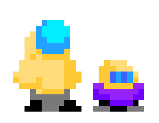
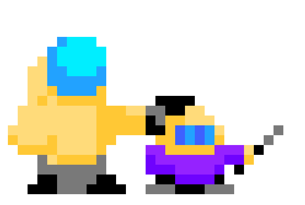
Mr. Monopoly and Cordax
Say “what is the book of ramblings” again! I dare you!
I’ll update this as I make more/if I make more (based on the other books as well)
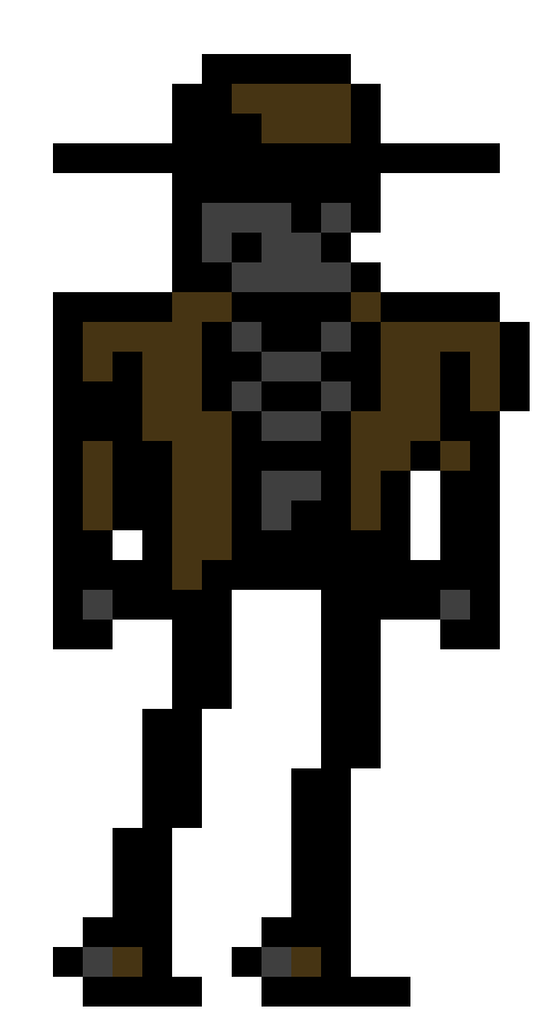
the deadsperado Diero has made his way into pixel form.
Diero’s design in book of dreams/tears/armaghiddon is probably my favorite design out of the whole series, and I don’t feel this does him justice, but with the limitations of the nes I’m having trouble realizing him any more accurately. then again I’m not good whatsoever at spritework, so it can probably be done by someone with actual talent.
I never even realised how much time passed since BoR
I know nothing about pixel art, meaning that I’m more than qualified to give you a critique on this thing
So, I feel like this sprite of Diero is in many ways inferior to those of Mono, Cordax and the Ghiddy individual you made way back then. Firstly, it’s got this weird black outline, that was in no way present in all the other ones (consistency smh smh), which looks kinda janky, but also makes the character’s features hard to discern. I feel like if you were to limit the black colour to the legs, the hollowness inside the ribcage and the eye/nose cavities, leaving everything outlineless, you’d get a much cleaner silhouette with more readable features and quite a bit more space on the character to work with.
The other thing I don’t like is the lack of contrast. Only very dark colours are present here, meaning that there’s nothing for the eye to latch onto, so I’d suggest to add some highlights. The addition of a lighter grey and a lighter brown to some areas would do wonders. I know that you’re limited to only four colours per 8x8 area, but I’m sure that there’s a way to add two more colours to the palette with the reduction of black.
Also, at first I thought that the nose cavity and the other black pixel two pixels apart from it were supposed to be the eyes… now I can’t unsee it…
I think I know the right man for the job
Hint: it’s not me
Hint 2: his name starts with P and ends with akari
The fourth color can’t be transparency because Mega Man’s color palette is four colors and transparency. Which means I could’ve used an additional color the entire time.
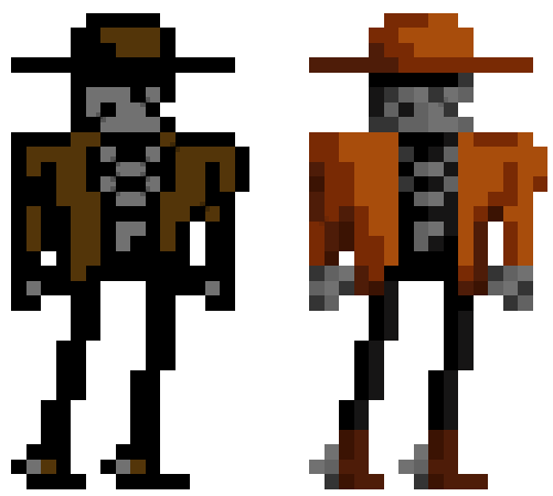
So I took another stab at Monopoly and Cordax:
As well, I duplicated the Diero sprite and gave him a full non-restricted color palette:
yeah, at a width of seven pixels, with the face only being about 5 pixels, there’s no good way to make two glowing eyes that don’t look off. this whole process has given me a lot of respect for the sprite artists during the NES era because without sketching anything out first this is hurting my brain.