Hagah, Avohkii and Ukiyo (BIONICLE Canon Contest #3: Honor Guard, Part 2)

Long time no see my friends! Here is my entry.
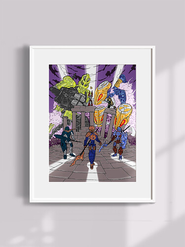
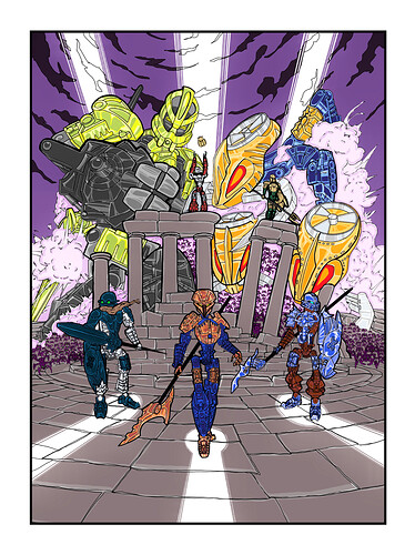
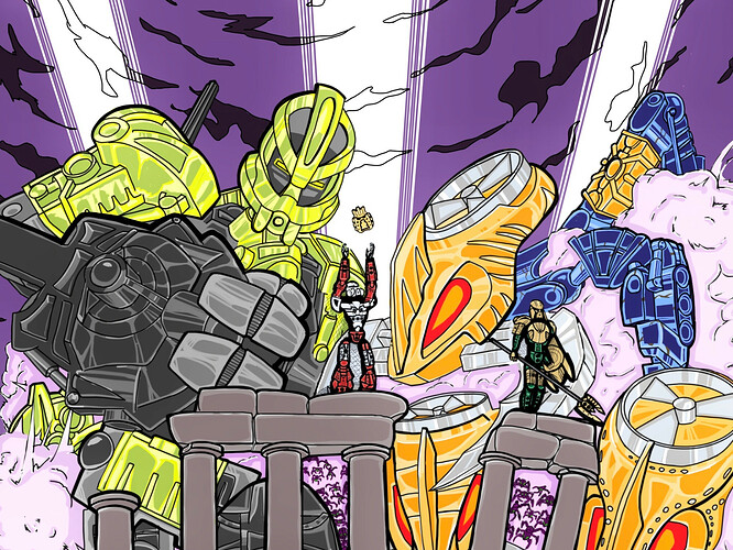
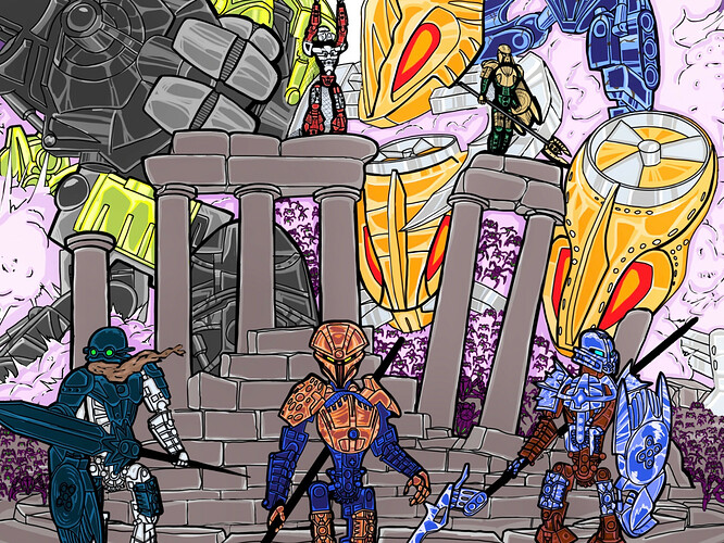
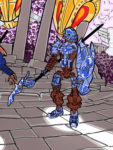
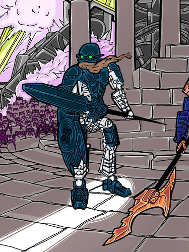
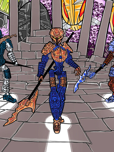
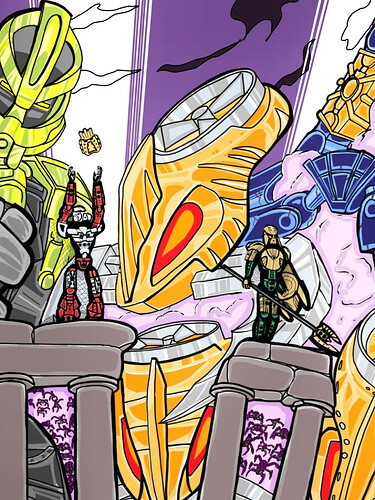
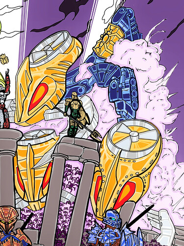
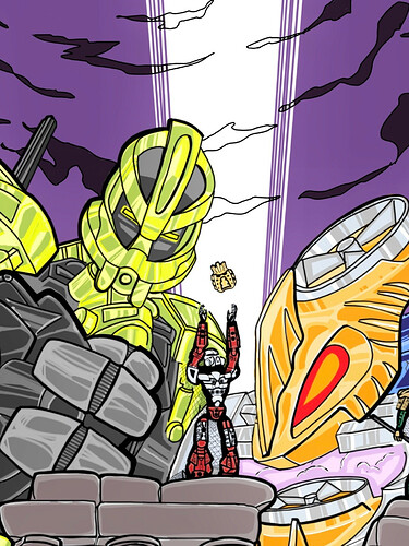
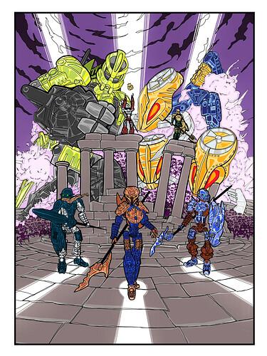
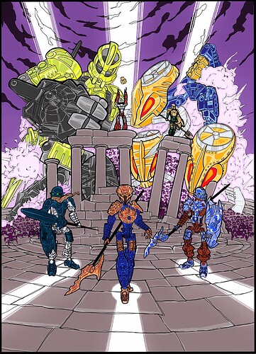
Toa Hagah are on the run with Avohkii. Norik uses the power of mask of light, and tries to summon beams to protect the team from countless Visorak!

highest resolution
I highly recommend you guys to download this and check it on your laptop or iPad, since the picture is very big and may get compressed on browser.


as a decorative painting


with margins


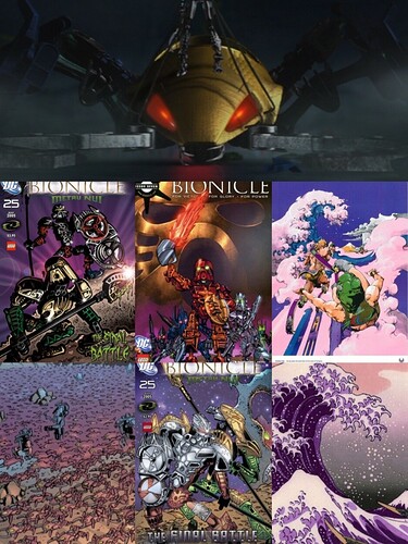
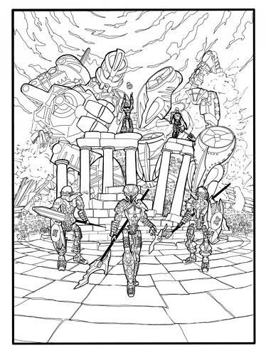
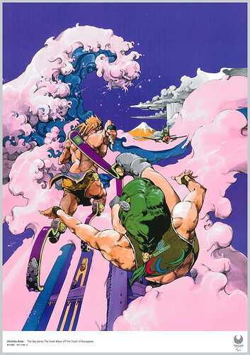
My artwork was inspired by many Ukiyo, posters and comic covers. I used purple and pink as the background colors, and spent a lot of time on the sketch

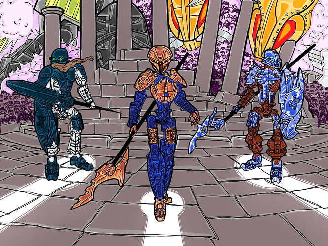
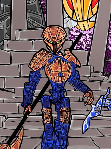
Since toa Hagah are elite ones of their species, I decided not to use the usual 2-2-2 division. Each toa has a precious metallic color of their own. Additionally, I use some unconventional color scheme to show their excellence.


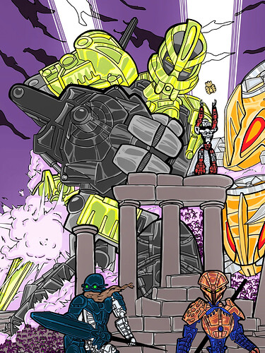
Bomonga has metallic green armor. His ability is very similar to Hulk😂, and green armor and mask may suggest a remembrance of Lesovikk.


I am really into Pouks’s MOC design, which has mask and breastplate with similar radians, and the shoulder armor and spear both have sharp thorns.
In order to make him more perfect, I modified Pouks’s spear that I added two pin holes to the spear piece, just like the rest of his teammates.

As a toa of stone, Pouks’s gunmetal armor is a bit too common, so I used metallic blue, which is a brighter color that contrasts well with his own brown.


Similarly, Kualus already has a very bright white, so I adjusted his armor to gunmetal, like 08 Takanuva.
Coupled with his mask, it makes him look like an mighty ancient warrior.


Gaaki has copper armor. Her mask design is from @Perp3tual . I really love the biological design on her 2007 pieces, so I didn’t change her spear. In my opinion the fin-shaped spear may have come from some ancient creature.


The rest two toa and Kahgarak .

Many other interesting details in this picture, like the remain of a suva and visorak army may need to be zoomed in to see.

I am very grateful to everyone who made suggestions during my production. I couldn’t have done it so quickly without you.

I will keep improving my entry until I am satisfied with it. You are welcomed to make any suggestion. Have fun!
56 Likes

Ooo you went for 1-1-1-1-1-1. Love it.

5 Likes

your style is quite nice though your picture is a bit weird to look at. cant exactly say what might just be me. Not sure how I feel about metallic green for Bomonga especialy with that mask. On the first look I was quite confused by it and thought “Why did he decide to include Lesovikk as the background?” before I realised who its supposed to be

3 Likes

I like the fact that they have different metallic colors despite that I think there should be a 3-3 distribution, nice artwork!

2 Likes

I never thought 1-1-1-1-1-1 would look good, but in artwork form, this is actually quite fantastic.

1 Like

Like it! It’s really bizarre and you captured that Hirohiko Araki feeling really well!

3 Likes

I would’ve kept Kualus and Pouks’ og metallic colors but this slaps. Bomonga fighting the Kahagrak is an excellent touch

5 Likes

Love the 1-1-1-1-1-1 split! I don’t mind gunmetal Kualus or blue Pouks so it’s nice to see them here. Also giant Bomonga is beautiful and more art needs to depict that. Good luck!

1 Like

Yeah, you get points for 6/1 (and bonus for copper gaaki), but why switch Kualus and Pouks’ colors?

1 Like

Overall feeling I’m getting some kind of blurriness. I feel it most in the crop of Iruini

If I download the full-res image and look at it at 36% to 50% zoom(basically looking at top half then bottom half), it feels really nice and I can understand the intent/style they were going for. The amount of detail in this is very impressive

1 Like

Wow I love this I love the green on Boomanga it looks like a comic or manga cover. You’ll definitely have my vote

1 Like

This image looks like a JoJo reference

3 Likes

@JustinArtCheng Thanks! Your entry is awesome! I really like the pose and the mask! The art style is distinctive!

@Rukah @Winger @synonymforexpd @imall543 @Kodiak Thanks a lot! :grinning:

@Voxovan @Voyager One of my inspiration is the Olympic poster painted by Hirohiko Araki. The color and composition are fantastic. I really love it. In addition, he is very good at depicting weird but attractive pose, which is the other thing I learned.

@vootcaboot That is mainly for the balance within the team. If a toa himself is dark, I tend to give him shiny armor, to avoid him being too inconspicuous. If he has light color, like the ko-toa, then give him dark armor so that he does not stand out in the team.

@Invader_Naj Thanks for reminding me!! I re-uploaded the picture, and it should be less blurry now.

@Crunchy Hey Crunchy, you are of the first people I know to create bionicle artworks! I made it as if it’s a poster or a cover, and I did all the things as detailed as I could. I hope people can enjoy every little scene in the poster and analyze the connection between them with great interest.
I know part of the design of this Gakki mask is from your old Helryx art. This mask is my favorite fan-made mask, and I really want it to be canon!

5 Likes

Top 2 at the moment! The color choices are top notch, especially metallic green Bomonga :+1:

1 Like

Thanks bro! The contrast between green Bomonga and purple sky is one of the most satisfying parts for me, I tried all kinds of purple and green then find my favorite couple.

3 Likes

Is this a Tron reference?

6 Likes

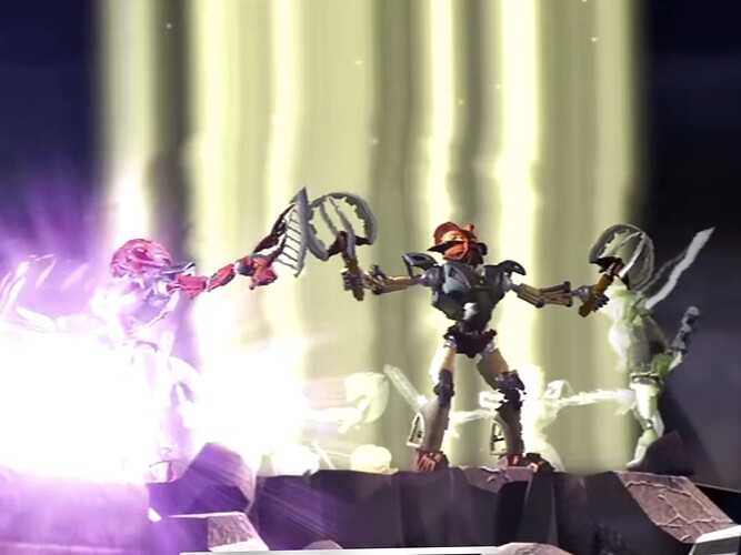
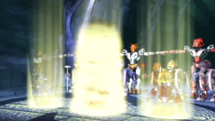
Yes, together with these in movie Mask of Light.

That is what I imagine it looks like when mask of light is activated.

There are still some interesting references from classic movies and anime in my artwork, I am still waiting for someone to find them out. :laughing:

4 Likes

This is beautiful.

1 Like

Hmm, I’m not sure about the green armor on Bomonga. It’s not too shabby, but it looks an awful lot like Lesovikk in the picture. The other three are great, though! I really like the Hagah vs. Visorak scenario, too. Gaaki does feel a little incomplete without her shield, but otherwise she, Pouks, and Kualas look very neat.

1 Like

Sorry for the late reply.
@Cordax Thanks! :smiley:
@MooCowsRock Thanks bro!
You are right that Bomonga looks like Lesovikk in my painting. I believe the distinction between metallic green and lime in toys will be more obvious.
In addition, think of it this way: since toa Hagah’s Kanohi were in the shape of masks worn by past heroes, maybe Bomonga’s mask and appearance are based on Lesovikk, the leader of first toa team.

At first, my Gaaki had a shield in her left hand, but I found it a bit out of balance of composition and blocked pouks’s spear.
A shield on her back is too bulky, because I want her to look elegant and agile.
I also tried a scaled-down shield, and it didn’t work very well.

2 Likes