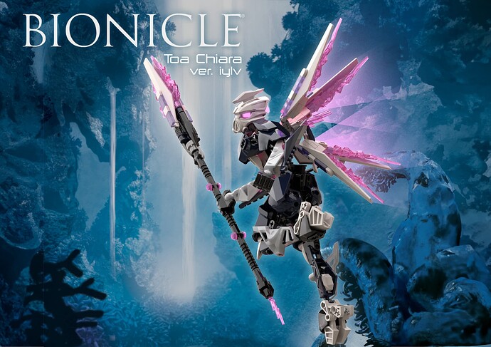
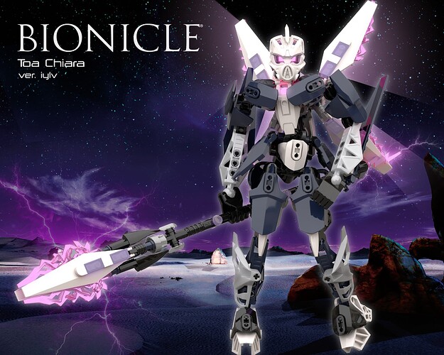
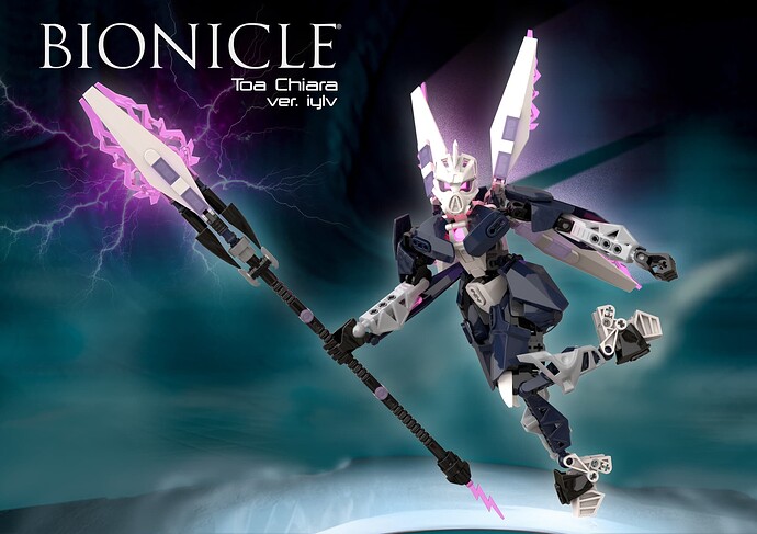
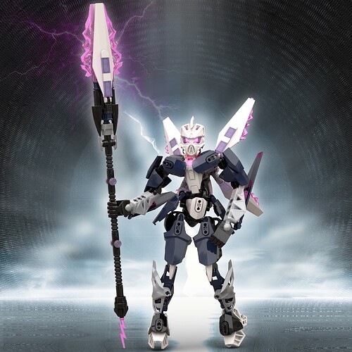
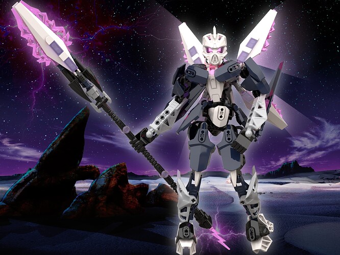
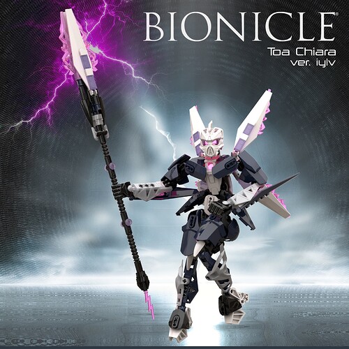
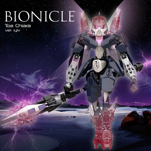
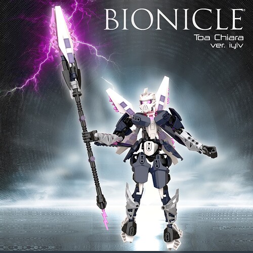
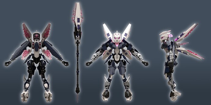
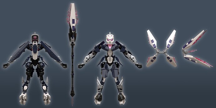
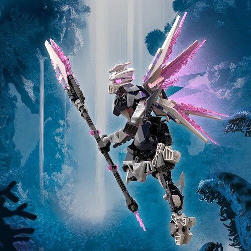
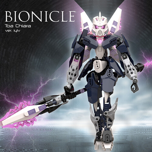
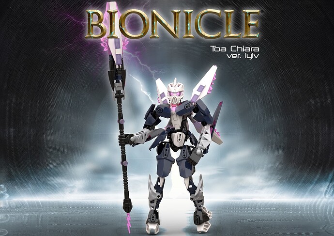
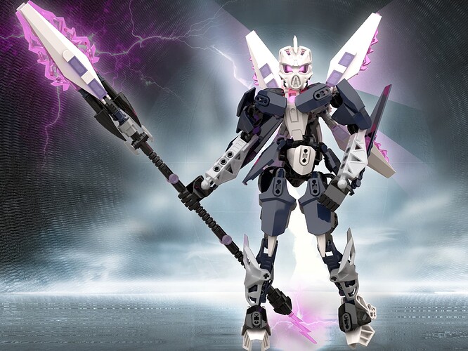
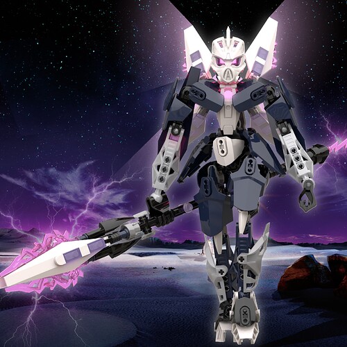
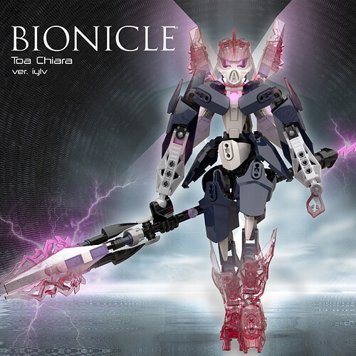
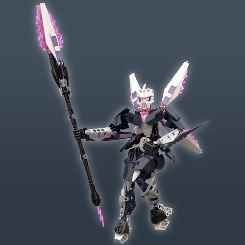
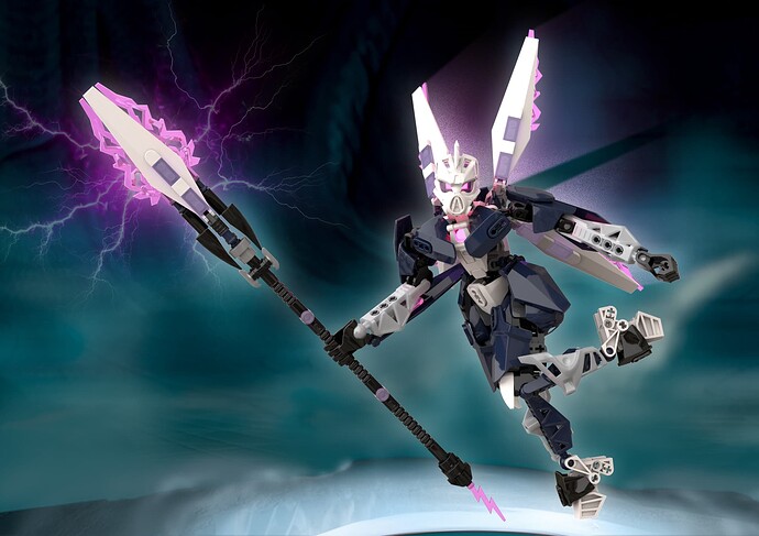
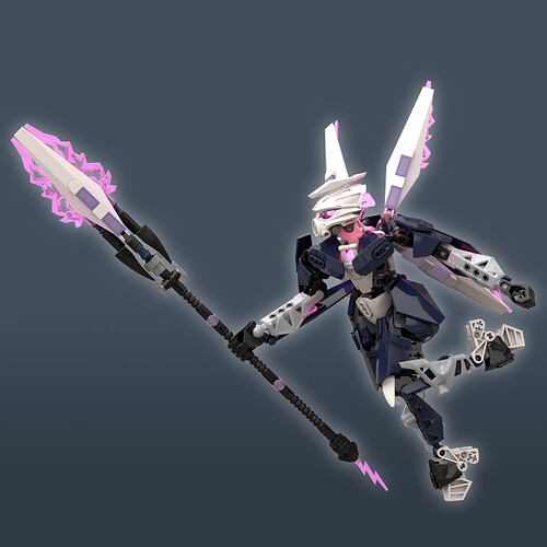
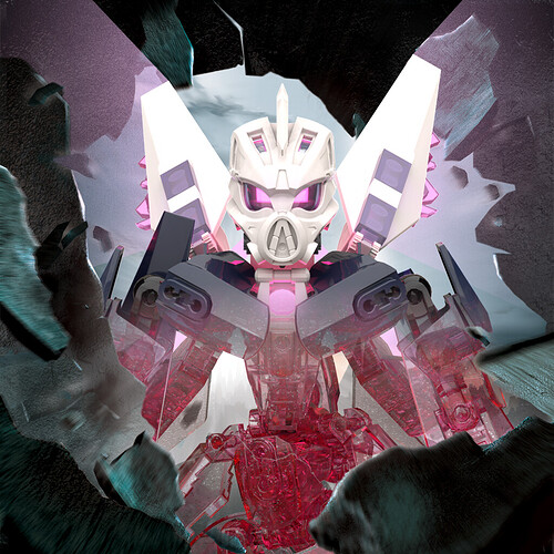
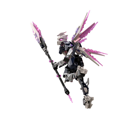
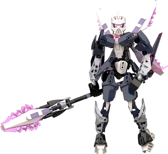
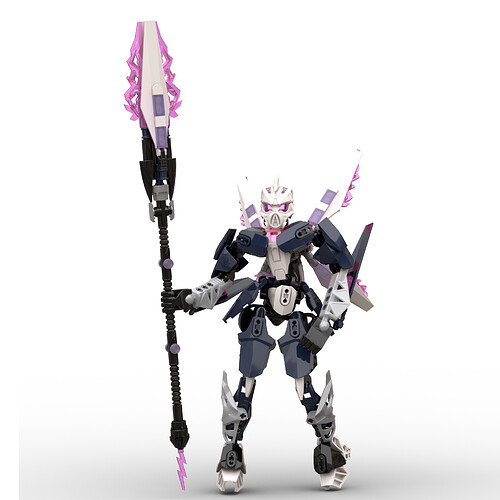
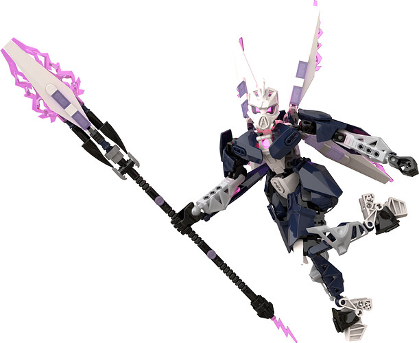
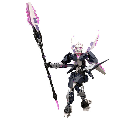
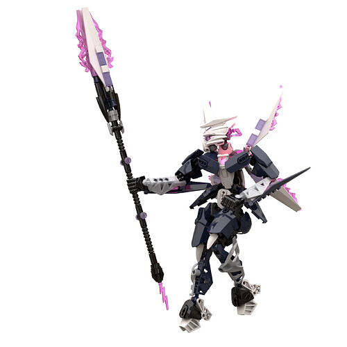
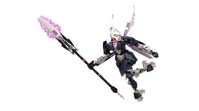
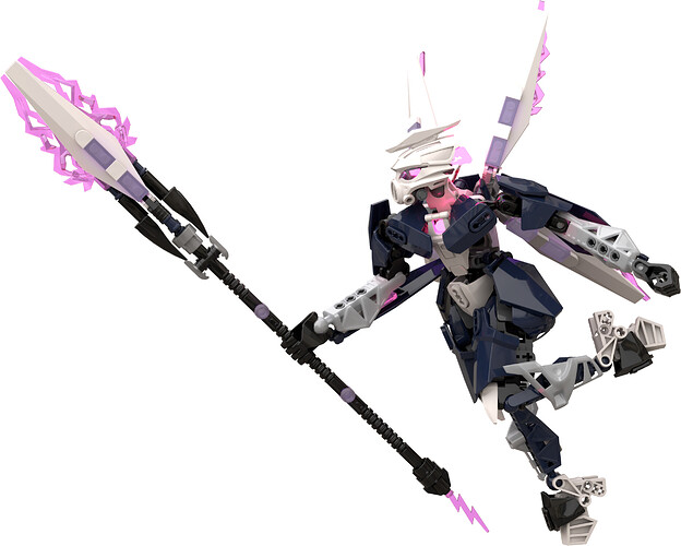
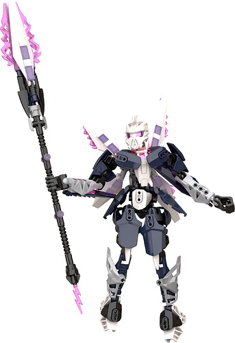
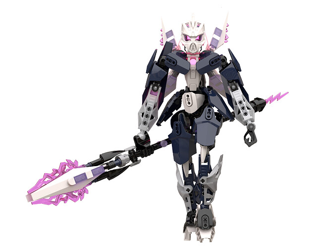
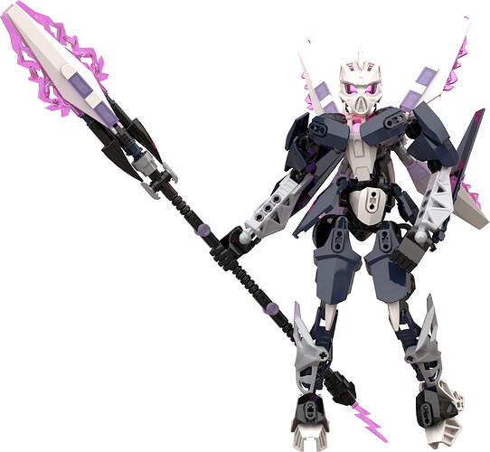
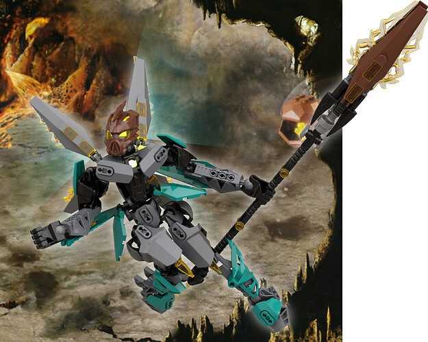
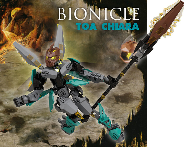
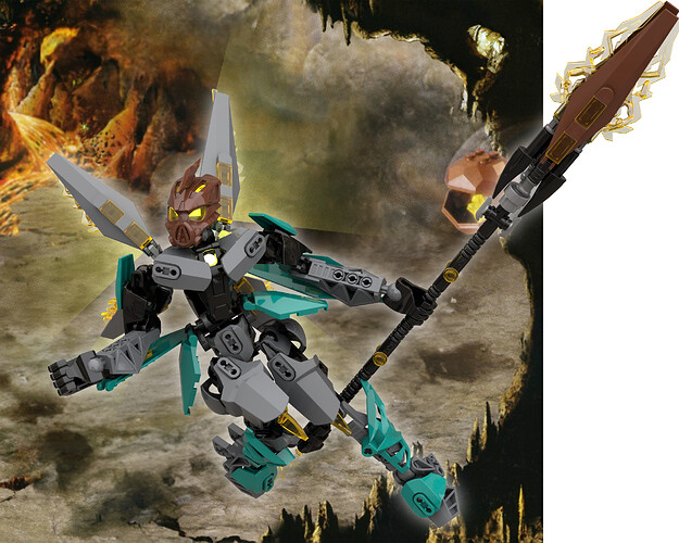
Toa Chiara - Lady Lancer (Fanon Contest Entry)

LOOK UPON MY ENTRY AND DESPAIR

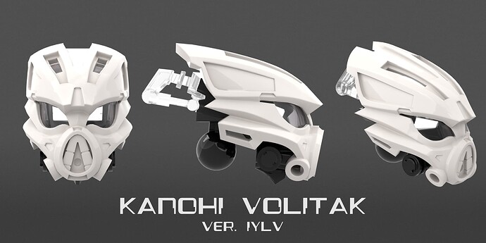
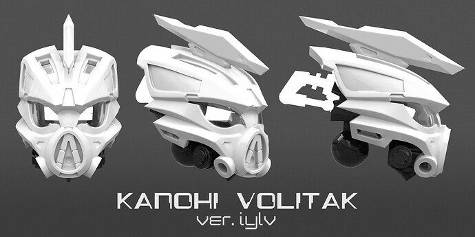
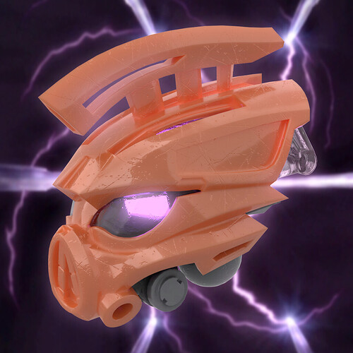
This entry will be both for my MOC & my custom kanohi volitak (relevant links at the bottom of post).

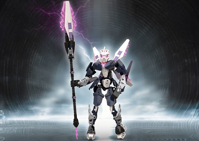
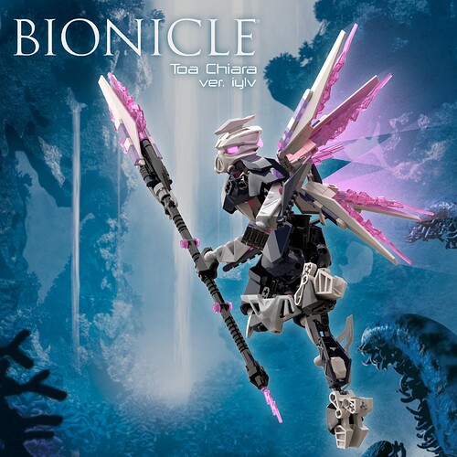
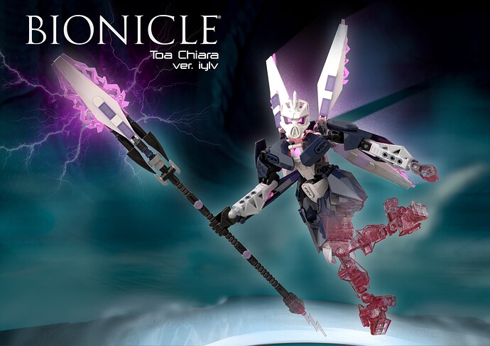
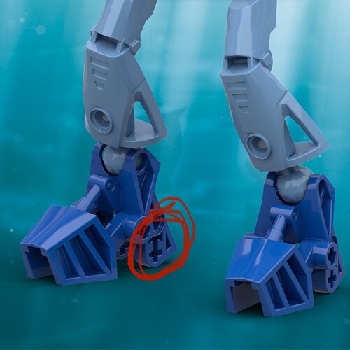
My entry is almost fully legal, and yes that includes colours. The only recolouring you’ll need is her pink eyestalk! Only custom pieces are my custom volitak and an optional variant of the mata foot (you can just use the vanilla mata foot), all modelled by the hardworking @iylv , who is myself, (once again, revelant links at the bottom of the post).

Instructions & stud.io files available with the relevant links at the bottom.

Special thanks to @Minethuselah & @TotalMaddness for helping with the build. Also, special thanks to @Synnova32 for feedback and inspiration (yes, I finally managed to tweak your pelvis design enough it’s not a 1:1). And again, special thanks to @Rothanak & @Pakaru_builds for the feedback.


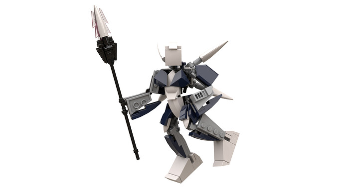
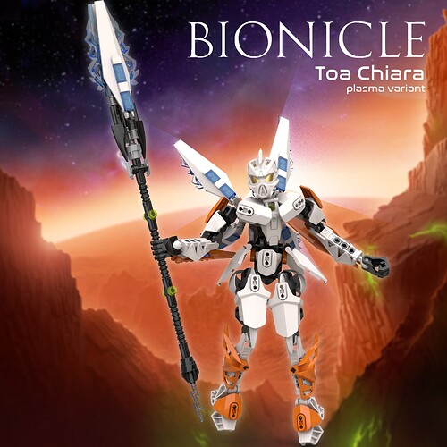
The whole design is just downstream from my custom volitak (link at the bottom). Cause of that, I played around with several variations on her look. First, centurion Chiara (yup, got that variant of a volitak), then a reference to Exo-Force stealth hunter… but the version I finally landed on?

Well kids, it’s time for the big key word for today.
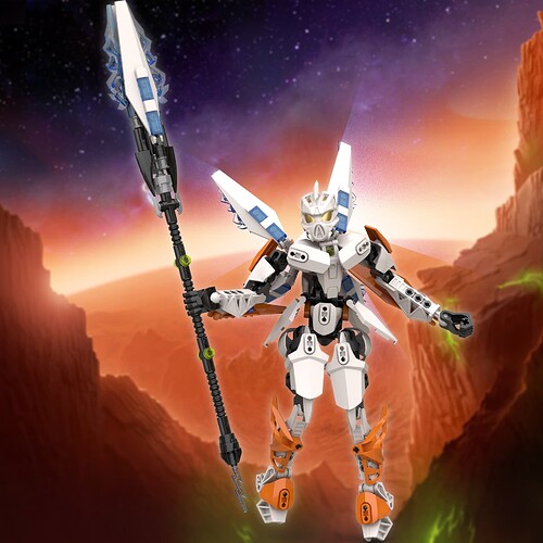
GUNDAM TECH FAIRY


Process is heavily documented here.

Oh, and BTW, if you want to try cen-Chiara-ion, links at the bottom and happy 810 day.

Now for the serious stuff, my lore interpretation of Chiara.

Chiara uses her ion thruster to deliver fast & hard hitting attacks. Combined with her agility, she relies on quick hits and taking down her target before they even begin…

Her ion thruster transforms into her ion spear, leveraging her quick acceleration to pierce enemy armor.


However, lock her in a prolonged battle and her hit and run tactics quickly become futile.

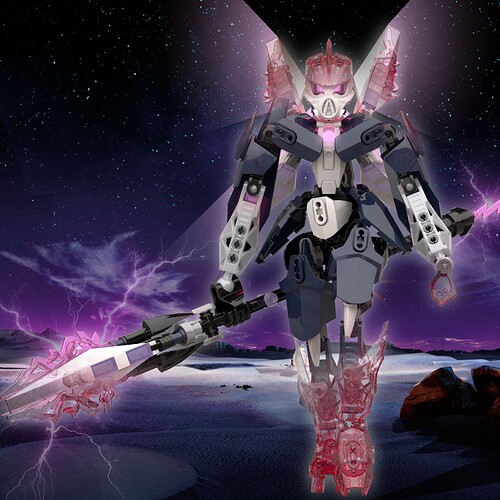
But that’s why she uses her Volitak - it gives her the element of surprise when initiating combat, and creates an escape should the enemy try to lock her in combat.

Speaking of her volitak, you know who modelled this volitak?
ME!
And you could use it too!.. just after I place the other renders, cause I worked hard on them.


Included png versions too!


FAQ:

  • Why digital? - because living abroad & having lego collection don’t exactly go hand in hand. Still made this MOC have 99% legal colours (I’m throwing a bone to the casters who do fancy eyestalk colours).
  • Why does Chiara have a boring hand? - I tried to give her a fancy hand with posable thumbs, but her arms were already long, and that made her misproportioned. So I just swapped it to regular hero factory hands and that save her proportions.
  • Why so much CCBS parts? - 1. because it’s got the elongated hexagon look I need for GUNDAM TECH FAIRY Chiara, & 2. because I’m new to CCBS (I’ve only touched 1 CCBS piece and that was for GWP Pouks), so it’s an excuse to experiment with it.
  • Why is my MOC so similar to Pakaru’s entry? - because I encouraged Pakaru to use my custom kanohi, Pakaru just klept a couple of ideas from my work in progress. I am NOT complaining about this. I borrowed some ideas from Synn myself, with credit of course.
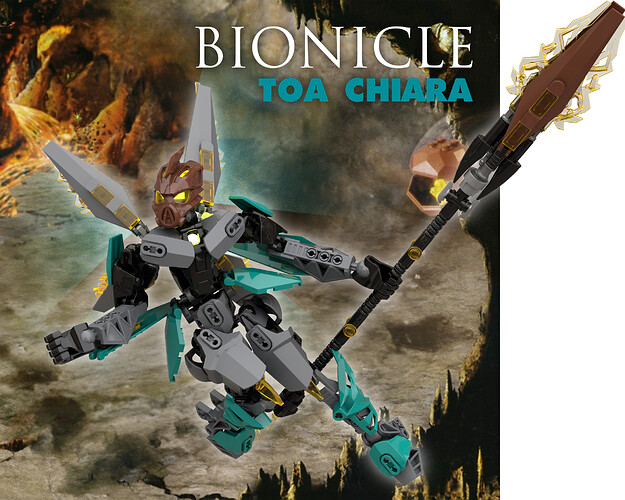
  • Can I use your custom volitak? - yes! But the real question is, will you use my custom volitak?

And now we get to the relevant links, happy 810 day, y’all.

CUSTOM VOLITAK (includes all variants)

CUSTOM VARIANT ON MATA FOOT

INSTRUCTIONS

STUD.IO FILE
Chiara [ver.iylv].io - Google Drive

19 Likes

I really like that mask… gotta convince my brother to let me use his 3D printer so I can get a physical copy xD

I’m glad to have helped with this, the end result is amazing! The spear you settled on is a highlight, it meshes with the gundam wings flawlessly and looks great with the detailed grip you gave it.

5 Likes

Happy to have helped, and look forward to more interactions and cooperation in the future!

3 Likes

This version of the mask with the fin on top reminds me of another mask called the mask of Sparta.

3 Likes

Of course it does.

If you want to make cen-chiara-ion (centurion chiara), there’s still time.

This crested version (not the TechKrest variant), lewa nuva’s air katana, metru build, heeled mata foot. All you need is a shield or a gladius (like Jaller Mahri’s sword), and you’re golden.

This one’s on me, for free.

Also, I’ld have given Chiara a menpo to double down on the GUNDAM TECH FAIRY look… but it’ld stop looking like a volitak.

6 Likes

I would, but I’m short on dark blue and white parts that I wanted to use for her design. And right now I’m buying parts for my Scraterra. But I’ll definitely keep this mask in mind. I like the look of it a lot. Maybe I’ll use it for one of Bellum’s team members based on Athena.

3 Likes

Nice.
This Volitak variant looks good. The spear is also quite impressive.
Good luck for the contest :+1:

4 Likes

@Droconis I’ll be sorely disappointed if your MOC doesn’t have a little owl. I think a mixels brick build owl will be just the right size.

@Scmd1999 I hope DuckBrick received that submission. I’m super paranoid about not receiving submissions, especially with an IRL submission that’s due about the same time as this contest (the submission folder refuses to accept it). I’ve been refreshing the DuckBricks entry ledger non-stop. Someone lemme know if it’s there.

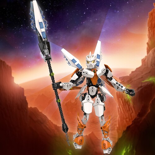
Also, would like a bit of feedback with ordering my renders. I’m not sure if it’s the right order. And no, as much as I like the shot from behind, it’s not main photo material.

5 Likes

I was already planning on it :+1:

3 Likes


Screw it, GWPs my own Chiara.

Usually I make my own .svg for my GWP variants, but needless to say, I’m a little tired from the submission.

8 Likes

I should say first of all that I like your Volitak model better than most, especially on Chiara–I feel like a lot make it look like she’s wearing a skull mask or something, while this looks more heroic. Excellent work.

Second,

is now one of my favorite inspirations. =P

Third, the actual execution of that vision is largely really good. I find the color distribution especially pleasant, and the generally angular-but-not-too-sharp look vividly characterizes the build. The pectoral armor is probably my favorite part. The wings, while not something I’d associate with a Toa of Lightning ever, are a great fresh take, especially considering I have essentially no mental image of what Chiara looks like. I just never got around to visualizing her.

I read through the design process on the mask topic and I’m not sold on the booty, partly because my only distinguishing visual of Chiara is “slim” and partly because the sideways Nuva armor frankly looks tacked on and a bit… off, I guess. I liked some of the subtler armoring piloted in the other topic better. But overall, an excellent build!

4 Likes

The fact that you actually read through the design process means a lot. And yes, you’re not the only one who said it’s tacky.

In my defence, it was a lot worse.

Oh, forgot to cite these 3 influences.

The torso was heavily inspired by the G2 villagers. I really was sleeping on the first wave of G2 heroes (the rest of G2’s design sucks). Actually open instructions for G2 villagers to get the look.

Then there’s Tracer. The poses? Taken from Tracer. The whole lore-questionable writeup about hit & run Chiara? It’s basically just Tracer.

And then I just google searched magic girl poses for when it’s time to pose. Will probably do that again when it’s Naho time (because there’s a few decent Toa Naho, but no Naho that really has the wow factor).

Needless to say, Zaria will not have an anime girl pose, if I’m doing a Zaria MOC… nothing is stopping you from posing Zaria like an anime girl though.

Plan to make a Zaria kanohi at least.

Edit: also, I suspect the heel of the foot is extremely structurally weak. I was following the concept art sketch, but that was design for the Miramax films, not real life. Lemme know if you want me to make a variant that fills up the axle hole, or just leave it as is.

5 Likes

It was definitely interesting and instructive to those of us whose process is basically “Huh, does this look good? …Nah, probably rework it.” =P

From what I read and saw, I wouldn’t say it was a lot worse–meaning that I didn’t see it as a terrible design choice from the start, it just doesn’t quite jive with the aesthetic of the rest of the MOC. Trust me, I know really bad tacky. I built this. =P

Actually yes. I have a conscience. =P

5 Likes

Firstly, you made the rookie mistake of drawing, um, moc-ing her breasts way too high.

Shoulders could use a little rework, Roodaka looks like she’s shrugging.

Other than that, amazing silhouette. Shame the lighting and photography doesn’t do it justice.

5 Likes

ooh, def tacky

2 Likes

Uh… thanks. =P

4 Likes

not meant to be offensive, sorry if it came off that way

2 Likes


7 Likes

We surviving on Mars and conquering Aliens with this one :speaking_head: :speaking_head: :speaking_head: :fire: :fire: :fire:

4 Likes


Did you know, NASA rovers recently sound yellow-green crystals hidden beneath the martian surface?
Yeah, Mars Mission is totally a work of fiction & not prophecy…

EDIT


7 Likes