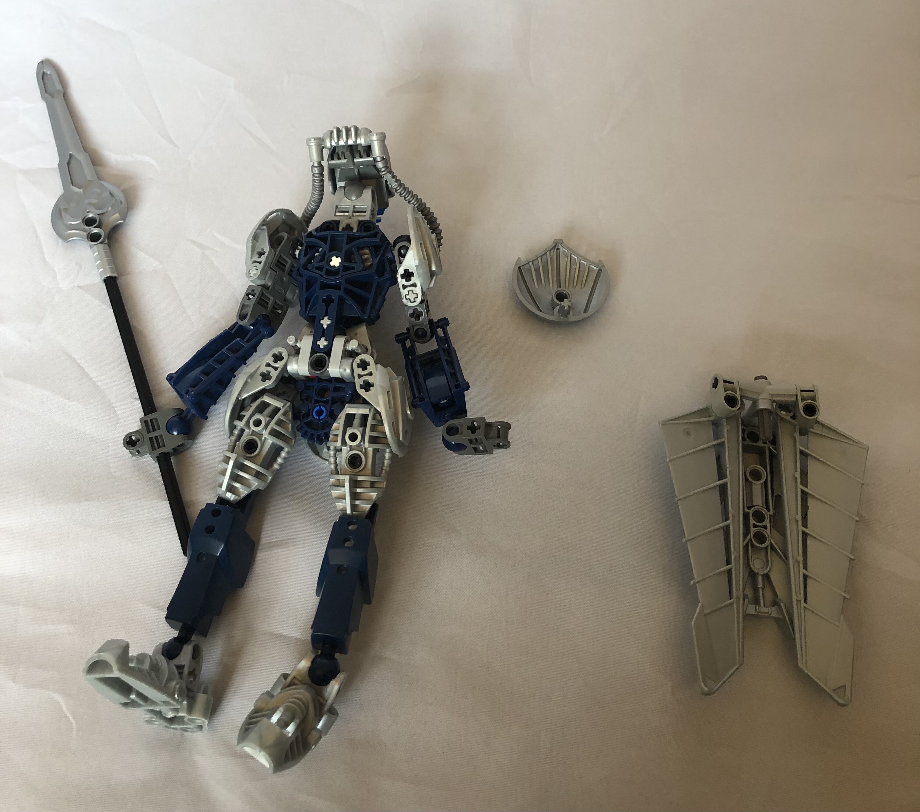
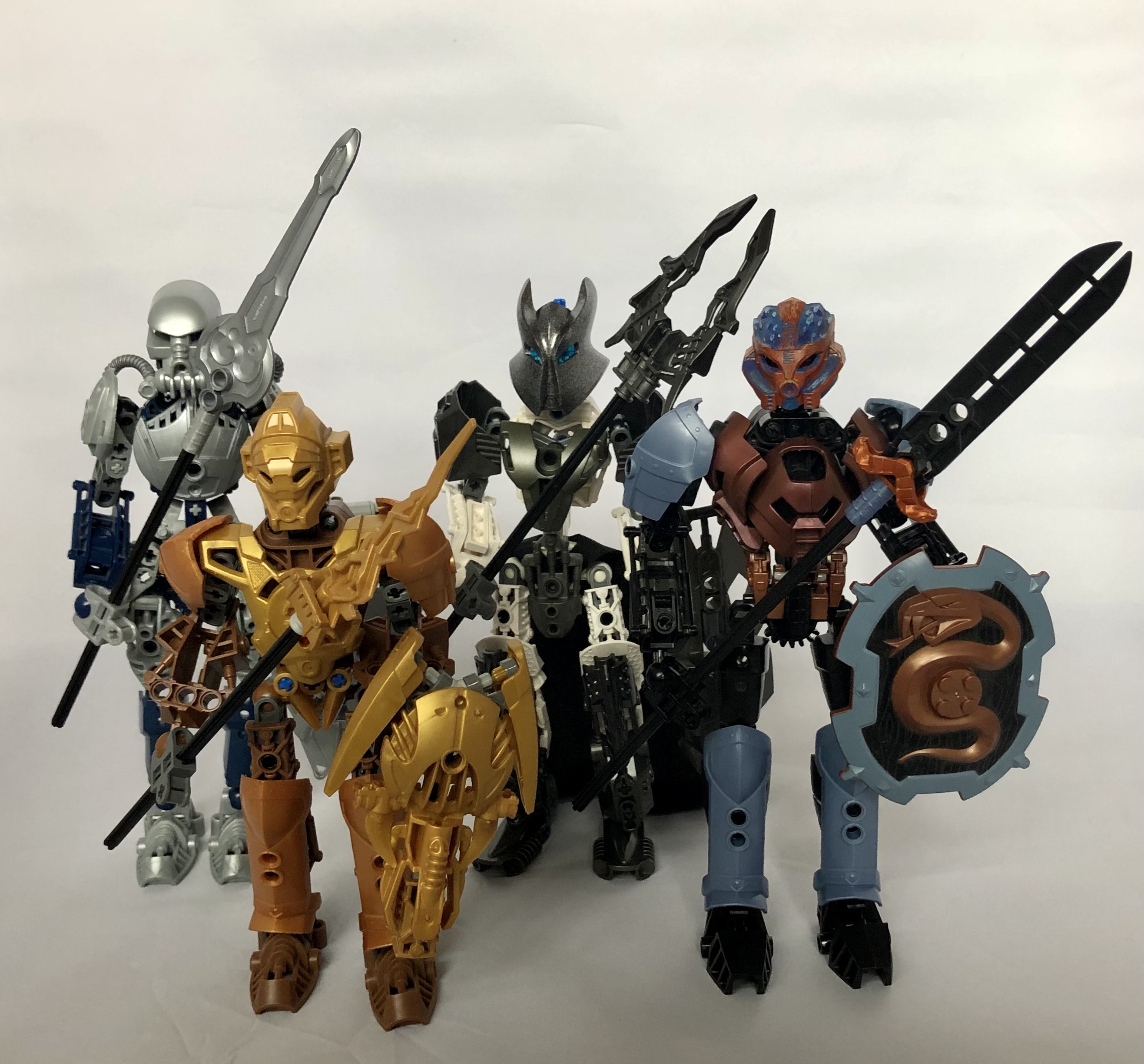
figured i’d made mine a little less boring than most of the other versions i’d been seeing. included an alt pic of bomonga with a non-painted mask and a group shot as well. gear functions on all except kualas because of how his chest is built.
54 Likes
love these. Keep up the good work!
thank you, ngl not a fan of metru builds but think these came out ok
1 Like
These are some great hagah. I like how you gave them metru builds while being distinct to each other.
1 Like
These are cool, but personally I can’t see them as Teridax’s Hagah.
That shield for Gaaki is nice!
I also like the copper Huna armor for Bomonga, I’d love to see a demonstration of the gear function with it
1 Like
These are awesome but which one has the hydraxon mask and which one has Pohatu Uniter’s mask?
gaaki and bomonga, thought that’d be obvious by the fact that they’re blue and black
1 Like
Ah ok
Ngl I didn’t think gold worked with brown but you really made it work
These look pretty good. Can’t see them as the hagah…
2 Likes
It does look pretty good, but I feel like it blends in too much. I think it would look a little better if the metallic colors stood out from the main colors, to give them a more striking appearance.
Ooh, we have a radical! These are unexpected and pretty cool designs, and I love your usage of Knights Kingdom pieces. (Missed opportunity to call the topic “Even More Toa Hagah” though.  )
)
My opinion on these varies greatly from figure to figure. From favourite to least favourite - Gaaki, Kualus, Bomonga, Pouks. I was able to tell who was who pretty quickly, as well.
Seeing as we’re a bit out from the contest, I’ll give my detailed thoughts. But ultimately they’re your designs, so you’re welcome to take on as much or as little of what I say as you want. For all I know, you might not even be planning to enter the contest, so if you just wanted to share and weren’t really looking for feedback, then feel free to skip the rest of the post. 
-
I don’t have a lot I can say about Gaaki, because she is just great. I love the build, the colours, the part choices, everything. This is a very strong (and very rare) example of a build that has a very subtle feminine design without overdoing it or resorting to unnecessary cliches. I love the armour, colour - and that choice of sword as a “Tidal Spear” is perfect, there’s practically a wave motif on the side. My only possible qualm is the helmet choice, but only from a canon perspective - I think it looks great aesthetically. Other than that minor concern, I wouldn’t change a thing.
-
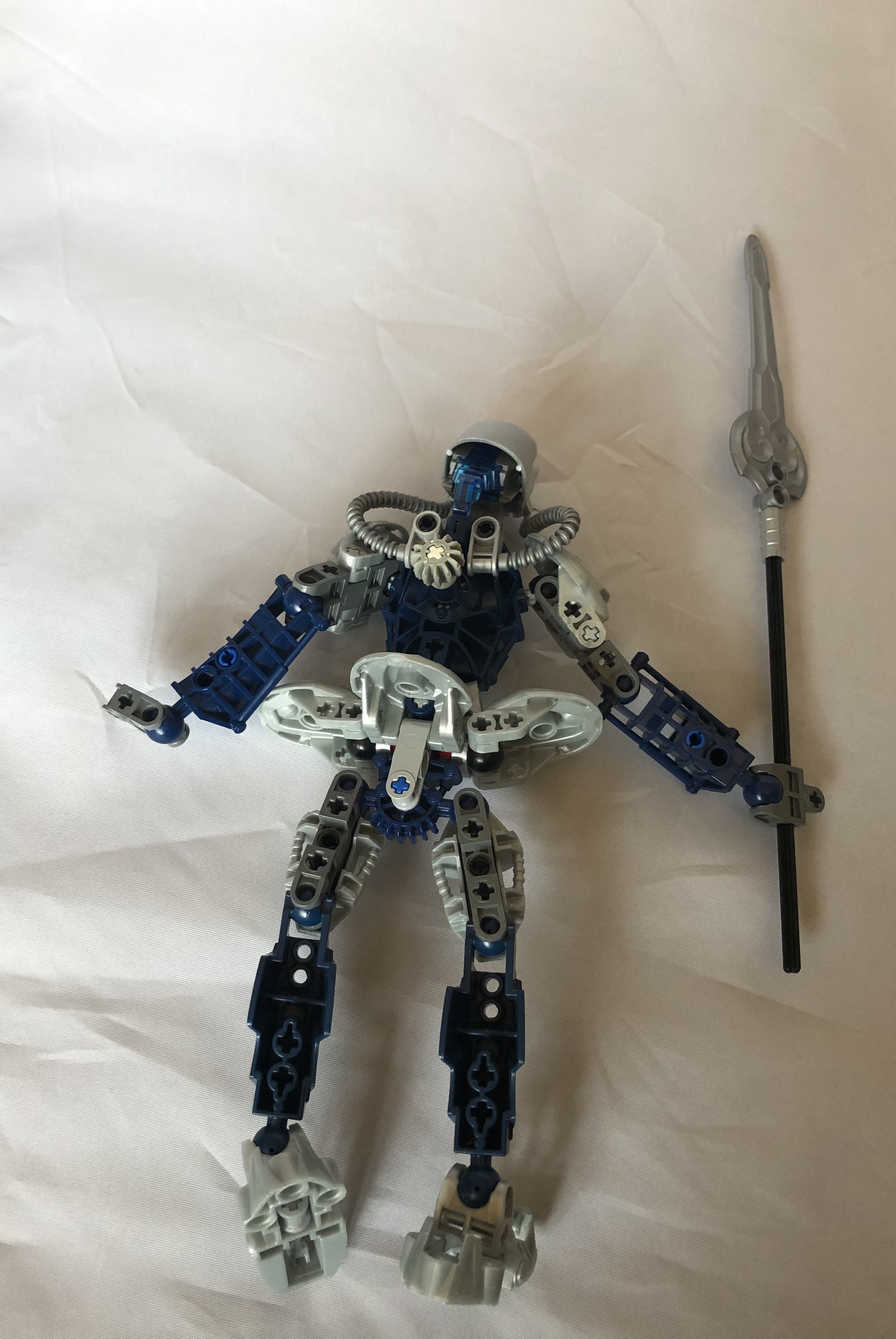
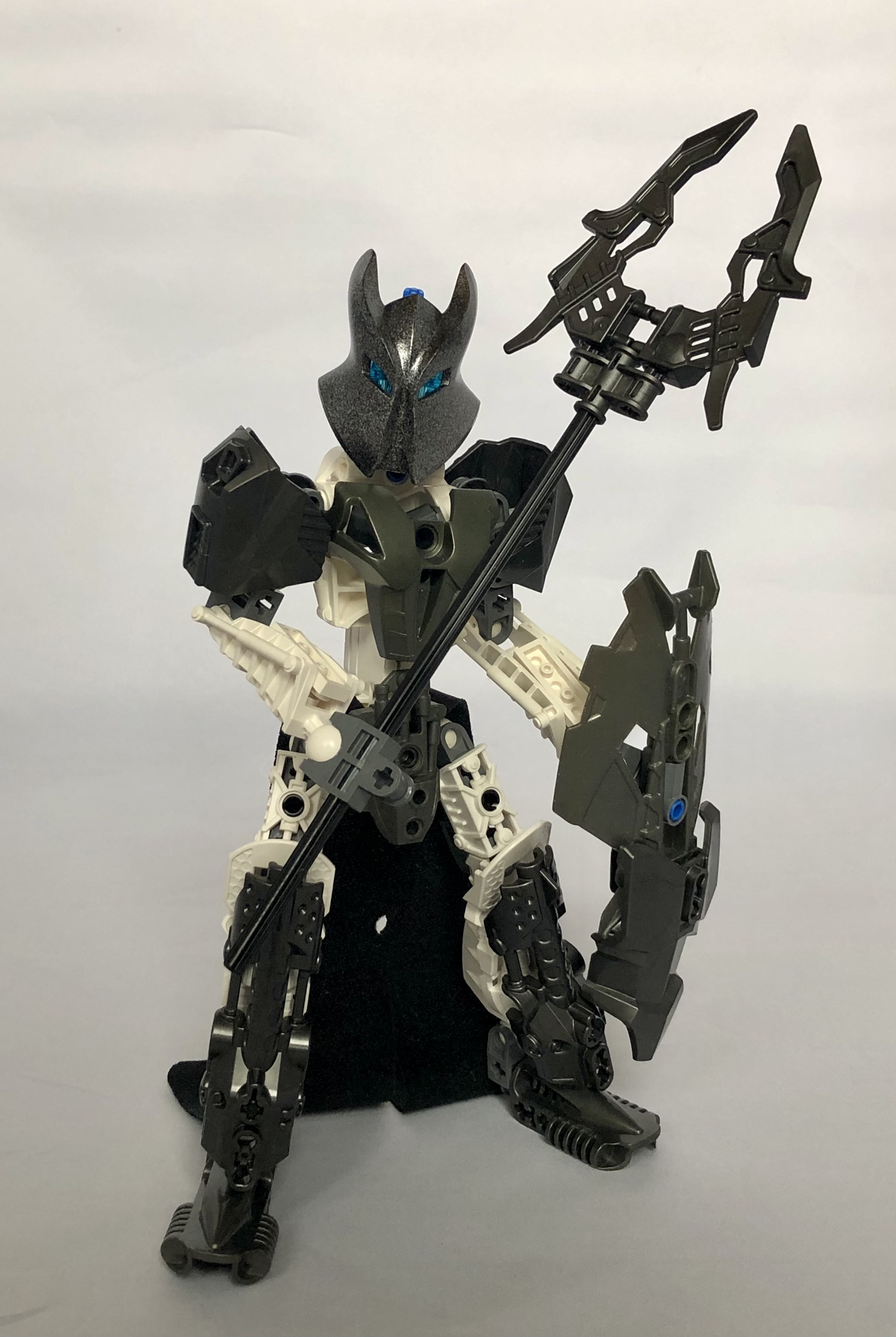
Fact: There’s a lot of dark colours on Kualus. Not necessarily against that - he looks like a “mountain” Toa of Ice, which I actually kind of like - but it is a touch jarring at first, perhaps because it makes the team as a whole unit quite dark, even though it works for him as an individual. Love the choice of Vladek helmet, and it suits the character while not feeling too “menacing” thanks to the blue eye colour - his lower-body cape is also nice, though I admit that I have a soft spot for fabrics. I like the colour balance on the feet especially, but it gets messier around the torso - the slightly different shades of gunmetal are also bugging my perfectionist side, but that wouldn’t really affect my vote. I think his torso could use some work (and maybe the shield, but that’s not canon anyway, apparently). While I’m not against CCBS parts, I’m not a huge fan of them as “focal” points of G1 characters - for example, I’m totally cool with his leg/shoulder design, but I’m not a fan of how they’ve been used in the spear here - but that’s more my own preferences than anything objective.
-
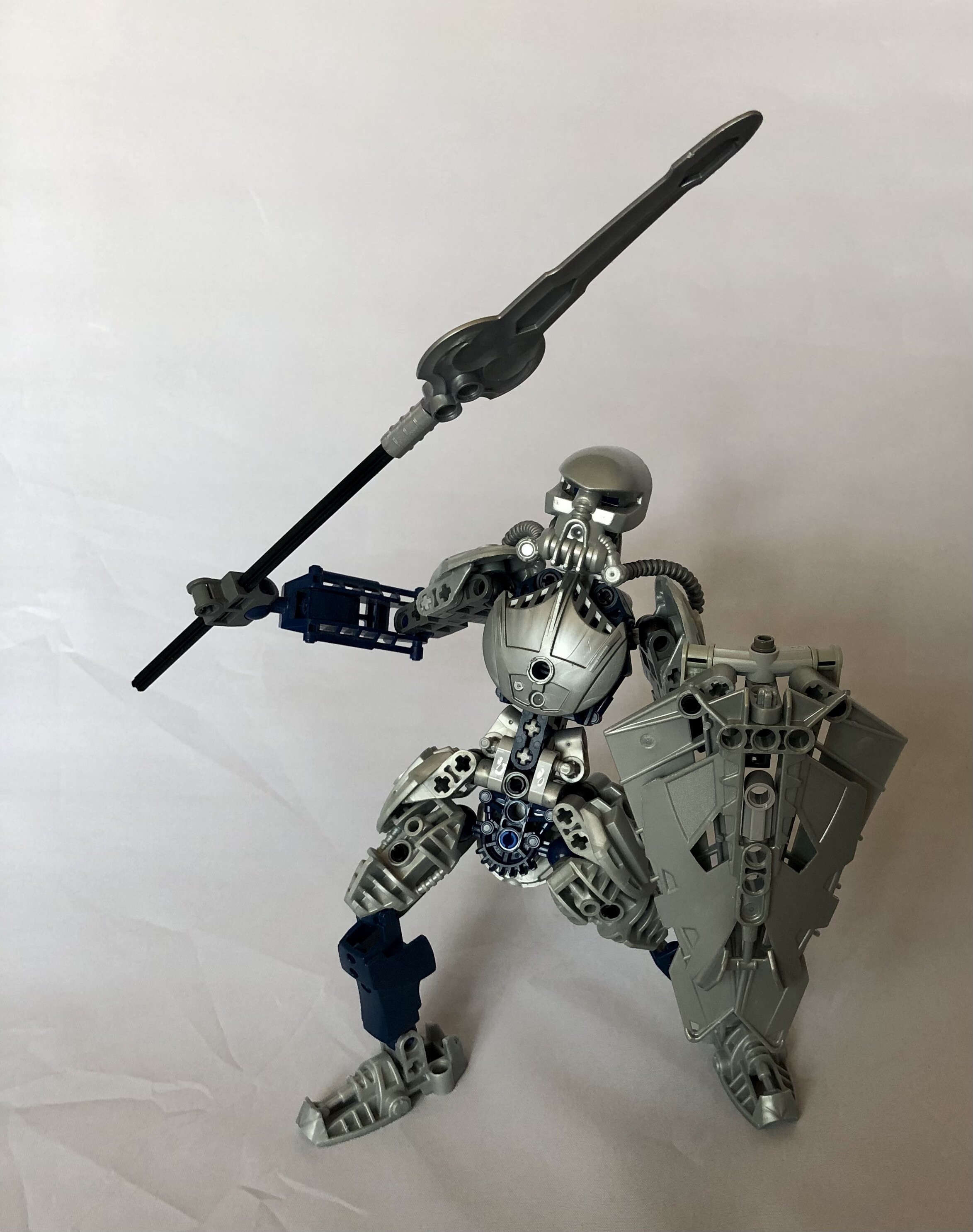
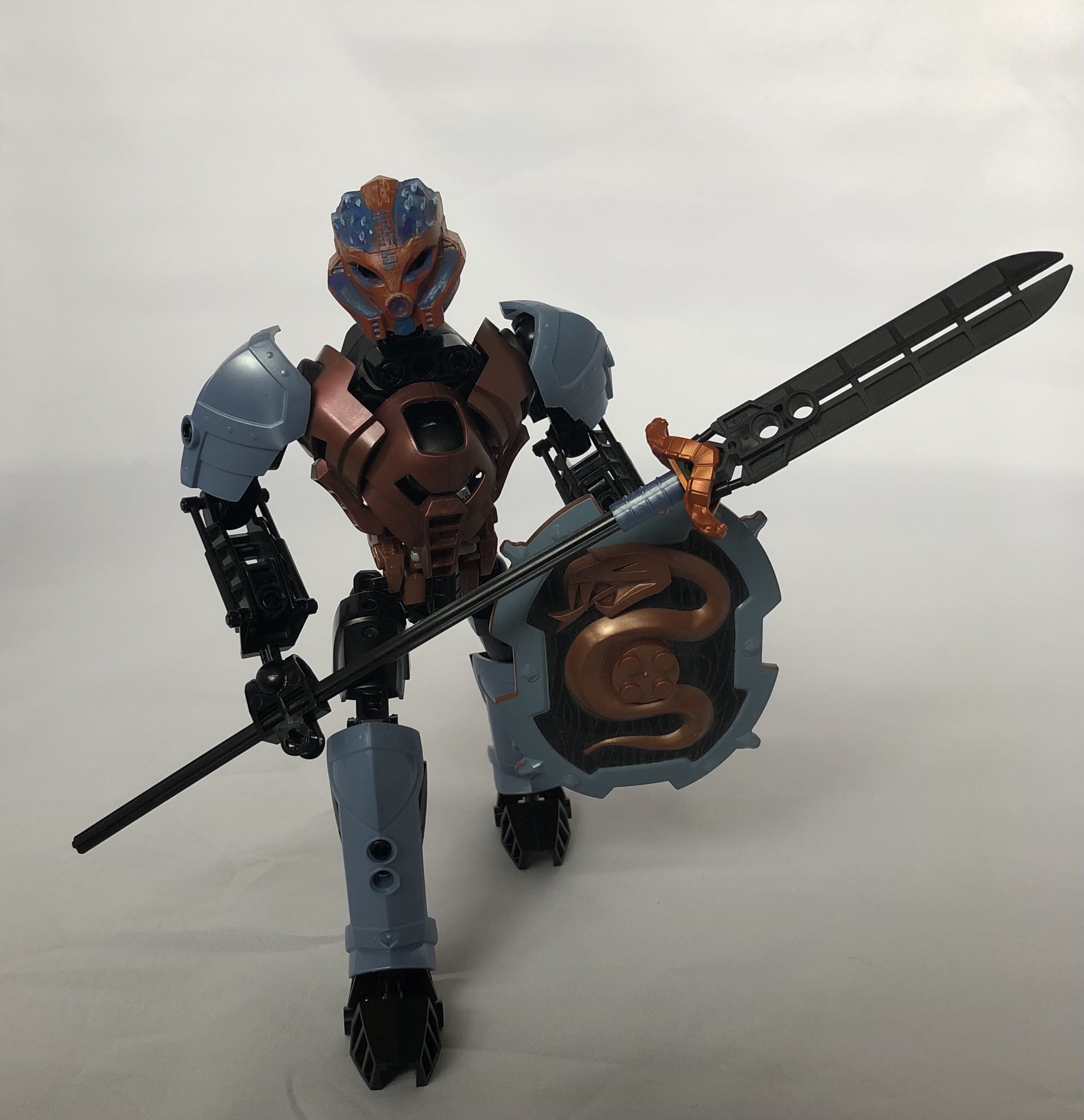
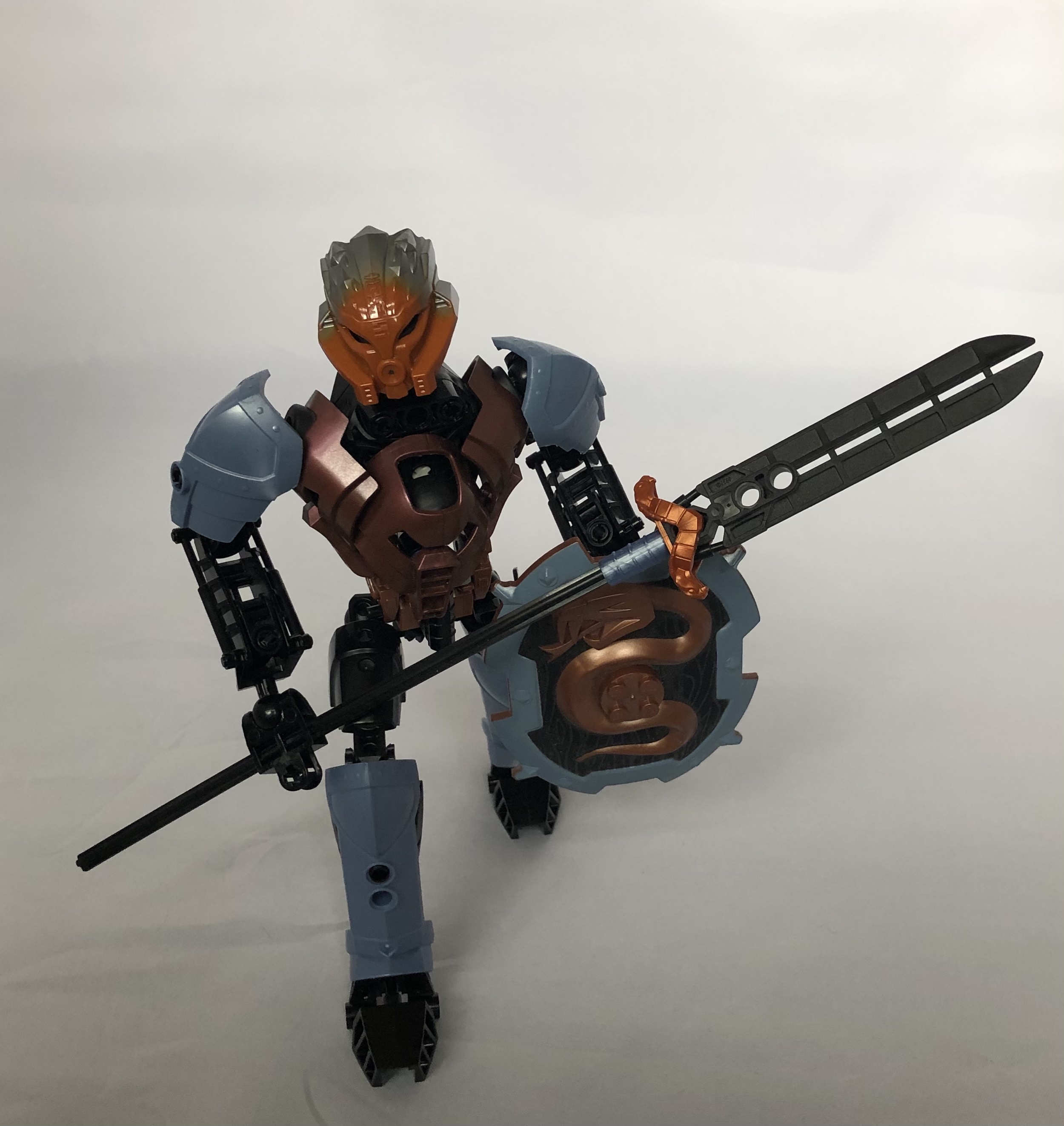
Bomonga is interesting. I thought I would be instantly averse to the multiple metallic colours, so the fact that I’m not (even if it’s still not my favourite take) says that you’'re doing a good job persuading me. Bomonga can join Gaaki in the category of super effective torso designs with subtle, not overdone proportions - although this time, for a bulkier character. I like the spear a lot - thought it would look better in pure copper, I feel - and the shield looks good on him (even though the snake motif is very jarring from a canon standpoint). The mask looks better painted, but I’m surprisingly ok with it as a styllistic Kakama in the G1 universe. I like that he’s bulky without being super short - I always envisioned him as tall and muscly, so I like that for the character quite a bit. Really, my only aversion to him is that he’s basically the only member of the team with two metallic colours, so it’s kind of a bit visually clashing with the rest of the group - I consider that to be a bigger issue than some of my minor gripes, but you’ve also done as much right otherwise as you possibly can to convince me of it, so I’m a bit conflicted. Put simply, he’s one of the best looking on his own, but he looks a little too cool and unique next to the rest of the Hagah, if you get what I mean.
-
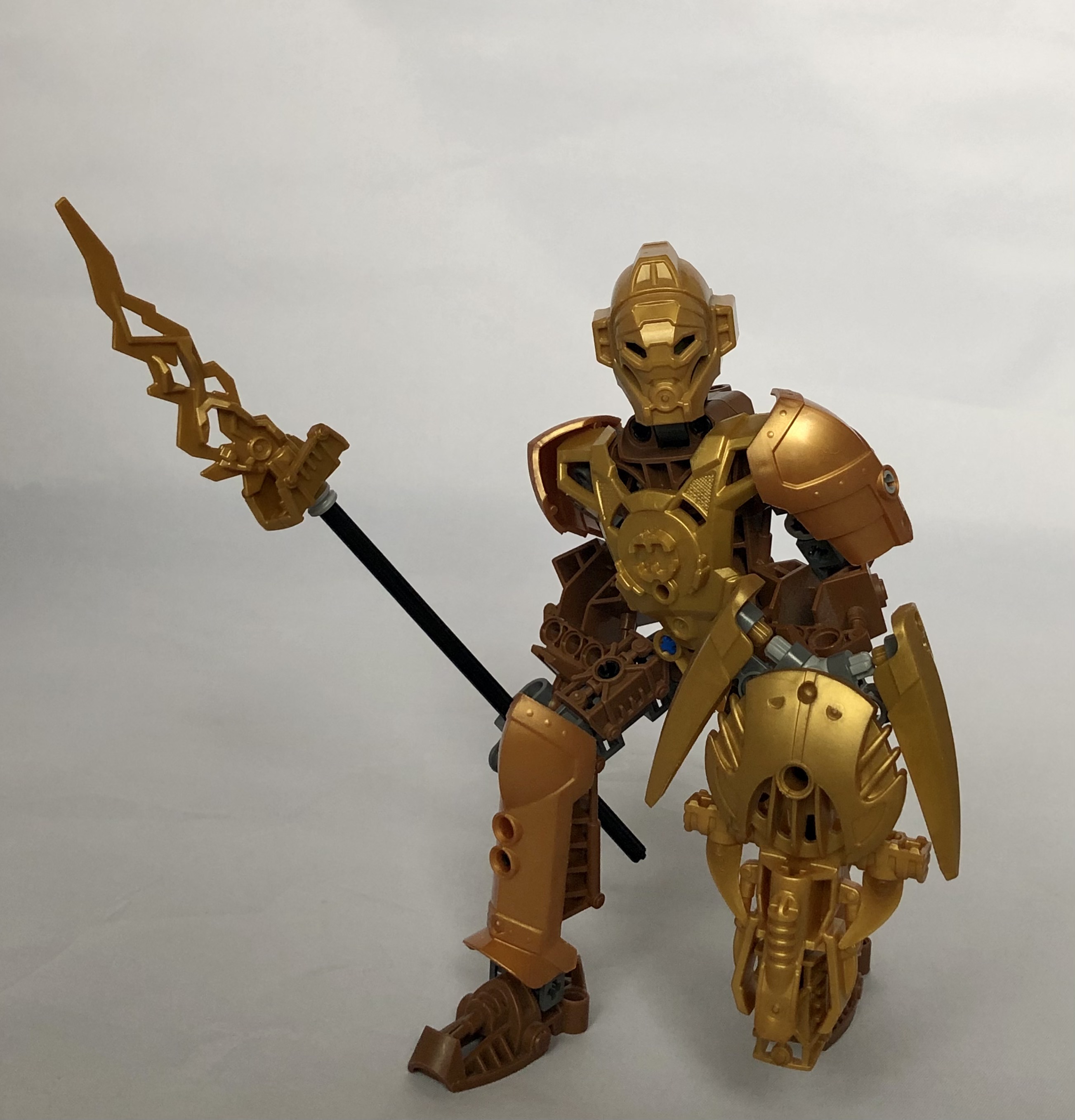
I’ll be honest, I’m not sure I like this Pouks very much. The “similar but different” metallic colours on him bug me the same way they did on Kualus, but it’s much more noticable here when he’s got such a similar primary. That being said, I don’t at all mind the gold-on-brown generally - I think it looks especially nice with the “warmer” gold from the Knights Kingdom armour - I just don’t like having the two shades of it on the same character. I’m not a huge fan of some of the part choices, here - the “Avalache Spear” looks more like a lightning bolt, which seems a bit odd. I’m not as against the Hero Factory chestplate as I thought I might be - I actually like the semi-regal way it’s sitting on his shoulders - but I can’t look past that empty H too easily, maybe there’s some way to cover it up? And the G2 Miru is a touch to technical and space-helmet-ey for something that’s supposed to be an ornate, honorary mask - I’m not sold on it the way I was for Bomonga’s Kakama.
All-in-all, most of these range from pretty solid to genuinely fantastic as individual figures, but some work could be done on making them a more consistent team (I’m not saying they need to be more “uniform” or “conventional” or anything - they just need a more balanced colour balance and stylistic cohesion when they’re all standing together. They look way better in the individual photos than in the group shot). I’m also not a huge fan of some of the spear/shield choices (although again, the shield will get replaced, apparently, so that’s not going to affect my votes).
All that said, I still love these interpretations, and someone would need to build an exceptionally good Gaaki to pull my top vote away from yours. Excellent work, and I certainly enjoyed the more unique takes you had on the characters.
(You also have a bit of a flair for good character posing, by the way. )
3 Likes
Ngl boomanga looks fantastic
I don’t imagine the Hagah too look like these, but these are some good MOCs nonetheless.
The painted mask and custom torso on Bomonga are beautiful and I like how you used that mini figure shoulder armor piece as part of the spear. That’s a really cool building technique!
3 Likes
Nice.
i’ll give a detailed response since you took the time to type out as much crit as you did and i appreciate that immensely:
gaaki: yeah not much to say besides thanks. the mask was more just as something not intrinsically tied to a canon toa without being 3d printed or brick built as the latter i felt would be really out of place for this. glad i toned down the detail on her then, originally she had greebled leg armor made from silver piraka minifig torsos and exo-force robot arms but i was told on discord she didn’t need it.
kualas: fair enough, his weapons are least well made of the four imo. i blame lego for there being two shades of gunmetal though. i don’t know why we needed that lol. tried to keep them seperated so it was less obvious, ie like in the final they can be shifted to the same shade, i just didn’t want to paint anything. bomonga’s mask was the exception because i did that ages ago.
bomonga: he was like that (multiple metal colors) for two reasons; rare earth metals, and the fact that neither of those two colors have enough part variety for something like this (i mean technically that’s three shades of copper if we’re splitting hairs). the kk snake shield just happened to work with the color scheme as a bonus. i agree on the spear tip, but short of just using a copper ninjago sword, there aren’t many options without it being something really custom and out of place.
pouks: me neither tbh. i wish i had the kk armor parts in pearl but i didn’t, so i tried to work around that through blocking. the g2 miru was mainly because i didn’t want two using versions of the g2 kakama. the hau, pakari, and akaku all look too similar to the g1 mata masks to be readable as something else, and the kaukau looked weird for a mask on a toa of stone. tried hero factory helmets, same result. didn’t look right. he is what he is i guess.
and yeah, i’m entering whenever this actually happens. one doing well is enough for me since i love all of them but pouks anyways.
1 Like
I didn’t think any Toa would work with Hydraxon’s mask, but you made it work on Gaaki. She’s easily my favorite out of these. I don’t think the gold works with the brown on Pouks, though, and the double metallic colors on Bomonga look… eh. His torso armor is very cool though, and the use of the minifig armor piece on his spear is absolutely genius.
Kualus looks somehow feminine to me, I’m not really sure why. He’s pretty solid, although I personally don’t like the shoulder armor’s design. The hip-cape thing seems strange, though. I think he’d look better without it.
the legs and spear aren’t CCBS pieces.
I mean, technically they came on ccbs sets but they aren’t the bones, shells, or clip-ons that most people call CCBS.
I consider all the parts designed for CCBS sets to be CCBS parts (especially the ones designed to slot into the shells) but I see where you’re coming from. I didn’t just want to call them “G2” or “HF” parts because that’s misleading as to the issue that I actually had with them in this context.
2 Likes
I really like the variety of colors here. It’s not often that you see a lineup that includes gunmetal, copper, and sand blue alongside the usual silver and gold, it really sets them apart.