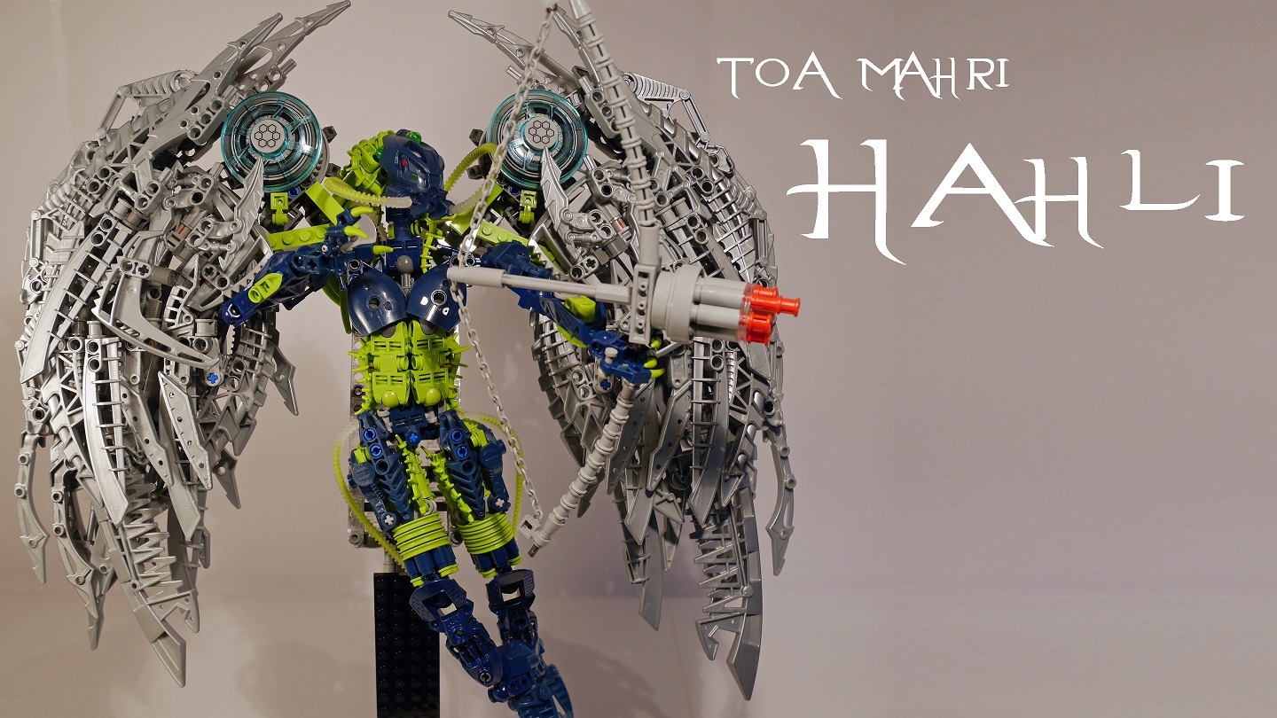
One of my first bionicle MOCs in recent history. Hope ya’ll like it, (also my first MOC on the forums).
A few things to note about this:
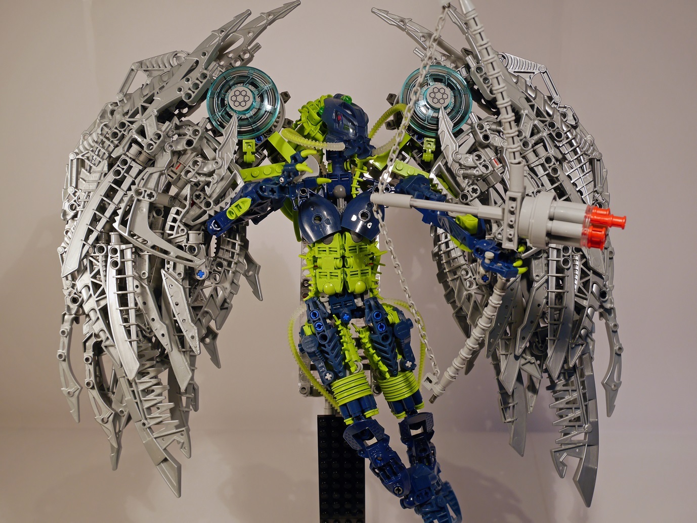
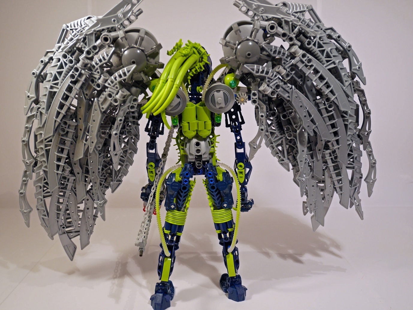
I realise the upper arms are rather basic, this was because I wanted a decent amount of possibility near the wings for the arms. I might have been able to get around this but I didn’t really focus much on that part as they aren’t very visible (especially from behind because of the wings).
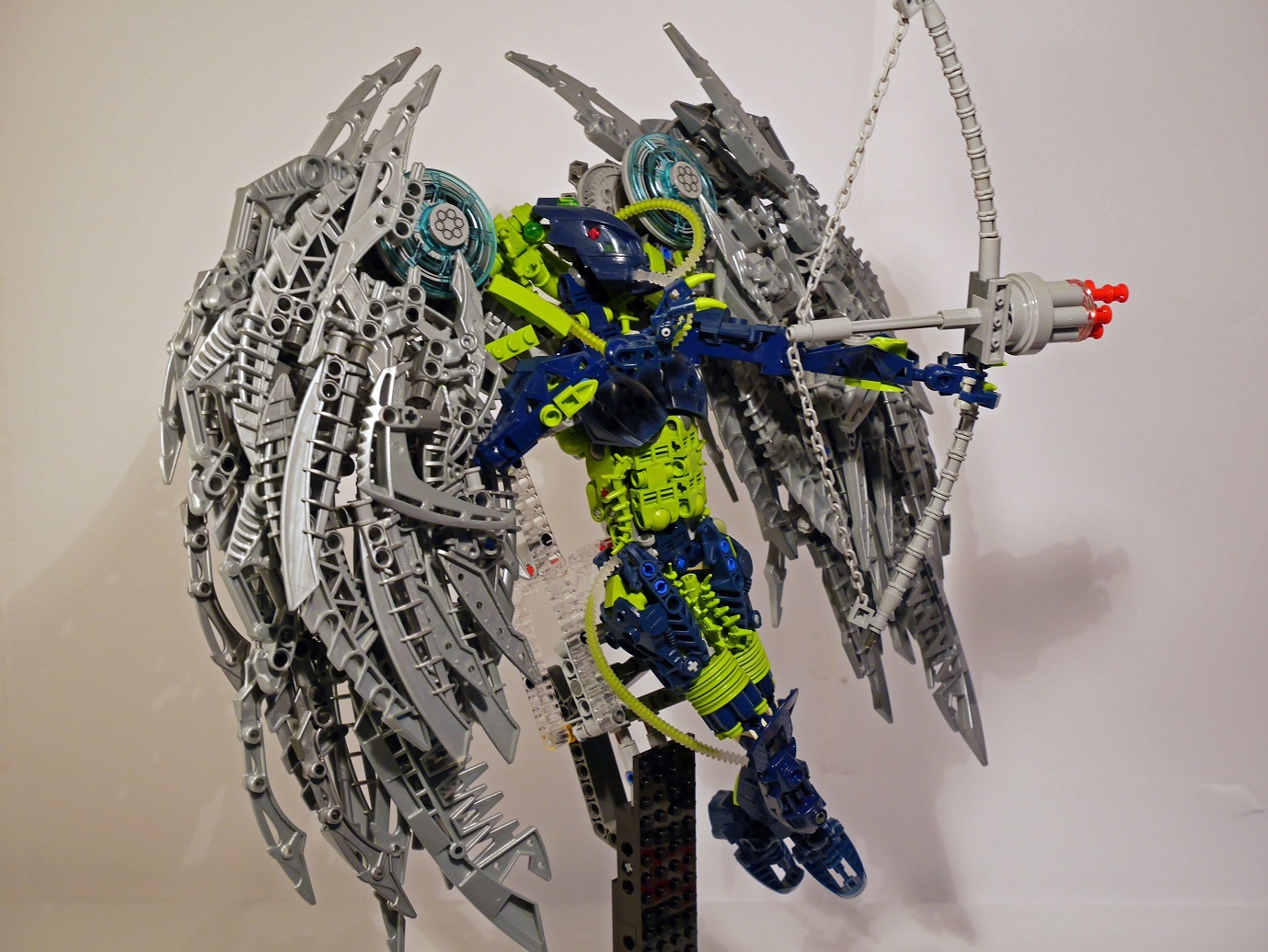
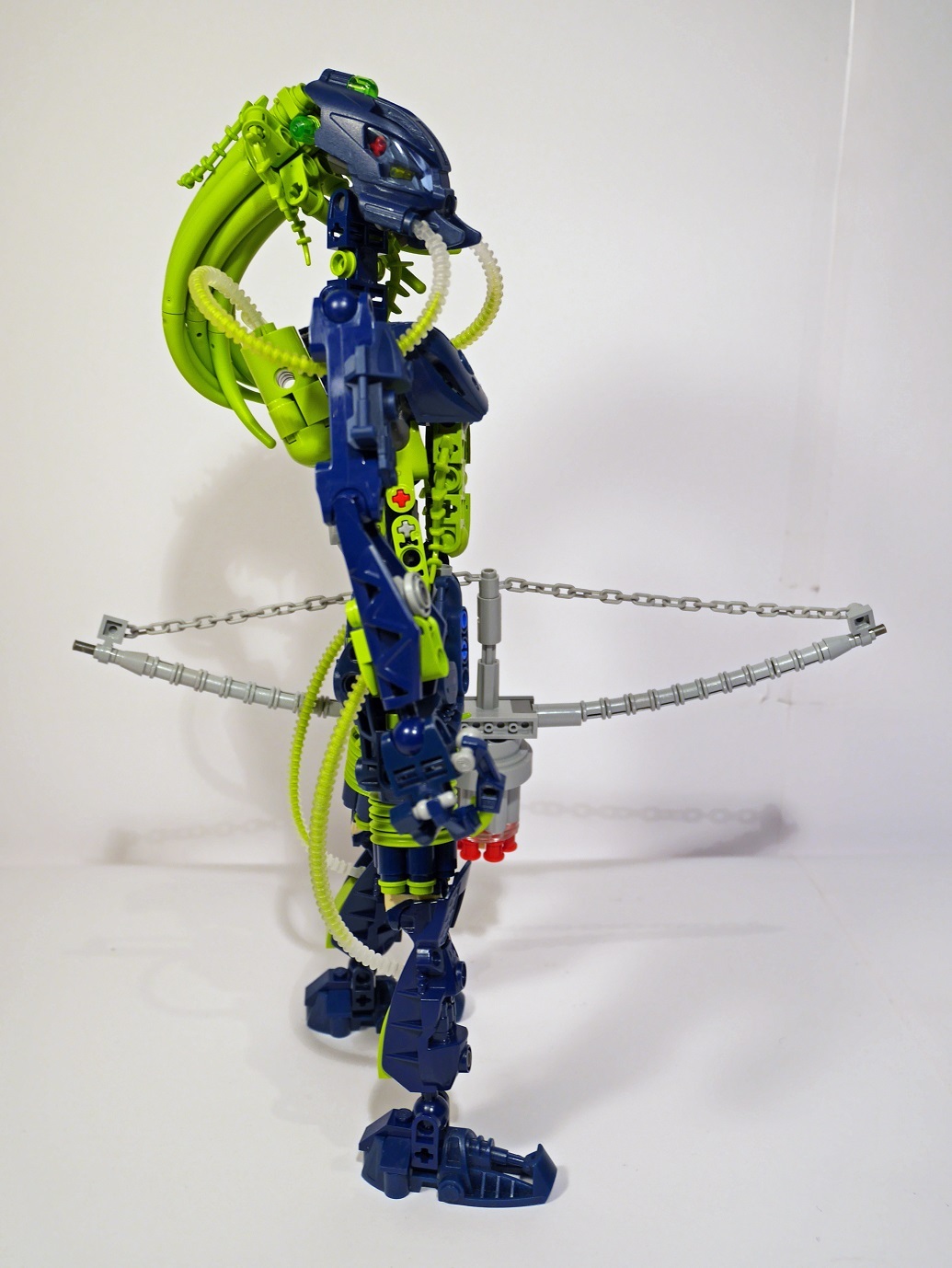
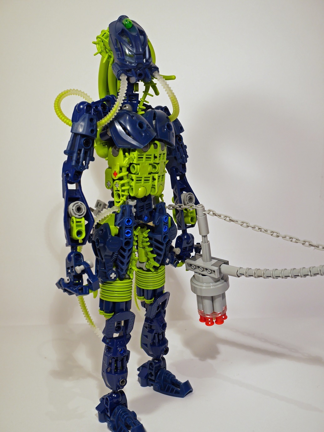
The cordak blaster being a bow serves little practical purpose, it’s for style more than anything.
I probably need some practise if I’m going to get into Bionicle MOCing, so expect a lot more in the future. They should get better over time.
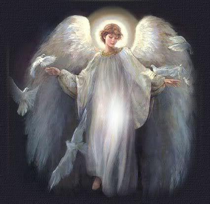
(EDIT): I feel like I need to clarify on the wings. The design of the wings were based on typical angle wings, meaning A: they were intended to be large like in the picture below and B: I would use multiple parts to make up the wings giving the look of feathers making up the wings (with a few liberties taken here or there). Many people here seem to have problem with these two things, which although I can understand however they will not be changing in their design drastically any time soon, some people can’t handle complexity, some people can including me so it seems to be subjective (also considering that this criticism is exclusively on this forum for some reason). Either way I wanted to explain myself on that.
The proportions are a little strange, the wings are horribly part-spammy and excessively large, but the bow is sweet and I like what you’ve done with the legs and “hair”. Cool MOC.
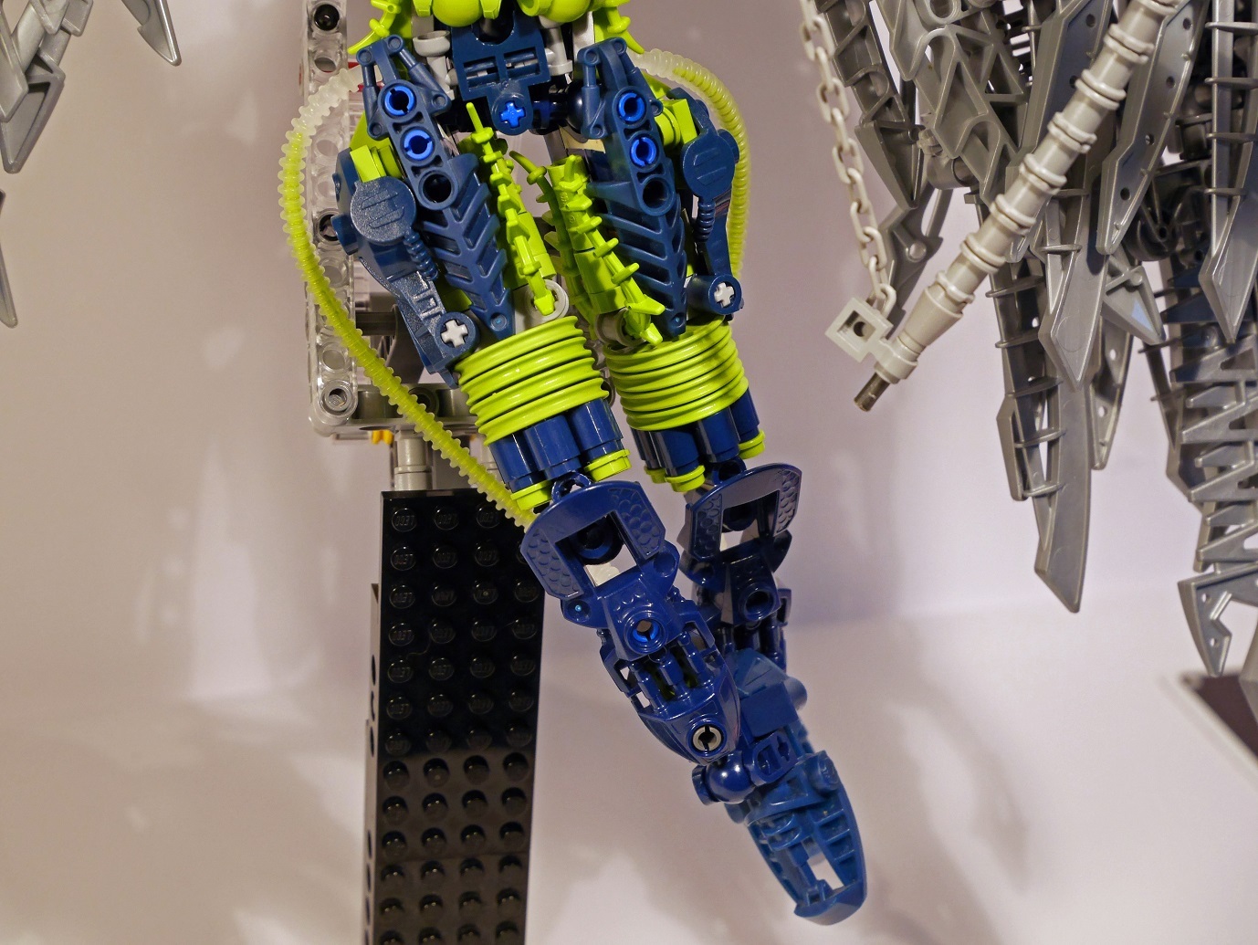
this is great, the body is well done, the upper legs are good, the lower legs are basic, but that’s not a bad thing, they work well, the arms are also basic, but I don’t thing they look out of place, though the hands seem a little bestial for a toa, the bow looks beautiful, and the hair looks like hair, though the neck seems a little long,
if only the wings were as good as the rest of her, they need to be severely simplified, as they just look like two hunks of shrapnel hanging from the shoulders, it isn’t the size that bothers me however, as it has a realistic feel,
overall this is an amazing moc which is dragged down by over complexity of the wings.
bonus points for the air tanks on the back.
8.5/10 maybe you could engineer the wings to spread open to look less messy, instead of just making them smaller.
Originally I was going to base the wing structure off this picture with vertical bone structure, but I reverted to using horizontal rods instead as this design was too flimsy. I based my design of the wings on a typical angel, explaining their size.
@BricksOfAwesome
Was not really the size, just the idea that a generally underwater toa revamp would have wings. The design of the wings is good though and I do enjoy the revamp. It just seems like an odd choice to me.
My problem with the MOC is that, from the mid-section of her torso and up, it’s unappealing. The body is square, and, plainly, boring. The arms are far too skinny really, they just don’t look right. I know the logic was that you don’t really see them anyways, but a MOC in my opinion should look good all-round. Also, the neck is a bit long.
However, I do like what you did with the “hair,” that was a nice touch. The wings I’m still a little on the fence about. They look really epic n such, but they are quite cluttered. I don’t know how you could have achieved the same look without it feeling cluttered though. =/