Thank you for concisely summing up my entire issue with the “Teal” debate.
By the same metric that “Earth Blue” isn’t “Dark Blue-Green” because there is not enough “green”, “Bright Bluish Green” isn’t “Dark Blue-Green” because there is not enough “dark”.
(I know that was confusing, you can read it a few times over because it does actually make sense. )
When Greg described Lariska’s colour, you can be pretty confident that he wasn’t talking about a specific Lego part colour. The issue here is that the colour he described doesn’t even come close to any colours Lego actually makes.
That’s why, I feel the “Teal” rule should be more relaxed for Lariska than Artakha’s “Sand Green” rule, because there’s not really an appropriate specific shade for the actual colour.
(And I also agree that on a colour spectrum, “Earth Blue” or even “Earth Green” are way closer to the colour in question than “Bright Bluish Green”, so that needs to be considered.)
tl;dr: Calm_Hawk is dead right, you should listen to them.
Hmm some very good points have been brought up. While working on my entry I have found that teal does look very bright so maybe allowing some other colours as accents would be acceptable?
Edit: as I see it there are two routes this could take:
.either teal with a slightly darker colour like mata green
Or metru blue and metru green
Teal isn’t terrible as we haven’t had any teal characters plus it would be cool if Lariska kinda pops
But on the other hand the metru colours are definitely more camouflage.
Another option is to use dark turquoise as a secondary color, like how the winning Artakha was mainly gunmetal then sand green.
If the winning model does use teal, though, I suspect Lariska will have to be that shade in the artwork — like how Artakha couldn’t be recolored into another grey-green.
Artakha is described as grey-green in the story, which is interpreted as sand-green in LEGO’s color palate.
Just as there are different shades, tones, and tints of red, one could draw Artakha as a desaturated green that doesn’t match LEGO’s sand-green.
EDIT: To further clarify, let’s say the winning MoC for the Nidhiki contest is metru green. Since the art portion is based on the MoC, why recolor him into a different shade of green?
I’d stick with black alongside dark teal. It’s a solid combo and looks striking.
I think what Sharnak means is that if the winning moc already had the canon color, then there’s no point in recoloring the moc in order to add that very color.
Regardless, Lariska is far out and probably won’t happen until late spring or summer. It’s better to clarify with the TTV judges than resort to pointless arguing.
He could be, though? TTV did not enforce a specific hex code for his colous.
Also, to all the people saying that this is semantics and that Lariska is canonically “teal” and therefore “Bright Bluish Green” - Lariska is canonically “Dark Blue-Green”. The use of the term teal is to distinguish that colour from armour that is a mixture of dark blue and dark green - it is not referring to Lego’s specific shade of teal, as seems to be the popular perspective.
If anything, “Bright Bluish Green” actually contradicts the canon colour.
If I see this kind of conversation happen again regarding anything having to do with these contests, every single person involved will be getting a suspension for the duration of that contest.
You’re all getting warnings for the time being. Do NOT do this again.
I’m gonna be honest, I used a Vahki head when I MOCed Lariska several years ago. I don’t really have a problem with her looking (at least sort of) like a Vortixx. I think she should be shorter than Roodaka, though. I imagine her to be lithe and have places to store her daggers. Other than that, I’m really interested in seeing what other people come up with. A custom head would be cool. I personally quite liked @Gilahu’s several-year-old MOC back when I saw it on the LEGO Galleries, so I hope we get more stuff like that.
I’m (probably needlessly) afraid that we’ll see a lot of voluptuous renditions, but I likely won’t vote for anything with a bust size bigger than Roodaka’s. I like @Surel-nuva’s rendition near the top of this topic, though.
I’ve seen a few that use the Turbo head. The idea’s grown on me.
Perhaps stickers can be put on the visor to give the impression of her eyes behind the visor? (Though they’d have to be official, uncut, Lego stickers.)
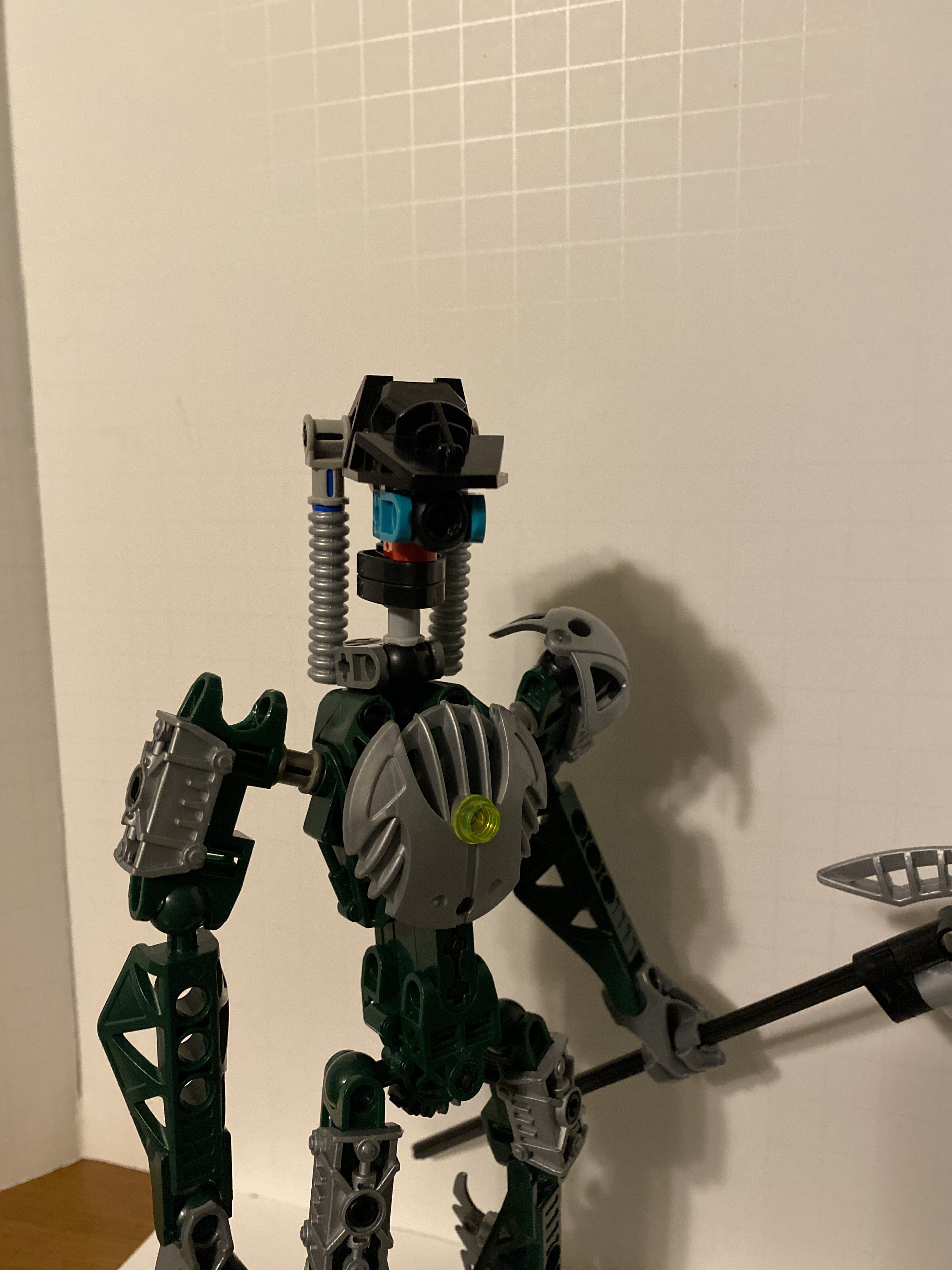
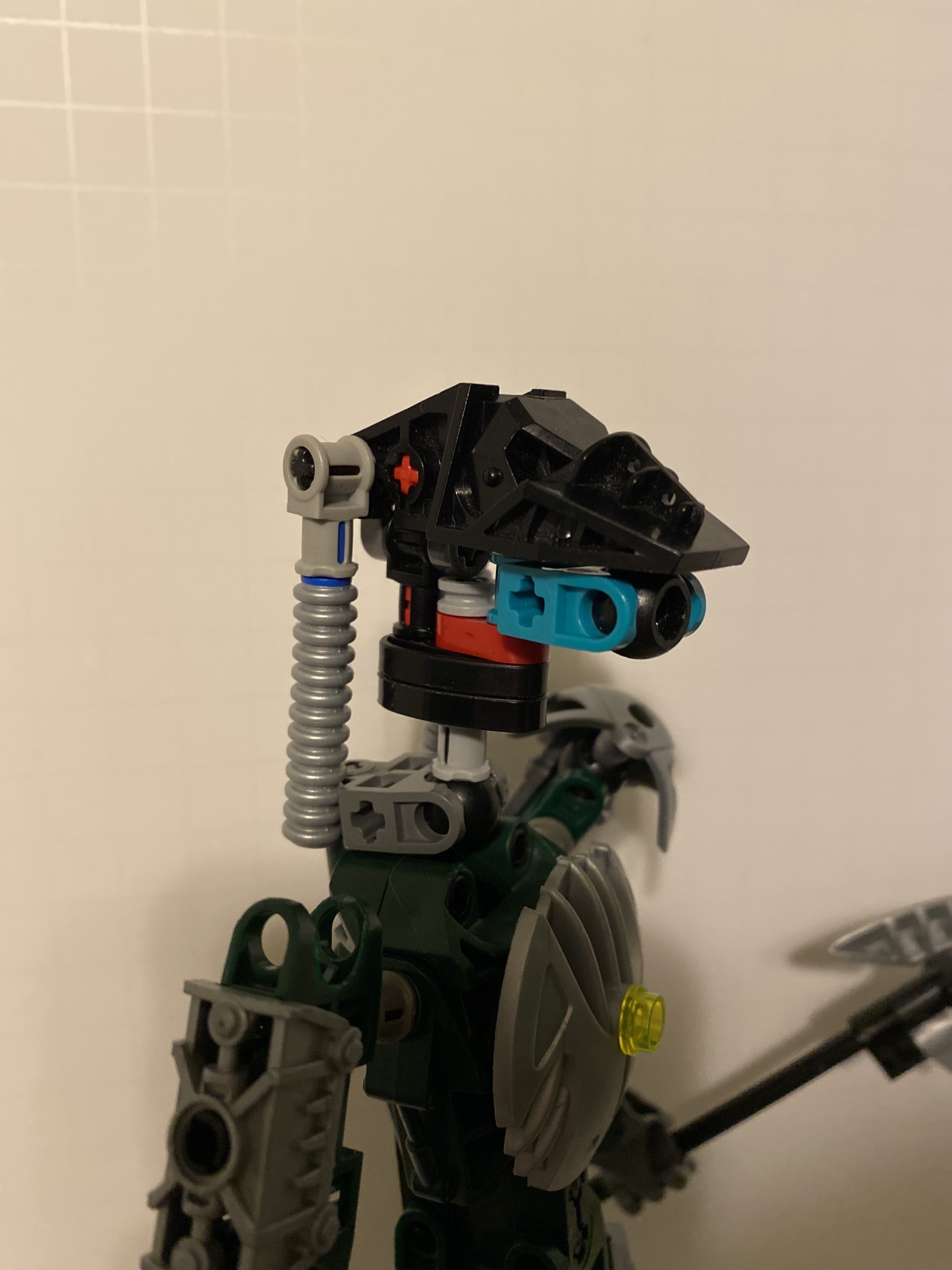
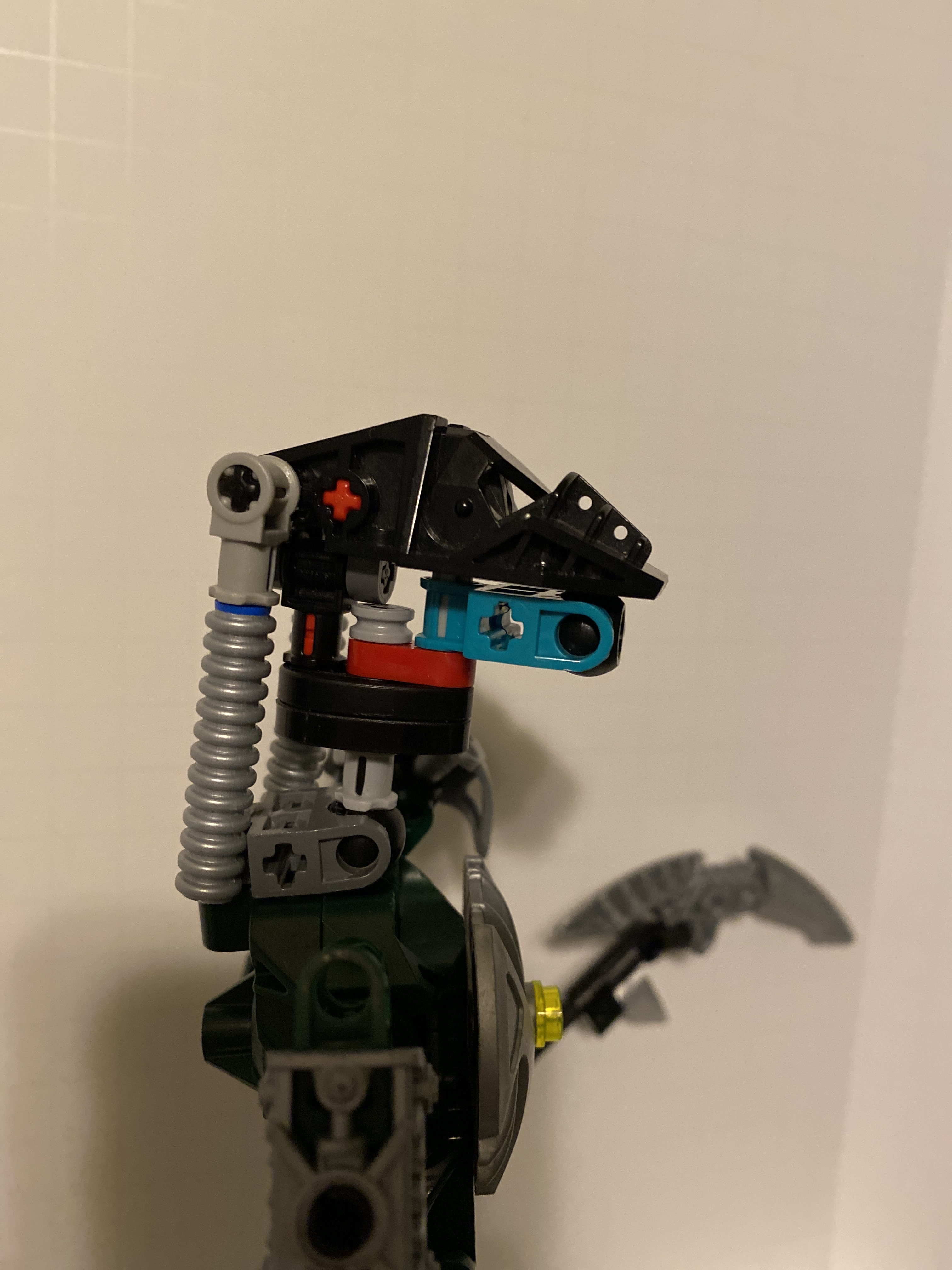
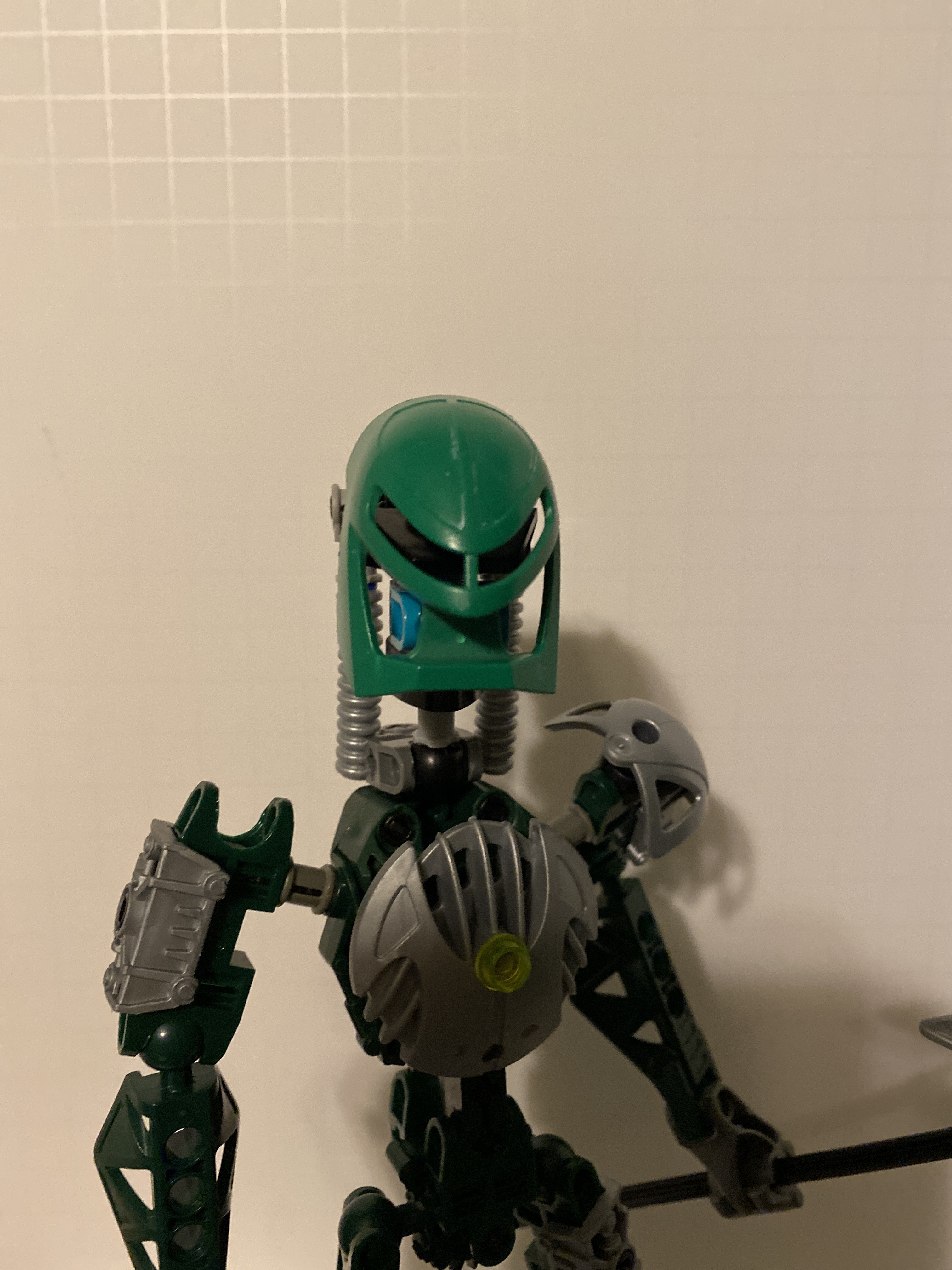
To be honest, my favorite Lariska MOC so far has been a Nidhiki and Krekka combo model. While the dark blue and green aren’t exactly the “dark blue-green” specified, they feel faithful enough for my tastes. I also just appreciate the idea of her being a combo model, which feels like how she would have gotten a “set” if Lego ever did decide to make one. I’m aware that this is contrary to many of the opinions here, but thought I’d throw my two cents in.
I too like the combo model very much, and it makes a lot of sense to me that Lariska could’ve been a combination of those two models. I love seeing combo models in general, because I think it’s quite creative when builders are able to create a unique model using a limited part selection.
However, I do prefer @Gilahu’s lariska, because in my opinion, it looks more cohesive, while still fitting in with the 2005 titan aesthetic.
If we’re thinking of the same combiner model MOC, I think you have good reason to like it. I really liked the feet on that one and the general combo aesthetic.
I’m most likely not going to be entering the contest but I got to thinking of what I saw many people wanting.
-Different than a vortixx, but similar
-Slizer/throwbot head
-Can wear a kanohi
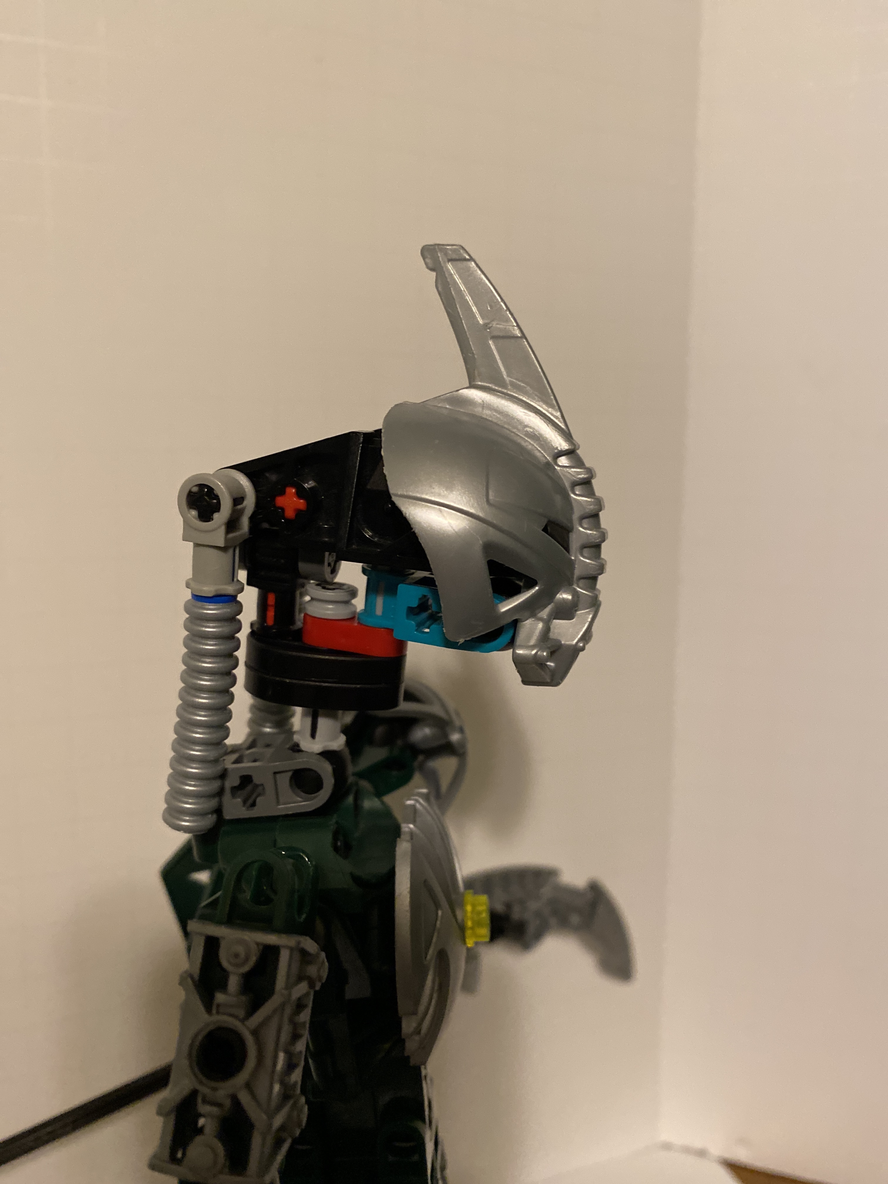
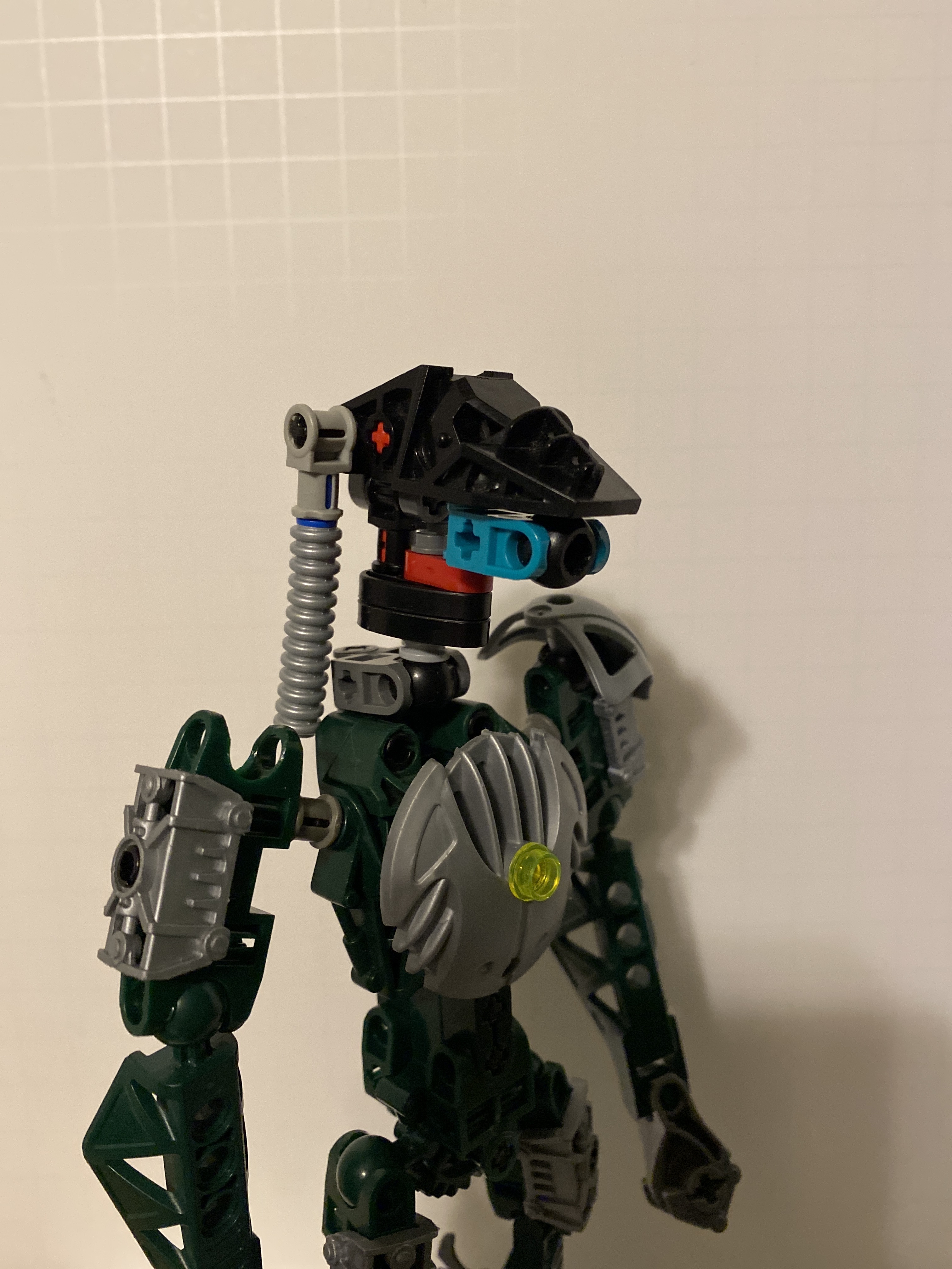
This is the concept head I made. If anyone wants to modify it or wants the instructions if you can’t just see it, let me know.
We probably are, I saw it on the boards, though I can’t remember who made it.
I do like his model (and his work in general), though I feel like the proportions that he goes for takes a bit away from the athletic/nimble look.
Hmm, interesting… The head feels a bit too tall, to be honest. It either has a really long neck or the lower half of the head just doesn’t integrate well with the slizer head.
Huh. It’s interesting. The Slizer head looks better than I expected, but… overall it seems thin. It’s a good concept, though. I really had no idea how to make a Kanohi-compatible head without using a premade one until now.
That looks a bit better; you wouldn’t happen to have a black hand socket, would you? Having that one piece in a different color makes it stick out too much, imo.
I like how strong Gilahu’s looked while also looking feminine, though I don’t know that Lariska necessarily has to look feminine. Less bulk might work, though.