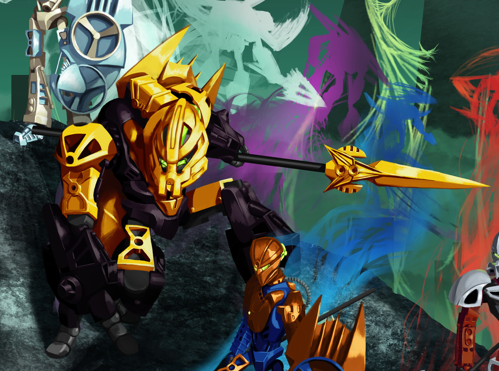
After a month (and a week) of blood, sweat, Krita, and tears, I’ve finally finished my digital painting of the six Hagah. I’d like to add for the record that I almost finished it by the original deadline, but the extension was a great way to finish it without any last-minute stress.
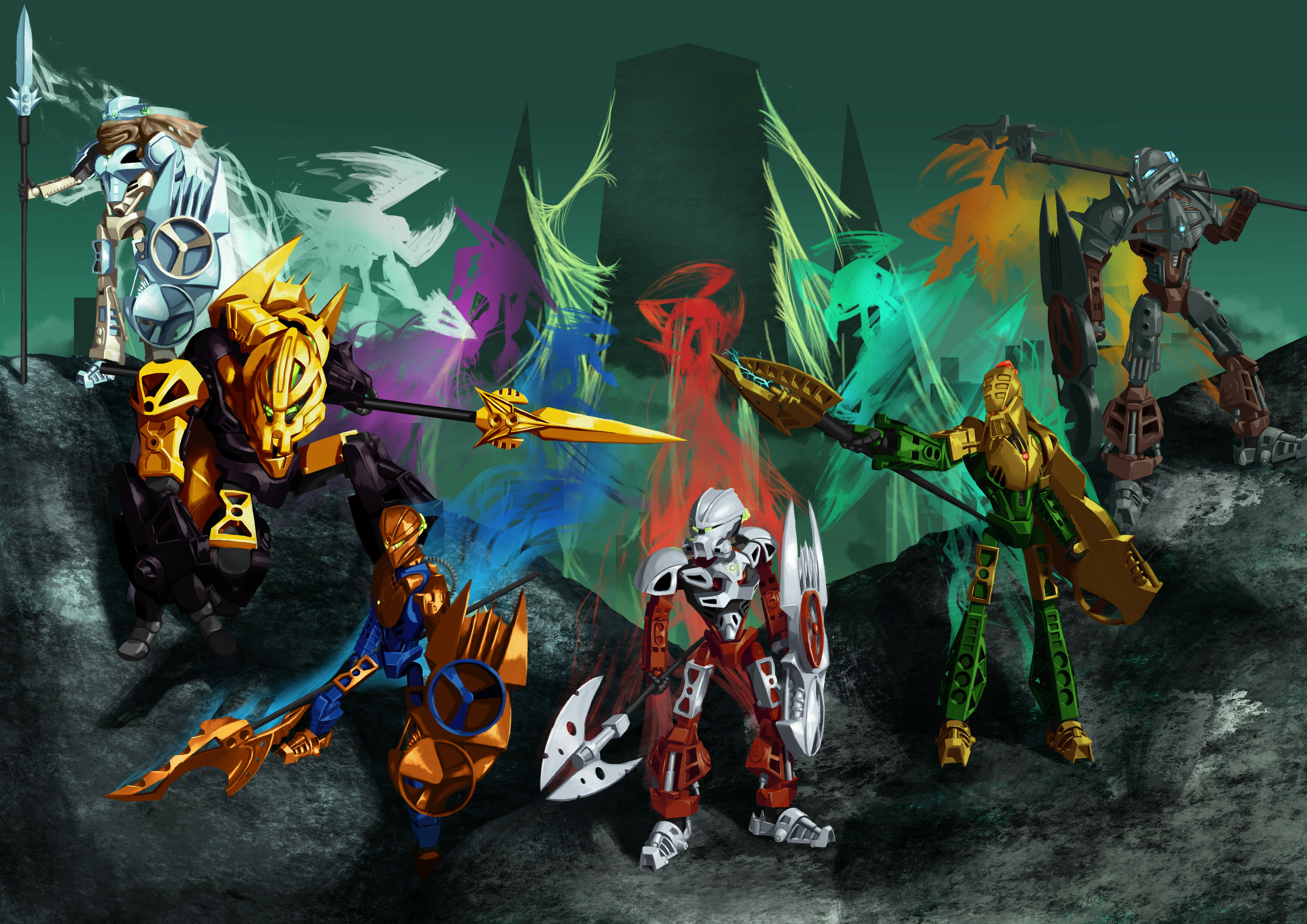
I definitely wanted to go for a Miramax-style inspiration with this. It’s not 100% faithful- I decided to axe some aspects like all the wiry bits and Nokama’s janky feet, but I kept their designs as a basis and used them as reference quite a few times. My goal was: if a piece was used the same way in the Toa Metru as the Hagah, to try and match the Miramax depiction of it as close as possible (such as Kualus’ lower leg and the upper thigh armor of almost everyone). Otherwise, I tended to not try anything too fancy in changing it from the original part.
My color scheme shifted a bit as I went. When I started, I was going for a 1/1/1/1/1/1, then once I got to Pouks thought a soft 2/2/2 silver, gunmetal, and gold would be nice (I had to stress the soft part because I wasn’t changing the blue Kualus). Then, after seeing a lot of people taking a liking to bronze Gaaki and also growing on me as well, I eventually decided to embrace it and go back to 1/1/1/1/1/1 (though I guess it could still be interpreted as a soft 3/3 silver and gold).
The lads, in order of completion:
Norik
He was the first Toa I drew and was basically my guinea pig for how the six would look. This was also the first time I’ve done lineless, digital artwork in a long time, so I did a lot of experimenting with him in general. My experimenting with him probably shows more than I’d like if you look too close, despite spending a good chunk of this week cleaning him up, but I still really like how he turned out.
Kualus
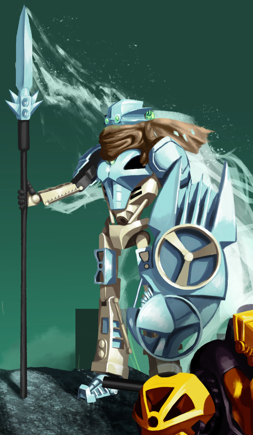
Kualus was fun. I spent a lot of time getting his scarf to look right and I went through a million ways of holding his spear while standing stoically, but ultimately went with a way that’s about the same as the original MOC. I decided to give him the light blue armor because… well I liked it.
It was also around the time when I was finishing him that I thought of their spirits forming into silhouettes of Rahaga behind them, partially because I realized the Toa Hagah probably were never in Metru Nui alongside the Visorak, but wanted to keep the webbed-up city as a background. This seemed a visually interesting way to convey more of their backstory than the group shot I was planning, so I really focused on it. After looking at the completed painting with and without the ghosts… yeah I’m glad I chose to do this.
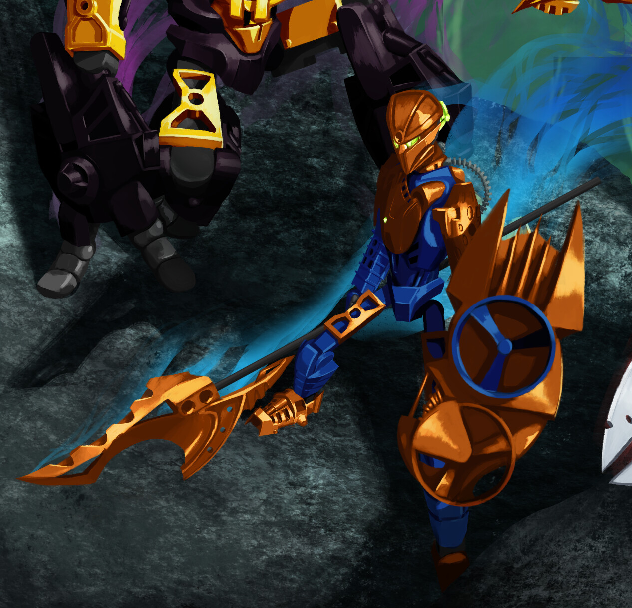
Pouks
Pouks is probably my favorite of the six. IDK, I think the blue, gunmetal, and brown just work really nicely together. I also had a lot of fun figuring out how to meld the Kalmah foot into the chest and am super happy with the result. He’s also the one I really stressed the Miramax mouth on. If I weren’t so terrible at expressions I would’ve added a few more to the others.
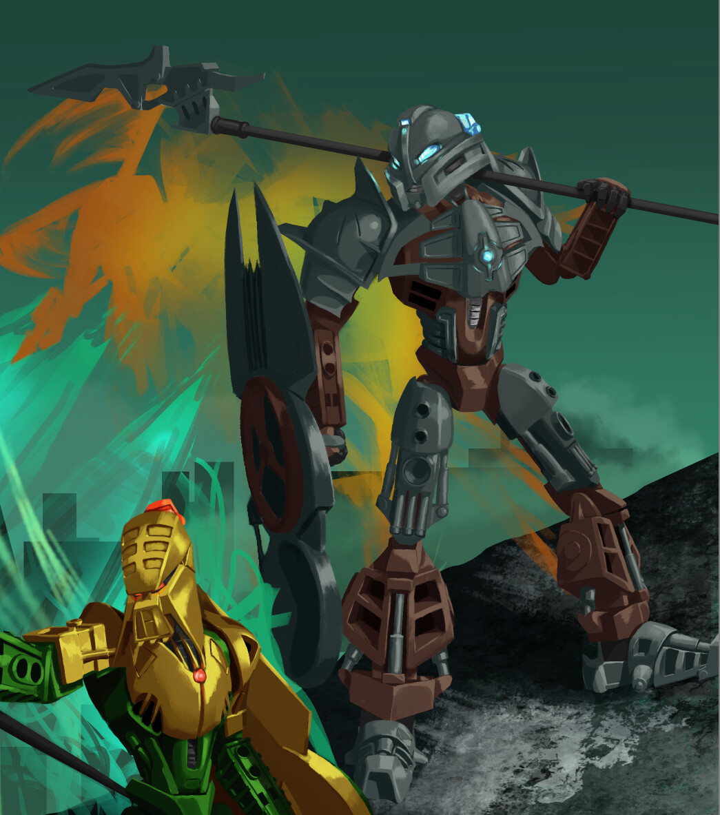
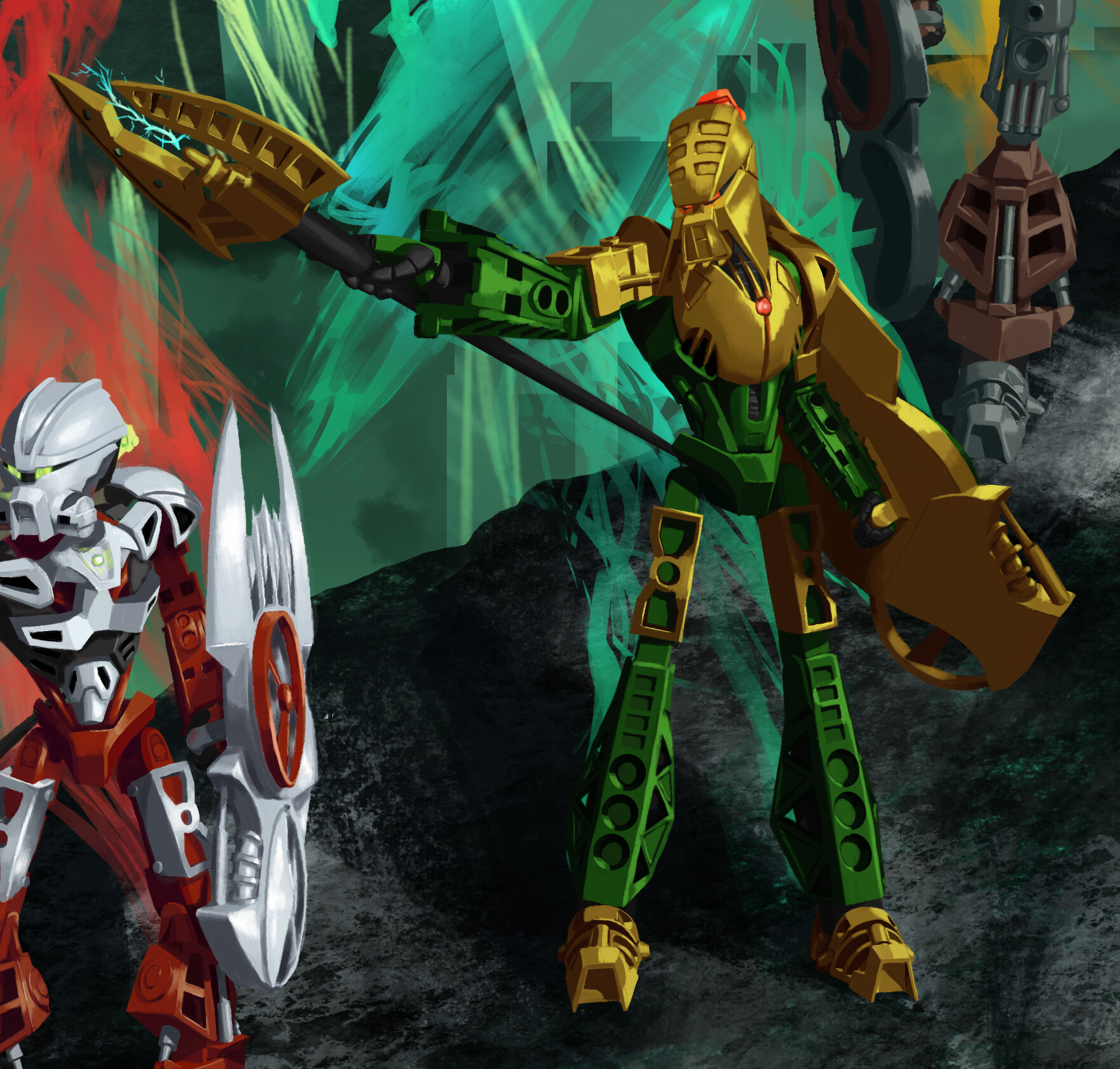
Bomonga
Bomonga was a weird one. I decided to play with his mask power a bit by making him a bit larger than the others, but I didn’t want it to be enough that he became the centerpiece. Combined with the kneeling pose, I think that does a good job of filling out his side of the screen. I also decided to keep him as a bright gold, modelled mostly after the newer Lego gold.
Gaaki
Oh Gaaki… what a surprisingly difficult one to work on. I’ve gone back and forth on whether to have her as a light gunmetal (really reaching for a soft 2/2/2 silver gunmetal gold, in reality it’s basically a dark silver) or bronze for days. But, just barely, I think I’ve decided I like the bronze a touch more than the light gunmetal, though I might as well upload the silver/light gunmetal one as well.
Other difficulties included having to redraw her bent leg from scratch and trying to reuse Kualus’ shield and recolor it to match. Adding bronze was an idea I had very late in the game, and the only way I found to keep the shading I did for her and still look good was to give myself a crash course in gradient mapping. This was a great skill to learn… but because I didn’t plan ahead and had the metallic colors separated into at least a dozen layers… that meant a dozen gradient maps. And from that point, my computer hated me and even minor things sometimes took forever to render. I’m sure there was probably a better way to do it, but it’s a bit late now. I’d say the result was worth it, though.
She’s also the only one whose mask I changed, since I saw the original creator of the MOC and the creator of the mask both wanted it changed. I looked through a bunch of Gaaki mask possibilities, but ultimately decided on the one made by @Perp3tual .
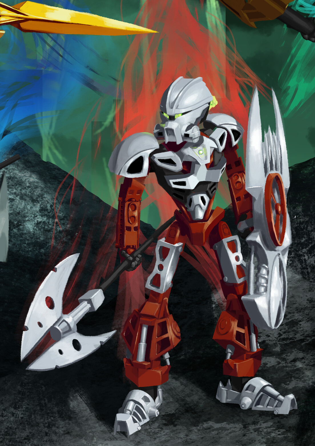
Iruini
I left Iruini for last in case I ran out of time, so I could still qualify for the contest even with 5/6. Luckily, that didn’t happen.
He was pretty fun to draw. I spent forever on trying to get the head right, and while I’m sure it’s not pixel perfect, I’m happy with it. The outstretched arm was a good exercise in foreshortening and I’m very happy with how the spear turned out. By this point I’d definitely gotten into a rhythm drawing these back to back, so he’s mostly pretty standard.
Flickr page and other versions:
FINAL version with shield: Time Would Bring Transformations- Bomonga Shield
Updated scarf color: Time Would Bring Transformations- Updated Scarf | ar9914 | Flickr
Bronze Gaaki: Time Would Bring Transformations- Bronze | ar9914 | Flickr
Silver Gaaki: Time Would Bring Transformations- Silver | ar9914 | Flickr
Ghostless: Time Would Bring Transformations- ghostless | ar9914 | Flickr
Green Bomonga: Time Would Bring Transformations- Green Bomonga | ar9914 | Flickr
Empty Background: Time Would Bring Transformations- Background | ar9914 | Flickr
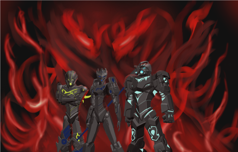
And a final note, one that’s kind of the reason I decided to go with this art style to begin with, is because it’s a personal homage to the last time I entered a Bionicle art contest: the BZPower “what would you have liked to see in G2” in like 2017. Unlike this entry, I didn’t come close to finishing that on time. I wanted to draw the six Toa Masters as shadow toa, but only got halfway finished before the deadline. I ended up having to switch my drawing software after finishing that, and could never quite recreate the brush I used for this. So I never really attempted digital painting like this until I sat down and remade it in Krita for this project.
Edit: hopefully fixed the preview image to not just be Norik
Edit 2: fixed a layer that was wasn’t saved right, also fixed a tiny part of Iruini’s ghost that wasn’t fixed
Edit 3: added link to Green Bomonga
Edit 4: changed scarf color and made some other, minor tweaks to Bomonga’s and Kualus’ energy and the shadow around Iruini.
Edit 5: added Bomonga’s shield
