As most of us know, the primary inhabitants of the Matoran Universe (by which I mean Matoran and Toa) all have certain assigned elements, and those elements have certain assigned primary, secondary, and sometimes even tertiary or quaternary colors. They are are follows, according to BS01:
Fire (Red, orange)
Air (Green)
Earth (Black)
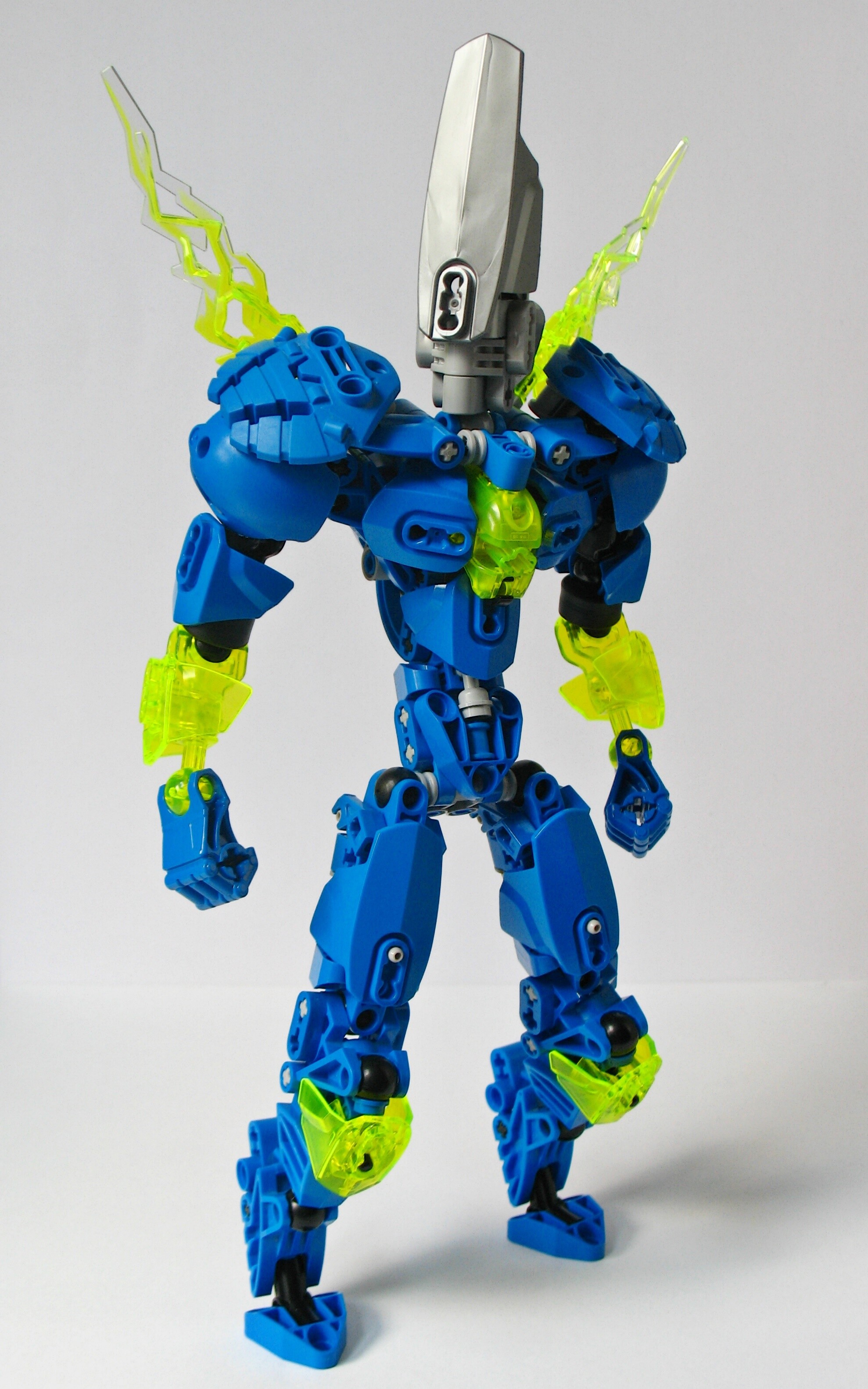
Water (Blue)
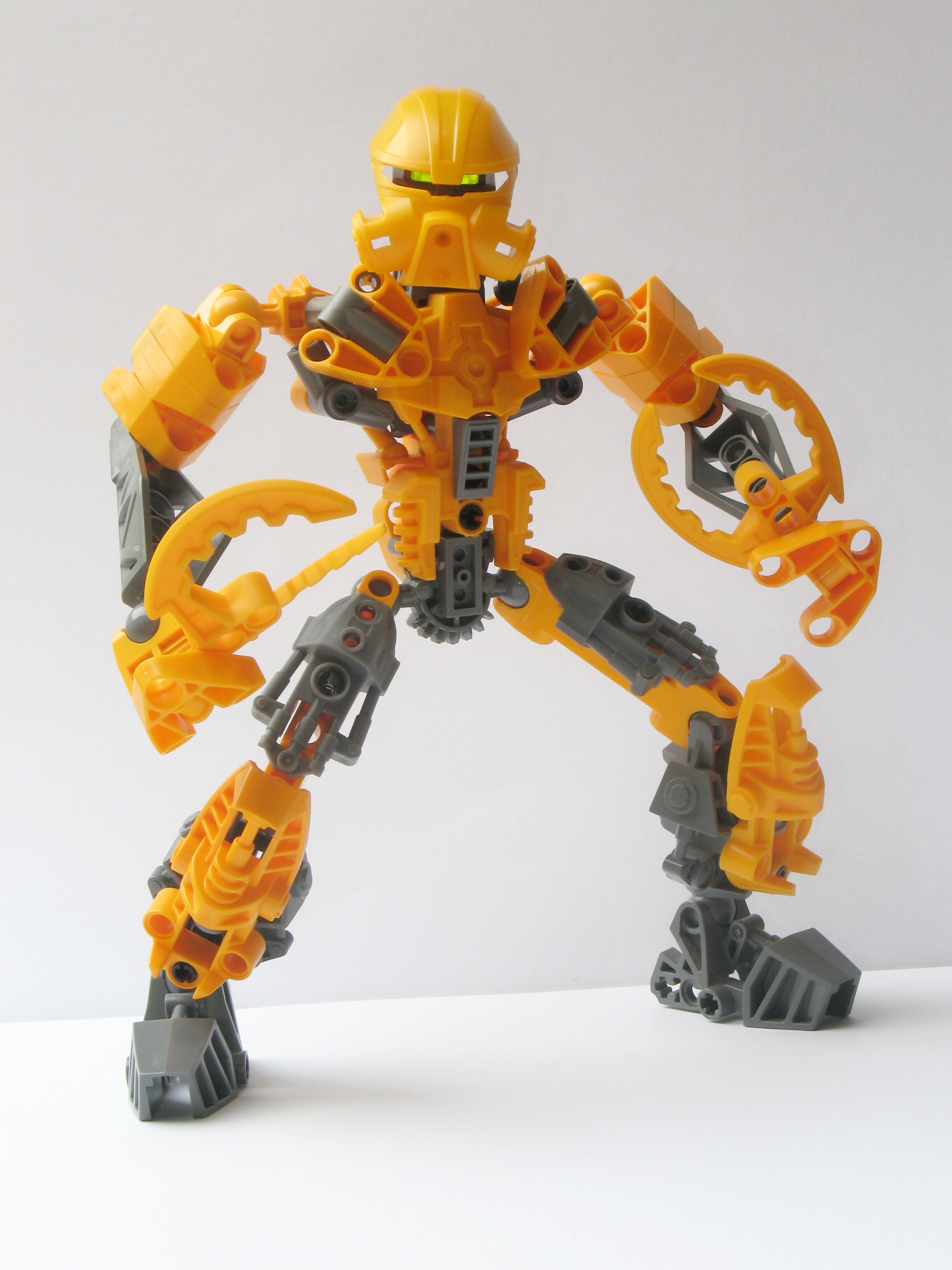
Stone (Tan, brown, yellow)
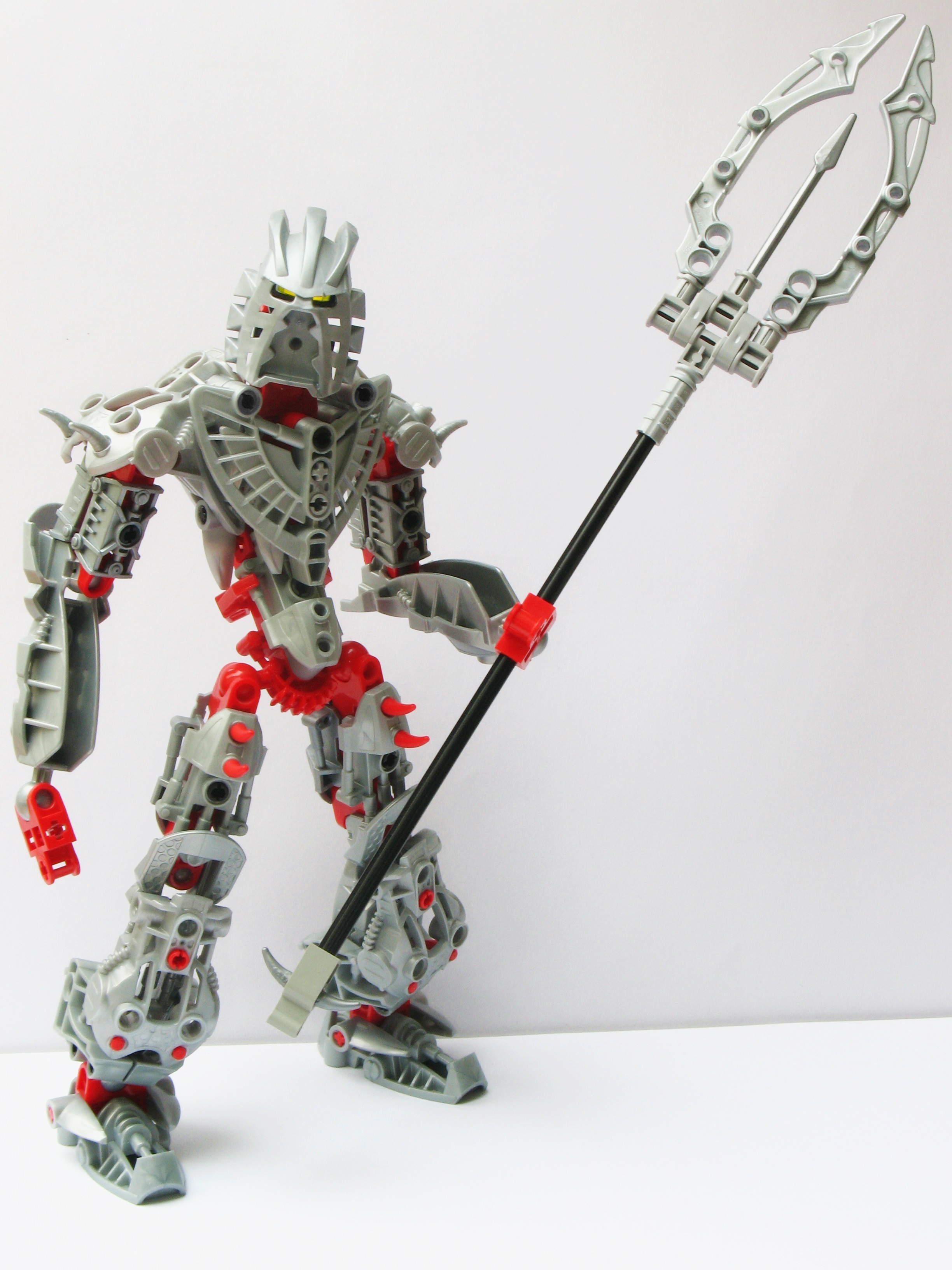
Ice (White, grey)
Light (White, gold)
Shadow (“Dark colors”)
Sonics (Grey)
Gravity (Purple, black)
Plasma (Orange, white)
Magnetism (Gunmetal, black)
The Green (Green, blue)
Lightning (Blue, white)
Iron (Burnt orange, grey, gold)
Psionics (Dark blue, gold)
Obviously the validity of all of these being able to be considered “elements” could be pretty easily brought into question, but it is what it is and that’s not what this topic is about. This topic is about colors.
Out of a lack of parts, and an unwillingness to compromise on my own lore, I would propose something slightly different:
Instead of staying strictly within the rules, play around.
I do not mean the obvious things that have already been done within the sets - yellow in fire Toa, Purple in Earth Toa, etc. That’s not what this is. This is taking an element and their color scheme, and going outside of the obvious, while remaining within what is recognizable.
An example would be a Toa of Psionics with a purple and gold color scheme, rather than Metru blue. For me, I’d still say this would remain recognizable as a Toa of Psionics. Or a Toa of Light with tan and gold, or white and tan.
Another thought process would be taking something that’s more inherently recognizable as an element, and using real-world aspects of that to change your MOC. Take water, for example - give a Toa of Water asymmetrical, multi-colored armor and greebling to represent coral. Or a Toa of air with heavier sand blue coloration.
For me, the implications of this are as much for making builds more compatible with my collection as they are for infusing different types of character into a MOC purely through its colors. Going back to my Psionics example, the minute a the color goes from blue to purple, the feel of the MOC goes from graceful to regal. Or the Light example, it changes the feel to a more experience, older character.
The other point I wanted to bring up was differentiation between armor and “skeleton”, and the color blocking that follows.
If I have a black MOC, and the torso and upper limbs have a consistent color, with the lower limbs being black, it gives the illusion of plate armor. If you stick to that formula, you can further give the impression of heavier or lighter armor. Reconciling our modernistic views of clothing with BIONICLE gets a bit sticky, but you don’t have to explicitly state it in your MOC, but rather just create the illusion to give a MOC more character.
Anyways, this is mostly just me ranting about random stuff and not really bringing up something to discuss, but I’d like to hear your own suggestions for alternate color schemes and/or color blocking styles.

 but that’s really saying more about the Mistika than anything :p)