Vahlix: Skeletonpatch's Self-MOC

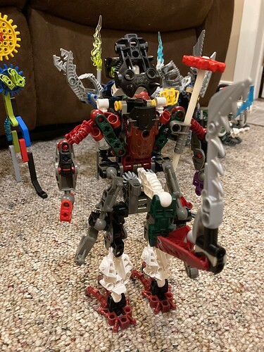
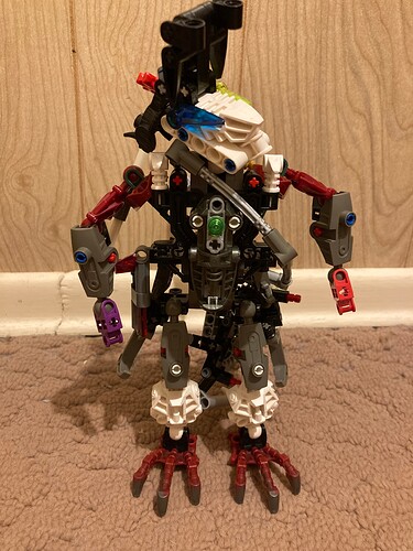
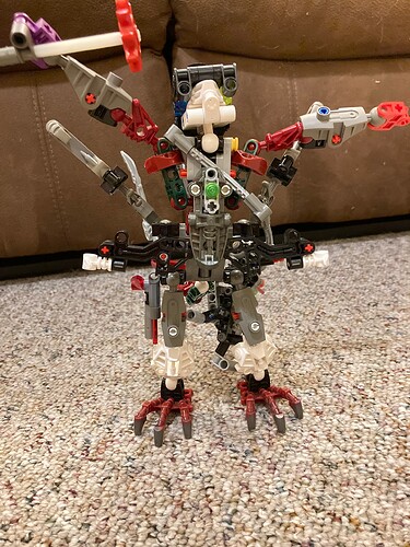
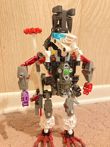
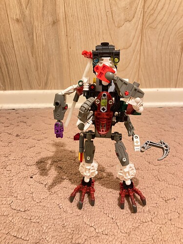
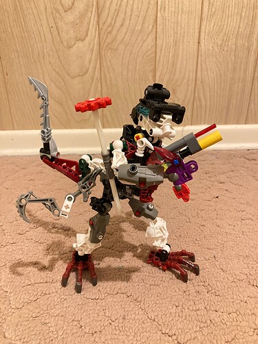
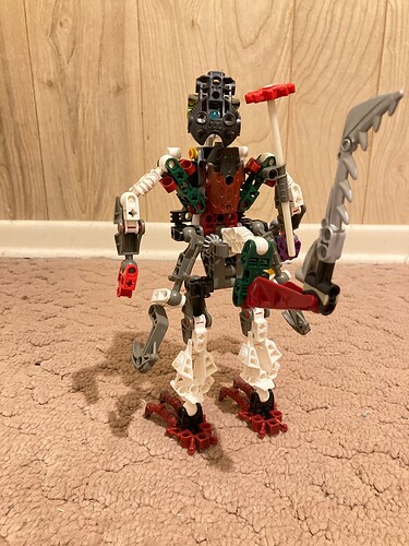
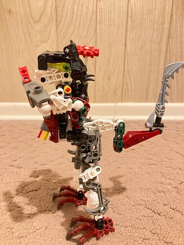
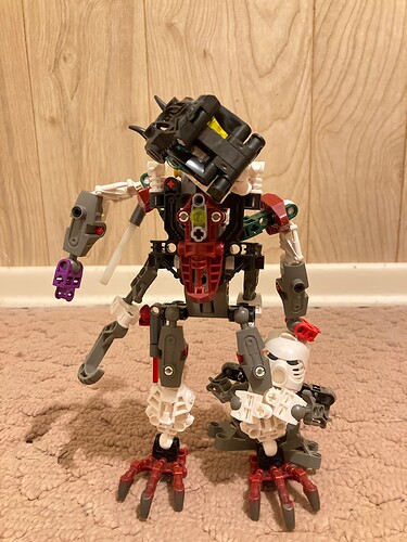
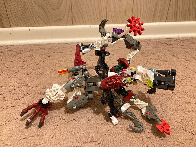
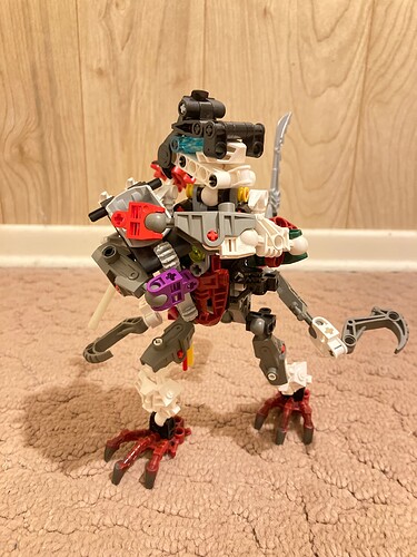
Howdy. Longtime BIONICLE fan, never interacted with any BIONICLE forums until now. Recently got back into BIONICLE and have built a few MOCs that I’ve been wanting to share, the first of which is this guy who somehow is supposed to represent me:

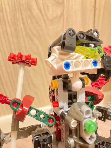
I don’t see the resemblance either. Vahlix is far-sighted and wears a bulky pair of glasses.

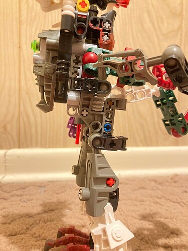
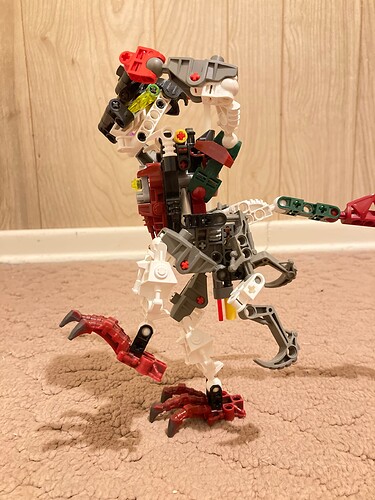
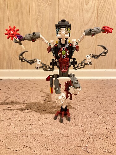
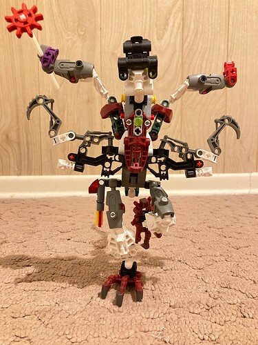
This is probably the most unorthodox build of any of my MOCs (not that you’d know since this is the first one I’m sharing), boasting a custom torso made by mashing a Visorak torso to two Rahkshi torsos.

He’s surprisingly stable considering the bulk in the upper body.

This guy claims to have lived in the Matoran Universe and identifies as a Ko-Matoran. Not a single Ko-Matoran he’s met knows who he is or what he’s talking about when he reminisces about the past. Now works as a trader of “rare” materials on Spherus Magna, moving around to different settlements and scavenging from any ruins he comes across. His most prized possession is an ancient staff made from special materials not seen since long before the Core War.

Thank you for reading, any feedback is greatly appreciated. Apparently new users can’t have more than three pictures, which is annoying since I wrote quite a bit more and none of it works without the pictures. I guess I’ll share them later.

I intend to share more of my MOCs soon but at this point I have no idea how active I’ll be.

12 Likes

I like how funky this guy is! He’s got an interesting silhouette and I think the unorthodox torso definitely works in his favor. I feel that the color scheme is a bit all over the place but you probably intended that. Good work!

5 Likes

Thank you! The colour scheme is indeed on purpose, part of his deal is that he is cobbled together using parts from a bunch of different sources.

Now for stuff it wouldn’t let me include in the first post:

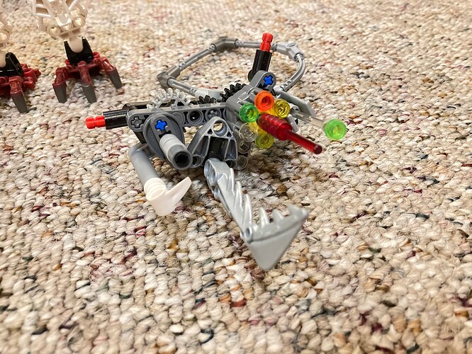
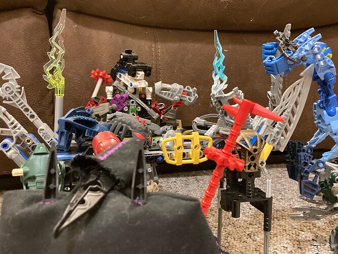
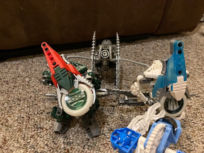
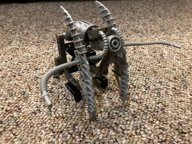
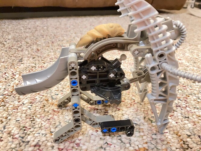
His primary weapon is a custom-built cannon which he uses in conjunction with his personal Vahki (which he restored to working order himself) and an amalgamation of a Bohrok to defend his trading stand from petty thieves:

The tail and extra arms really help him keep his balance when wielding this thing. It’s slung around his shoulder with a strap most of the time, which is not as cumbersome or awkward as it looks like it should be.

His sidearm is another custom-built gun, this one being much more compact and typically holstered at the hip. Also visible in the background is the charging station the Vahki are plugged into when not in use. It’s powered by a Kraata on a treadmill.

5 Likes

Welcome to the Boards.

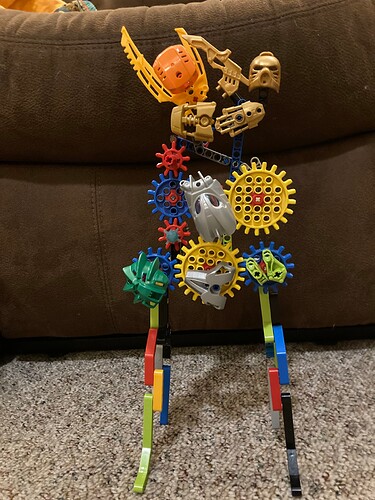
Vahlix’s colors are a bit all over the place, which makes it difficult to tell what’s what when viewing him. He very much feels like an old Dark Hunters build, in that it’s very cobbled-together looking and uses a lot of older pieces. Being so frequently posed directly in front of the table/large wall art of gears and masks makes it even harder to tell what’s part of him and what isn’t.

The vahki are vahki and the bohrok is a color-mismatched bohrok, so I won’t go into either of those. One way you can help improve the viewability of your model is to narrow down which of the many colors he has is the primary and secondary, and sort through your collection for pieces in those colors you can use. Having a custom torso unfortunately doesn’t matter too much if nobody can see how it’s implemented.

There’s also an entire topic on how to use certain building techniques or difficult-to-use pieces, as well as expertise from many different people across the boards with years of backlog to look through. Who knows, you may be able to find some inspiration there.

3 Likes

Your photography advice is something I was keeping in mind… and then apparently forgot to implement when I actually took the pictures, for some reason? That’s annoying, why didn’t it occur to me to make sure the super colourful gear wall wasn’t directly behind him in every photo? I felt compelled to build a bunch of props for this character but didn’t take enough care ensuring those didn’t distract from what should be the star attraction. I’ll take better photos later when I have time to better show off the build.

The colours being all over the place is very much intentional. Most of my other MOCs have better colour blocking in my opinion (though I guess you’ll be the judge of that once I actually share them).

3 Likes

@Ghid, you linked to the “Introduce Yourself!” thread and while I very much would like to post there and introduce myself, the reply button isn’t there for some reason. I have taken note that if I ever post a link to that thread, it must be directed to that one specific TheMOCingbird post.

Anyways, here’s the aforementioned better pictures:

Short of dismantling him (which I don’t feel like doing right now) I’m unlikely to get better photos of this guy’s build. Also being limited to just three photos per post (as a new user) is really crampin’ my style.

Ghid drew a comparison to the old Dark Hunter contest entries and while some similarities did occur to me after I built this, that resemblance wasn’t intentional. My “artistic vision”, so to speak, was to use as many parts from my favourite sets as possible, while still building something cohesive. Keerakh (the exact one featured in the earlier photos), along with Turahk were among my first BIONICLES, so those two in particular got a lot of attention in this build.

4 Likes

So you are aware, posting two replies in a row is called double posting, which is against the rules. You can check out all the rules for the site here.

Strange. It’s definitely there for me.

Perhaps your account is simply too new to post there?

3 Likes

Went and read what the New User restrictions actually entail, now I can introduce myself. Will avoid double-posting in the future.

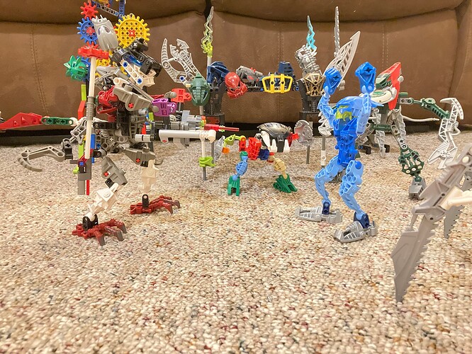
Because this is supposed to be a MOC thread here’s a fun picture of Vahlix trying to sell a pair of shoes to a Sister of the Skrall:

3 Likes

Welcome to the boards! I imagine this guy speaking in a 1930’s carnival barker voice, talking about his “rare and dangerous” materials he’s collected from across the universe.

This is, in general, a difficult concept to pull off. Most BIONICLE pieces go together, so the only part of him that looks purposely different his his headgear. One obvious solution would be color blocking - keeping the random colors, but concentrating them on differerent parts of him - while another solution, which would be a lot more parts intensive, would be giving different parts of him very different textures, perhaps by having sections use system or CCBS or standard technic parts. Perhaps more immediately, I don’t think the bohrok skull pieces really help his torso shape at all.

I like the concept of the sales table, though I do feel like there’s a lot of colors going on there as well. It’s difficult to make out what’s meant to be table and what’s meant to be wares. Ideally at some point you’d be able to make it all one color.

4 Likes

The Bohrok skulls are there to bulk up the front of his torso, as he looks largely naked without them. They’re also there to serve a superfluous and pointless gear function where if you press down on the base of his tail they flip down:


Isn’t he just majestic?

I personally like the way the darkened torso kinda disappears, drawing attention to his extremities. I’ll try swapping out some parts for different colours and see if that improves anything. Should probably make the extra arms stand out more.

My “artistic vision” for this MOC was to focus on using parts from sets that I’m nostalgic for (or recolours of those pieces to avoid making the colour scheme too drab or too loud). I have no nostalgia for CCBS, hence why it isn’t included here. Not to mention most of my loose parts come from bulk purchases at garage sales and for some reason CCBS shells are way more common than torsos or limbs, meaning that I’m rather limited in what I can accomplish using it.

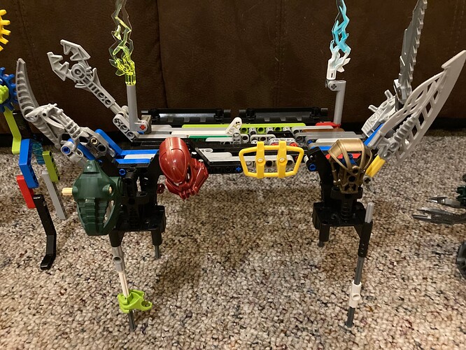
The table was built using all the loose Technic beams and liftarms I could find and was strategically assembled to look and feel as roughshod as possible. One of the legs is half a unit shorter than the others and parts of the table are assembled with smooth pegs so that it will wobble whenever it’s interacted with. There’s a large hole in the table that’s stitched together with axles. The Bohrok fell over and pecked the bottom of the table with full force at some point. The two torches correspond to Vahlix’ eye colours and are also a reference to the RE4 Merchant.

I’m also gonna highlight the Vahki charging station. For how basic it is I really like the shaping and the consistent colours demonstrate that it was assembled more carefully and with better materials than the table was:

The idea here is that the Kraata is on a treadmill which spins the generator underneath its housing. Vahlix doesn’t actually know what a Kraata is and treats it like a pet.

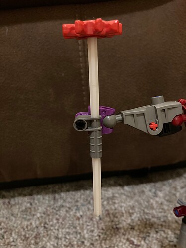
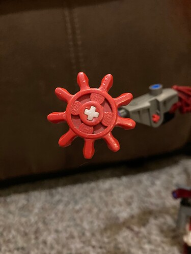
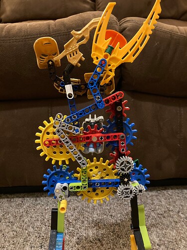
The “ancient staff” I’ve included is made using old pre-Technic axles and a sprocket that were included in the LEGO bin I got from my mom when I was a kid, which in turn is from when she was a kid in the 70s. I have no idea how common these parts are and have never encountered them outside of my own collection. Obviously the display wall gets its sprockets from the same place.

Fun Fact: The Technic axle is older than the minifig by four years. Before Technic was its own named theme, axles were made from undyed plastic, so they’re only semi-opaque and milky white in colour.

Bonus Fun Fact: These old sprockets on their own are not tight enough to stay on an axle, so there’s literally a metal ring inside the axle hole to provide the it with enough grip to stay on. Consequently, the sprockets always feel lose and jiggle, and will leave an indent in the axle if they’re in place for a long time.

4 Likes

honestly, still think he looks better without the bohrok skulls. I think it’s to do with how flat those pieces are from the side, which generally doesn’t look good for a torso.

Now that I can see the torso build better, I see why the arms were posed rather weirdly. It’s not an ideal connection for articulation. On the topic of torso coverage, the slizer feet that form his shoulders might work if you attached them on top of the foot piece to form pectorals.

Gotcha. I still think you can make that more distinct, though depending on what your collection looks like it might have to be a gradual process. For example, I think you could make a limb or two just using those Rahkshi thigh pieces, and that’ll look different from the rest of him.

I see, though I maintain that, similar to the MOC itself, it’s difficult to sell that concept well. (Though I think that not having the full table in view in the title picture is why it didn’t click immediately for me.)

4 Likes

Looking through my parts there aren’t many substitutes I could use that don’t look absolutely garish in practice. I’m already too attached to this guy to make fundamental changes to his build.

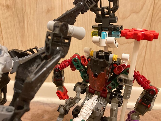
Did make a few alterations, namely replacing all the blue pins and swapping the blue eye for a lighter one since it kinda disappeared against his glasses (the entire apparatus on his head is literally just a pair of glasses, he’s far-sighted). I’ve also added a light blue Barraki eye to the back of his head to represent his brain stalk (Vahlix identifies as a Ko-Matoran, so there should probably be at least some hint of that in his design).

Don’t mind Nuparu, he’s just taking a look under the hood to see what exactly is happening inside that head. A full analysis and breakdown of Vahlix’ neurological makeup is due to be published in the next issue of Spherus Science Monthy.

3 Likes

Nice! Those glasses are really cool.

3 Likes

Welcome to the boards, Skeletonpatch!
Very nice moc. I like the patchwork “cobbled together” look and all his accessories and robots are neat as well. The lore is also fun, the quirky inventor certainly seems to be a fun character. Cool job overall

2 Likes

I’ll never forget the day my dad told me: “Son, one day you’re going to build a BIONICLE MOC with terrible colour blocking and obstinately refuse to notice the terrible colour blocking in the face of multiple people pointing out how terrible the colour blocking is. You won’t acknowledge this terrible colour blocking until you see it in action beside other MOCs you yourself built which have substantially better colour blocking, and you’ll feel so stupid that you’ll willingly eat your own words, go into a panic and cannibalize multiple sets to fix that terrible colour blocking.” Such an odd thing to tell a ten-year-old after he’d unwrapped the Rockoh T3 on Christmas morning. Man’s got some foresight. He’s also colourblind.

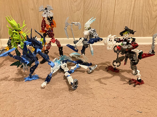
Basically, yesterday I looked at my Female Glatorian thread and when I saw the last photo I’d included in the initial post again, where a group of ladies are beating up Strakk for stealing a pair of shoes, I noticed something:

Vahlix’ arm disappears against the gunmetal Metru foot on his torso. And his extra arm disappears against the Rahkshi thigh on his leg. And I really need to pay better attention to where the white trim on the back wall is in-frame so that it doesn’t cause parts of a build to disappear against it. Considering that Dib, the most dynamically posed of everyone, is not at all suffering from these problems it finally hit me that Ghid and Hawkflight might be on to something. That and the fact that I literally took this photo seven times while adjusting Vahlix’ pose so that it was somewhat readable. When I realized I was already compensating for a flaw I hadn’t even registered yet I facepalmed pretty hard.

Like, I came up with this build that I’m proud of and decided to show it to y’all, but didn’t do you the courtesy of making sure it’s actually photogenic. And you told me that. And I somehow thought I knew better.

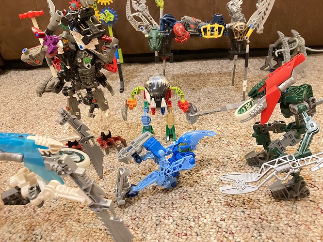
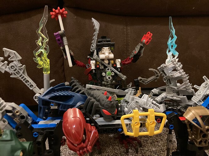
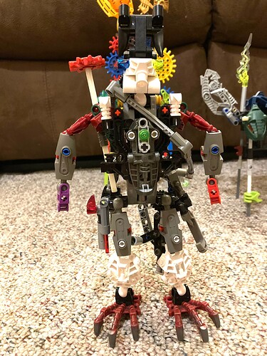
I stole several connectors from Kurahk and the arms from Toa Nuju (one of my first Toa), swapped the gunmetal Metru foot on his torso for a dark red one and put a pair of white Bohrok eyes on his waist to lighten up that darker area. Hopefully the results are an improvement:


Trying to mimic Dib’s stomp but his legs are a little too short for that to look menacing.


Breath in!


Breath out!


Now hold that pose for at least forty-seven seconds!

I considered making the foot on the torso either white or dark green but neither colour looked good to me, and the red serves as a good contrast against the grey and white on the arms when doing dynamic poses from the side. I also tried swapping the grey claws on his extra arms for a silver pair, and while that was more visible they didn’t feel right, so I left the grey ones and simply switched the hands to white.

It has been said that the Bohrok skulls don’t help with the visual flow, and I can now see where that’s coming from, however:


You’ll have to pry them from his cold, dead… torso?

I think, overall, Vahlix has been greatly improved. Let me know what you think, and I’ll ACTUALLY TRY to listen this time.
5 Likes

This build makes me nostalgic for old bio-tube stopmotions

4 Likes